 We’ve all been there. You spent countless hours conducting ironclad research for your latest infographic. You tangled with a designer over the minutest details. You struck the perfect balance between education and promotion in the finished image. You even squeezed the file into CMS-friendly dimensions, whipped up an embed code, and landed a few influencers to seed it on social channels. Yet despite having done everything by the book, the big unveil was met with a smattering of Likes and tweets — and those mostly from friends.
The good news is: You’re not alone. The bad news is: The flop is probably your fault.
Why Infographics Flop
While any number of amplification and discovery tools may help boost reach, technology alone isn’t going to cure what’s likely to be your infographic’s real ill: the content itself.
Infographics have become baroque — data as ornament, not structure. Marketers jam so much information into their graphics that most are visually impenetrable. Data splatter, not data narrative. Lost in the noise isn’t only the story, but also any real understanding of what viewers want from the format. For most people, an infographic represents the shortest distance to a working knowledge of a subject. Therefore, the producer’s job is to research a topic, allow the data inform a perspective, and then visualize enough information to tell the story — and no more. It’s the “and no more” part that gives marketers fits.

Imagine you’re in a foreign city staring at a wall-mounted subway map. Even if you cannot speak the language, you trust that a basic sense of direction, color and iconography will allow you read the map well enough to get reasonably close to your destination. Now let’s pretend the map is littered with novelty information — like gas prices at the time the station was built, tunnel length in some quirky unit of measure, or relative train speeds worldwide. Those superfluous additions would interfere with the knowledge you are trying to gather — that is, how to get where you’re going. You’d be lost in the clutter of the map as well as in the unfamiliar city. If subway map designers manage to maintain focus on their audience’s needs, why do so many marketers feel compelled to clutter their infographics with so much “noise”?
Do One Thing Well Instead
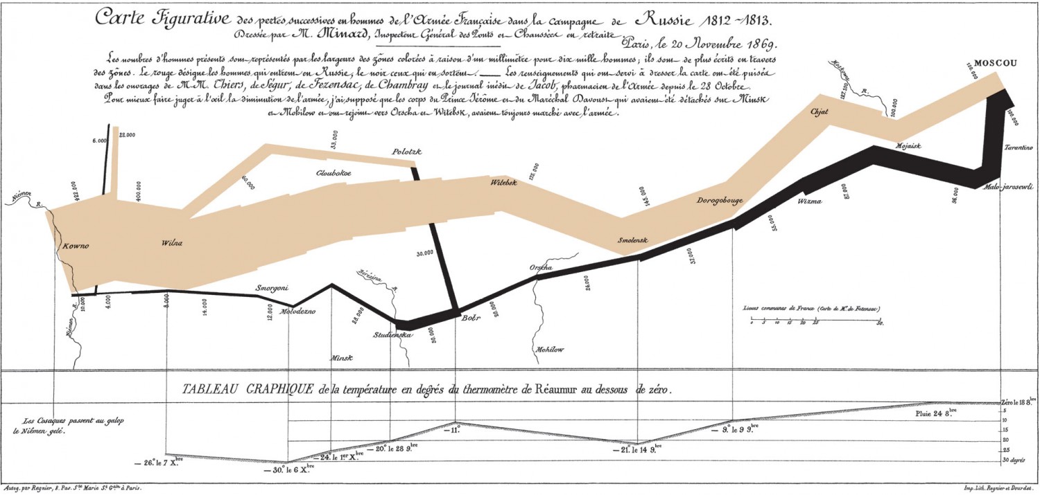
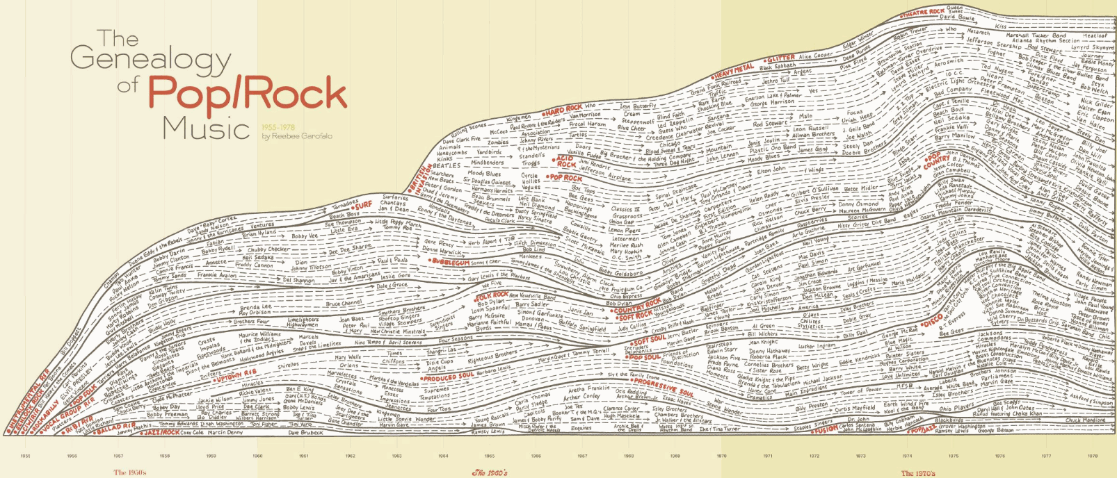
A good infographic is often a study in restraint. Consider Charles Joseph Minard’s timeless depiction of Napoleon’s ill-fated 1812 march to Moscow and Reebee Garofalo’s enduring “Genealogy of Pop/Rock Music”. Anyone who has taken an Edward Tufte course will instantly recognize these projects as two of the greatest examples of information design, largely because each creator told his story with the absolute minimum number of visual elements.
Using only basic data — time, temperature, geographic coordinates, and troop count — Minard produced a single image that explained as well as any textbook or film could have the seminal turning point in the Napoleonic wars.


Garofalo’s discipline allowed him to depict the inter-relationship between several hundred musicians and musical styles spanning three decades. Had he embellished the graphic with non-essential elements, the “Genealogy of Pop/Rock Music” wouldn’t be the icon it is today.
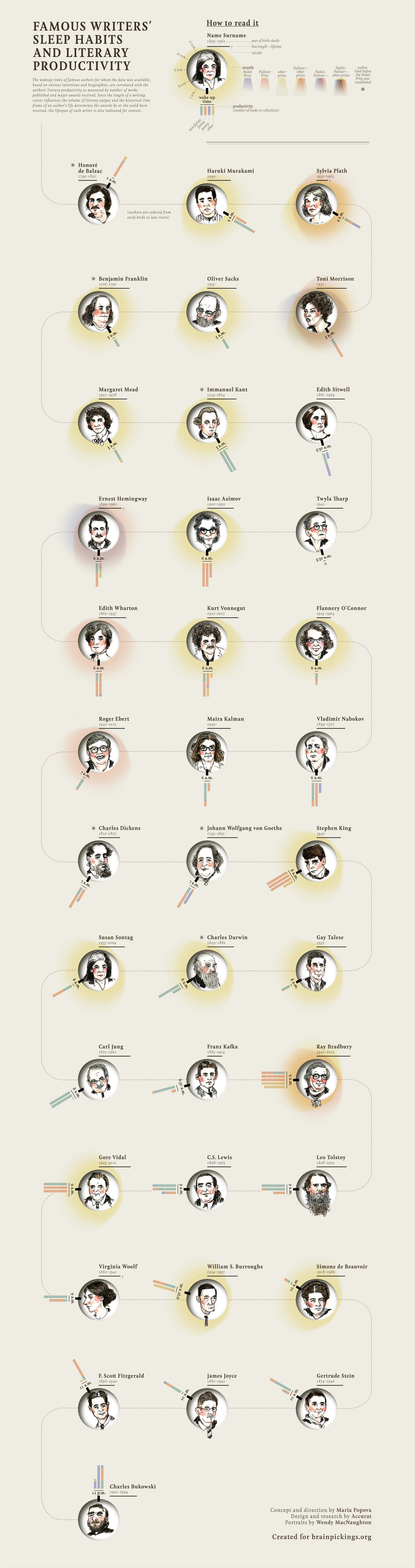
Some bloggers (even those with a marketing objective) have adhered to the “narrow and deep” ethos of information design heavyweights like Minard and Garofalo. For example, Brainpickings’ Maria Popova concepted a provocative look at the peculiar relationship between sleep and productivity of famous writers. Despite the fact that Popova visualizes more data points than does Garofalo, her creative partners’ off-the-charts design skills managed to make the data visually accessible.
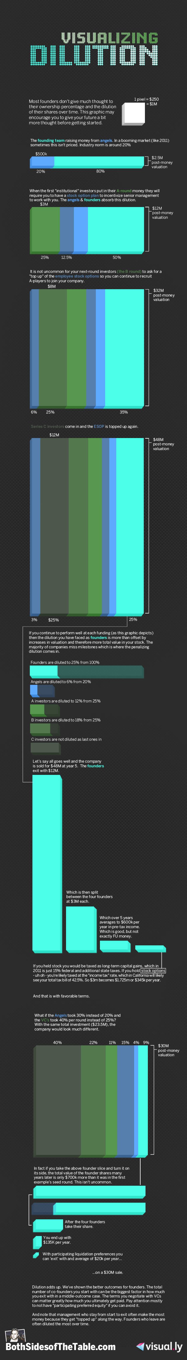
Upfront Ventures partner Mark Suster also proves that an unshakable commitment to simplicity is paramount to designing a share-worthy infographic. Suster collaborated with Visual.ly creative wiz Jess Bachman to produce “Visualizing Dilution,” a graphic that employs the most basic design element of all — geometric shapes segmented by color — to explain the nuanced impacts raising money can have on an entrepreneur’s ownership of her own company. Bachman and Suster’s success suggests efficient creative, not extravagant creative, is the key to must-view-must-share infographics.
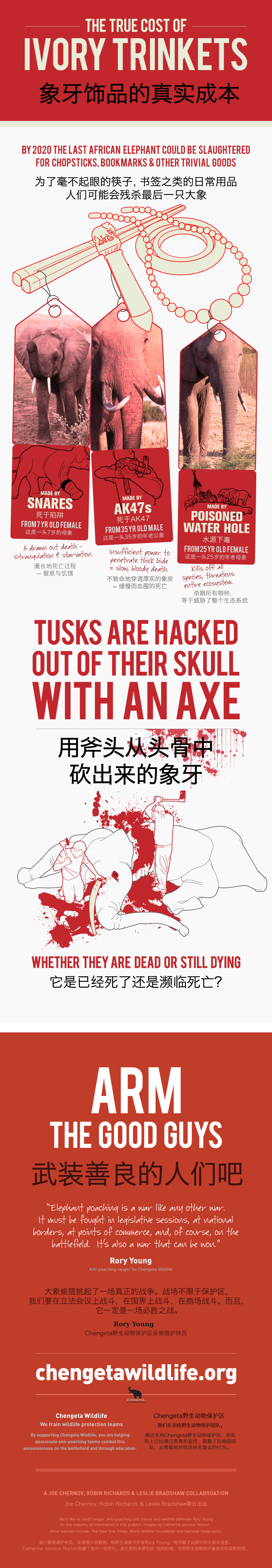
Like Popova and Suster, designer Robin Richards, marketer Leslie Bradshaw and I have also embraced a “Do one thing well” motto for our conservation-oriented projects. Starting with Shark Attack and continuing with our recent “True Cost of Ivory Trinkets” project for Chengeta Wildlife, we’ve aspired to resist what we call “IBU” (interesting but useless) design elements to lead the viewer directly to a single, unavoidable conclusion. Namely, we focused on how an entire species is endangered because of trivial trinkets and gift shop baubles — leaving out other information like the rate of population decline and a map of the contraband. You can see what we put together below.
The difference a graphic that stalls and one that spreads often comes down to the creator’s power of restraint. Said another way, brevity isn’t just the soul of wit, but also infographics.

![]()

