
Just like some words are more persuasive than others, some designs are more persuasive than others, too. A landing page’s layout, the fonts and colors used, image placement, form length, and other design factors can have an impact on how many people actually choose to fill out the form.
Want to design a landing page that persuades people to convert? Then you’ll need to take a step back from the aggregate data about site visits, conversion rates, and lead numbers, and think hard about the human behind the screen. What makes him or her tick? What are her or his goals? Only after considering these questions can we begin to think about optimizing our landing pages for conversion.
Conversion rate optimization (CRO) is, simply, understanding human behavior.

Easier said than done, you might be thinking. Well, let’s break it down a little bit. According to the Fogg Behavioral Model for persuasive design, human behavior is a product of three factors: motivation, triggers, and ability. The more you keep these factors top-of-mind as you design your landing page, the more persuasive your design will be.
In this post, we’ll explore these three factors of human behavior. For each factor, you’ll come away with solid, data-backed takeaways that you can use when designing your own, high-converting landing pages.
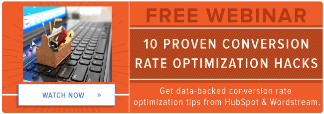
And if you want to learn more data-backed CRO hacks, watch our on-demand webinar with Wordstream.


1) Motivation
According to Fogg’s behavioral model, humans are primarily motivated by: pleasure/pain, hope/fear, and social acceptance/rejection.
For our purposes, it’s inspiring hope and social acceptance that are most relevant. Hope allows users to anticipate a positive outcome, and the desire for social acceptance is a hardwired into us as we historically depended on living in groups to survive.
Takeaways for Marketers
Convey your company’s expertise.
Chances are that your business writes offers on topics your colleagues are experts in. Why not show that off on your landing page? Dedicate space on your where you can tell visitors what it is that your company specializes in. By establishing authority in the field, you’ll give visitors more of a reason to trust the content behind the form, making them more likely to convert.
We’ve actually tested this theory at HubSpot. In one test, we included a blurb next to our logo on several landing pages that briefly conveyed our expertise. It said, “HubSpot is an inbound marketing software platform that has helped over 12,000 companies attract visitors, convert leads, and and close customers.” Landing pages with this variation saw, on average, a 3% increase in conversion rates compared to those with just the plain logo.
List the number of downloads an offer has.
Never underestimate the power of social proof. When visitors see that a whole bunch of people have downloaded the offer before them, they’re more likely to follow the herd. That number of downloads establishes a norm, and people like following norms.
At HubSpot, we tested added the following subtitle to some of our landing pages: “Join X marketing professionals who have already downloaded this offer!” Landing pages with this variation saw, on average, a 4% increase in conversion rates compared to those with just title and a offer-related subtitle.
2) Ability
In persuasive design, “ability” is synonymous with “simplicity.” Simplicity factors can vary by individual: Some people have more time, some people have more money, and others can invest in tasks with a larger cognitive load, while still others cannot.
Basically, simplicity is a function of a person’s scarcest resource at the moment a behavior is triggered. In marketing, we want to make our landing pages as simple as possible in terms of time and cognitive load.
Takeaways for Marketers
Use images instead of words.
When people want to download an offer, they may not have the time to read through a lot of words. Chances are, they have other things on their mind and may not have the cognitive space to read through a lot of difficult content on your landing page. To reduce words on your landing pages and get to the point more quickly, try showcasing the value of your offer through images. Not only is visual content appealing, it’s also much easier to digest than words.
At HubSpot, we ran a test where we looked at conversion rates of landing pages with the offer value proposition listed in bullet point format to those with the value showcased by screenshots of the offer. We found that landing pages with screenshots had conversion rates that were, on average, 3% higher than those with bullet points.
Reduce the number of form-fields you have on your forms.
Filling out forms is time-consuming. If a person comes to a landing page and sees a ton of form fields, they might feel overwhelmed and bounce from the page quicker than you can say “conversion.” Upon initial contact, it may be better to present a shorter form to the visitor. Although shorter forms mean you won’t get as much information from visitors, you can use strategies like progressive profiling to gather more information from them later on. It’s better to get more people to convert.
At HubSpot, we ran an experiment where we replaced our longer form with a form that only showed four fields at first. The landing pages that showed four form fields at first had a 7% higher conversion rate, on average, than the longer ones.
3) Triggers
A trigger is something that tells people to perform a behavior now. There are three types of triggers:
- A spark is a trigger that motivates behavior.
- A facilitator makes behavior easier.
- A signal indicates or reminds.
With interactive technology, triggers have become more important than ever before: A person receives a trigger, and they’re encouraged to act immediately, and sometimes on impulse.
Takeaways for Marketers
Mention the word “free” in the landing page title.
When people come to a landing page, they may hesitate to convert if it’s not clear that an offer is free. Don’t leave them to ponder — instead, mention explicitly that they don’t need to pay any money to download the offer.
At HubSpot, we tried this with a few of our landing pages. Landing pages with the word “free” in the title had a 3% higher conversion rate, on average, than those that didn’t.
Use words of urgency in the landing page header.
Triggers can also be used to encourage people to act on impulse. Add words that cue urgency to increase the likelihood that they’ll go with their gut reaction of downloading.
At HubSpot, we added urgency phrases like “immediately,” “available now,” “limited time only,” and “don’t miss out” to a few of our landing pages. The pages with the urgency wording had an average conversion rate 4% higher than those that didn’t.
When you design a landing page that has factors of motivation, simplicity, and triggers present, then conversion — your target behavior — will increase.
Have you tested any of these CRO tips on your landing pages? Share your experiences in the comments below.
![]()

