
In the history of American advertising, print has played a vital and interesting role.
Print advertising has been around as long as any medium, surviving the advent of radio, television, and internet, maintaining its steady influence all the while. There’s something truly iconic about a well-crafted print ad, and the agencies and brands that have done it well over the years have seen immense benefits as a result.
Here’s a look at some well-designed print ads from the last 115 years (one from each decade) and an attempt to understand what we can learn from the progression. Changes in taste, disruptive new technologies, and the natural evolution of our cultural propriety have completely transformed the way brands use print mediums to advertise – but certain patterns and threads hold true.
Using a modern interpretive lens to reexamine those strategic patterns (and the ads that made use of them) makes for an interesting case study of where we’ve been and where we’re headed – as advertisers and consumers.
1) 1906 – Kodak Story
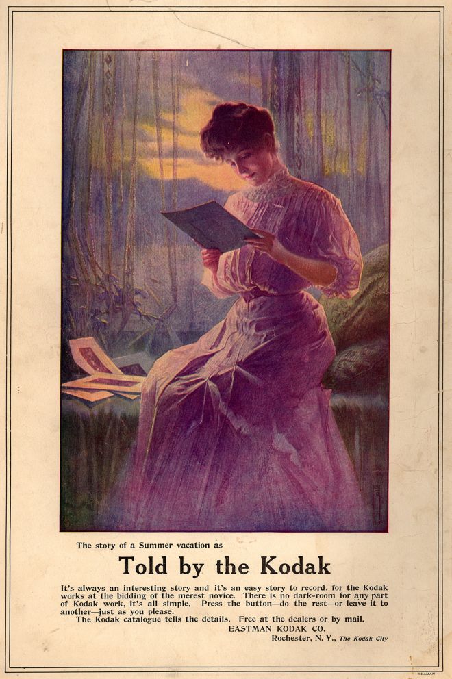
Using content marketing to ‘tell the story’ of a brand is nothing new. While the platforms we use to display our content marketing change drastically, the same underlying concepts have been exploited by businesses as far back as the turn of the 20th century.


In this ad from 1906, camera-maker Kodak (whose continued success, over a century later, serves as evidence that they were and continue to be ahead of the curve marketing-wise) created a series of print advertisements that targeted parents buying gifts for their adolescent children. The ads promised a technologically advanced way for young people to capture the essence of their experiences with Kodak cameras, requiring little-to-no expertise but delivering reliably breathtaking results.
While the model’s hair and fashion choices betray the ad’s century-old status, the concept could apply to a magazine ad today. She is contentedly going over the stunningly mounted prints that she took with her Kodak. The background is accented by a beautifully somber twilight scene, which gives the viewer an idea of what her photographic subjects might have been. Another connection to today’s modern marketing is the call-to-action at the end of the ad: “The Kodak catalogue tells the details. Free at the dealers or by mail.”
Free ebook download, anyone?
2) 1917 – Our Boys in France Tobacco Fund

Throughout World War I, American advertisers used the contextual backdrop of the war to promote their products. This glorified propaganda was used by companies in many industries to put their brand in the good graces of the American people. If the buying public believed a company was in some way supporting the war effort in a meaningful way, they’d be much more inclined to spend their hard-earned dollars on it. This was based in factual reality for many industries: gramophones, for example, vital to Allied soldiers’ communication while in the trenches, sold extremely well during the war years.
Other, less impactful industries took part in in the strategy as well. This ad in (and for) The Morning Telegraph, a daily newspaper that was devoted primarily to horse racing results and theatre news, shows how widespread the practice had become by 1917. Since the paper itself couldn’t rightly be positioned as benefitting American soldiers in any direct way, they positioned themselves as the “Official Organ in New York City for the ‘Our Boys in France Tobacco Fund.’”
Today, this would likely be seen as exploitative (or at least lacking in subtlety). Brands like McDonald’s, for example, have been rightfully reprimanded by the public for being a bit too heavy-handed while linking their brand to American crises and national spirit. Patriotism still sells – it just requires a bit more subtlety from the brands using it, lest the buying public react negatively.
3) 1929 – Dr. West’s Toothbrushes

This ad presents an interesting case study in the cyclical nature of visual design trends. In many ways, this toothbrush company (or whomever it hired to do its advertising) shows itself to be well ahead of its time aesthetically.
As far as color palette, the full rainbow is used for a strikingly immediate visual effect. The way the toothbrushes overlap in a grid-like fashion makes the ad feel symmetrical and comfortable. It’s interesting to think about how visual symmetry is now seen as an important design tool to evoke a brand’s strong organizational structure and trustworthiness. Being used in this context, almost 90 years ago, lends legitimacy to the theory itself. If it’s been working for that long, there really must be some innate truth to it.
The only aspect of this ad that would make today’s design experts cringe is the decentralized positioning of the brand itself. If modern viewers were to give this ad a 2-3 second gander and then look away, a very small percentage of them would be able to recall the name of the company. Not only is “Dr. West’s” relegated to the bottom of the page, but it’s depicted at such an angle that it makes it less memorable. Aside from that, this is a particularly forward thinking example of ad design considering when it was created.
4) 1938 – Carefree film poster

Historian Carlos Stevens offers the following about American filmmaking during the Great Depression: “The movies offered a chance to escape the cold, the heat, and loneliness; they brought strangers together, rubbing elbows in the dark of movie palaces and fleapits, sharing in the one social event available to everyone.”
During the time this film was made, the average movie ticket was $.27, offering struggling families a relatively cheap way to escape the harsh realities of their daily lives. Along with the pricing and promotional efforts of the theatres, Hollywood filmmakers recognized that there was a demand for a cheap product: one light on dramatic intensity and heavy on comedic gags. The filmmakers of the era recognized this demand and adjusted: resulting in titles like Carefree.
The ad for the film fits its tone extremely well, with a happy, dancing couple surrounded by swirling patches of bright pink, yellow, and orange. This colorful arrangement – especially in its use of adjacent pastels – would actually come back into fashion in the advertisements of the 1990s. The film’s stars – Fred Astaire and Ginger Rogers – were among the biggest draws of the era, starring in ten films together from 1933 to 1949. In an era when financial security was lacking for a majority of the movie-going audience, films like Carefree (and the accompanying advertisements) provided a welcome escape.
5) 1946 – Spam ‘n’ Limas Recipe

In 1946, America was reaching the height of its World War II involvement. Much like during WWI, the advertising of the era was greatly affected by the nation’s wartime status. Consumers were confronted with government-enforced rationing practices that affected the way they purchased everything from gasoline to meats and cheeses.
Enter: Spam. Spam is a canned, precooked ham product that was created by Hormel in the late 1930s and became popular throughout the country for its price and convenience. For a time, the tag of being a canned, precooked, processed meat meant modernity, not unhealthiness and questionable meat sources. This ad is representative of the product and the era in its arrangement – with all prominent real estate devoted to the end result of the recipe included below. Throw in a punny 1940s-friendly catchphrase and – voila – there’s your ad.
In this case, though, I think the end result is far from “‘Ah’ inspiring” – no matter how much “sugar lard” you add.
6) 1950 – Truval creative like the men who wear them

Much like visual elements of design can be cyclical, fashion trends can be as well. Popular fashions for today’s millennials borrow extensively from that of previous decades, and this 1950 ad from shirtmaker Truval is no exception.
The men in the ad are all donning colored plaid shirts, seemingly both comfortable and durable. They appear to be architects and/or engineers, standing around blueprints discussing the best way to get some kind of building job done. The copy reinforces these themes of strength and resourcefulness: “Creative … like the men who wear them.”
This ad holds up surprisingly well (other than the overtones suggested by its all-male, all-white cast of characters) against today’s fashion advertising standards. The shirts themselves are exactly the kind of hipster-chic flannel numbers you’d seen populating any number of New York City graphic design firms. The layout evokes the spreads seen in magazines like GQ, with most of the space devoted to highlighting the product itself and leaving the copy down below. Aside from the aforementioned demographic issue, the only element that really dates this example is the illustration style: heavily bordered and cartoon-like, these types of drawings were great for ads of the time because they were similar to what one would find in the popular fiction of the day – think Hardy Boys books and Superman comics. Now, brands are far more interested in allowing high-quality photography to highlight the product being sold.
7) 1968 – Sony personal televisions

The effect of technology on modern relationships has been well documented. Smartphones and the apps contained therein have revolutionized the way we meet, date, and communicate with significant others, for better or worse. Movies, TV shows, and advertisements have all parodied the now ubiquitous extreme of this phenomenon: a couple out to eat at a restaurant, paying no attention to each other, instead staring at their phones. The reality, though, is that technology has always affected our collective approach to romance.
In this Sony advertisement from 1968, a couple is shown lying down in bed, each facing the opposite direction and glaring into their own personal televisions. The humor isn’t missed on the makers of the ad, with the caption reading: “There comes a time in everyone’s life when they just want to be alone with the person they love.”
The room surrounding the couple’s bed is completely dark, highlighting the alluring glow of the screens and the zombie-like entrancement of the man and woman. The screens themselves offer a glimpse into the nature of that entrancement as well, with the man’s screen showing a beautiful woman and the woman’s showing the reverse. Ultimately, the ad does a good job of addressing the negative viewpoints many would’ve had about personal televisions: not inclusive enough, too isolating, etc. Instead of shying away from those claims, Sony decided to embrace their comedic weight.
Generally speaking, companies today are less willing to do this. The companies that make smartphones and the apps that power them tend to advertise in ways that showcase how we connect via the technology, as opposed to poking fun at the ways we isolate ourselves with them.
8) 1972 – Tareyton Cigarettes

If you’ve seen the mega-popular AMC show Mad Men, you’re familiar with the interesting and controversial history of advertising in the cigarette industry. Precisely when tobacco companies became aware of how dangerous their products were is the subject of much contention and many legal battles throughout the last four decades. Ultimately, there was no contest. It became overwhelmingly clear to the companies, the Surgeon General, and the American public that, without exaggeration, cigarettes are killers.
As that process unfolded, however, there were many different phases during which those companies had to constantly adjust how much they were willing to admit. After the 1964 Surgeon General’s report officially recognized the health risks of cigarettes, the fight for respectability took a turn for the worse for those brands. Despite this, it still wasn’t anywhere near the situation we have today, with less than 7.5% of 12th graders identifying themselves as daily smokers (versus about 30% in 1972.) So how did they pull this off? Well, the Surgeon General’s reports – while well researched and vital to maintain public health – don’t always have the immediate influence we would like them to. In the aftermath of that report, the companies were still able to jostle for position amongst the public opinion as the “healthy” cigarette brand. That’s precisely what you see in this ad, with Tareyton using the drinking water analogy as a way to prove how much of a cleansing effect its charcoal filters had.
This, of course, was a hoax. And a morally repulsive one, at that.
9) 1983 – Yamaha piano

As disco died on the dancefloor and the 70s turned into the 80s, design trends started to change dramatically as well. The color schemes that were in vogue in the 70s were immediately ditched for a sleeker, more simplistic approach. Stark contrasts were king, and glossy finishes helped brands deliver messages that popped right off the page.
In this ad from Yamaha, we see the beginning of another advertising design trend that began around the same time and has continued to this day: product integration. As more and more homespun companies gave way to global corporations with tentacles reaching many different industries, it became more difficult for ad-men and women to capture the essence of a brand with a single concept. To accomplish this, they would use visual analogies that linked the different product and service types they offered.
Here, we see Yamaha (a multinational conglomerate that deals in musical instruments, electronics, motorcycles, and power sports equipment) trying to demonstrate the engineering prowess of their most recent model keyboard synthesizer, as reflected by the shiny, modernistic glare of a motorcycle helmet. The ad works extremely well because of its crisp design and well-written copy. “Because this machine is so powerful, it can take you places just standing still.”
10) 1990 – Absolut 19th

Much as we saw the cyclical nature of aesthetic fashion trends with the Truval ad from 1950, the aesthetics of advertising can be very cyclical as well. With this ad from Absolut Vodka from 1990, we see a return to the hand-sensibilities of the 1950s.
This is a smart matching of form and content, as the concept behind the ad is based on the allure of sharing some Absolut-based cocktails with your golfing buddies after a long day out on the links (the relaxing drinks being the “19th,” following 18 holes of golf.) This comes in a series of ads on which Absolut places a bold image that takes up most of the print space, supplemented by “Absolut _______” at the bottom (always in that same bold white font). Recurring ad themes are great for the print medium because you can constantly tailor the concept to your audience. In this case, the “19th” wordplay is clever, but not overwhelmingly so – in other words, the perfect dad joke.
What’s the audience being targeted here? You guessed it – dads. Throw in the fact that the aesthetic framework – the hand-drawn golf course, the heavy-handed visual “bottle as island” pun – is also perfectly tailored for that demographic, and you’ve got yourself a perfect example of a tried-and-true theme that’s been smartly remolded for its intended audience.
11) 2002 – T-Mac Got Milk

While the vodka -> milk transition may seem a bit abrupt, in this case it’s fitting.
The “got milk?” campaign – created by the advertising agency Goodby Silverstein & Partners for the California Milk Processor Board – ran throughout the 90s and early 00s and aimed to promote milk as a healthy source of calcium for kids and teens. The ads became iconic for their uniquely written copy and larger-than-life spokespersons.
As compared to the Absolut ad, it provides a perfect counterexample in terms of audience. Here the advertisers are targeting adolescents; they want to strip milk of its old, lame connotations and repurpose it as a cool drinking option for kids who want to grow up to be like their heroes. Aesthetically, it couldn’t be more different from the classic illustration of the Absolut ad. NBA legend Tracy McGrady is seen mid-flight against a black and grey background (reminiscent of high school yearbook backgrounds), ready to finish one of his trademark slam dunks into an unseen net.
The copy is smart and achieves the perfect tone for its audience – coming off like the popular kid in a sitcom without being too sappy. Also, it’s always a good idea to match an iconic catchphrase with a similarly memorable visual callback. It unifies the campaign and helps tie all of the different ads together, making them easier to engage with. In this case, the milk mustache couldn’t be more perfect for accomplishing this – it makes the ads playful without being childish; funny without being frivolous.
Ultimately, despite all of the recent claims that its time has passed, print maintains its influence in the American cultural landscape. While the internet has changed the way we engage with all forms of content, there remains (at least for now) a market for the printed word.
That doesn’t mean things aren’t changing, though. In all likelihood, we will continue to spend more and more time engaging with digital content as our lives become busier and our tools become more connected. The lessons of print advertising, though – be they aesthetic, conceptual, or even emotional – will continue to influence the way we engage with brands and each other.

![]()

