Our marketing agency Revenue River’s blog was boring.
Scratch that. It was boring and ineffective.
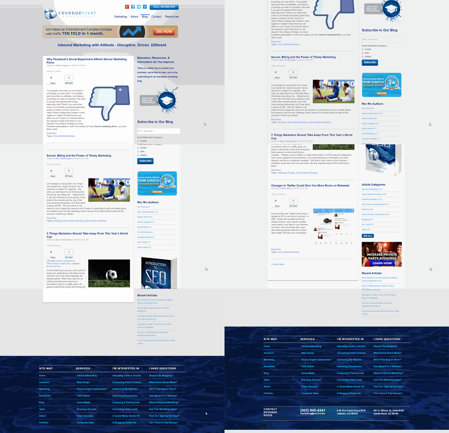
As an inbound marketing company that specializes in creating custom, beautiful websites for our clients in HubSpot’s COS, we were embarrassed when we looked at our blog compared to the designs we had implemented for others.
When we looked at the old design, all we saw was:
- An outdated, generic layout that didn’t match the quality of content that we were posting on it
- Too much of a focus on CTA’s in the right column instead of promoting what the reader wanted- more blog articles
- Poor blog subscription rates
- Authors with no identity
- An inability to feature relevant and timely articles
A few months ago, we decided that enough was enough. We were going to redesign our blog with major goals in mind. We were looking to create a new layout that:
- Was visually appealing
- Laid articles out with better title and image balance
- Was easy to navigate by date, topic or author
- Promoted offers in a smarter way
- Attracted new subscribers
- Interacted with readers to gather feedback on articles
The end result? A brand new blog that has been proven to knock socks clean off!
The Details
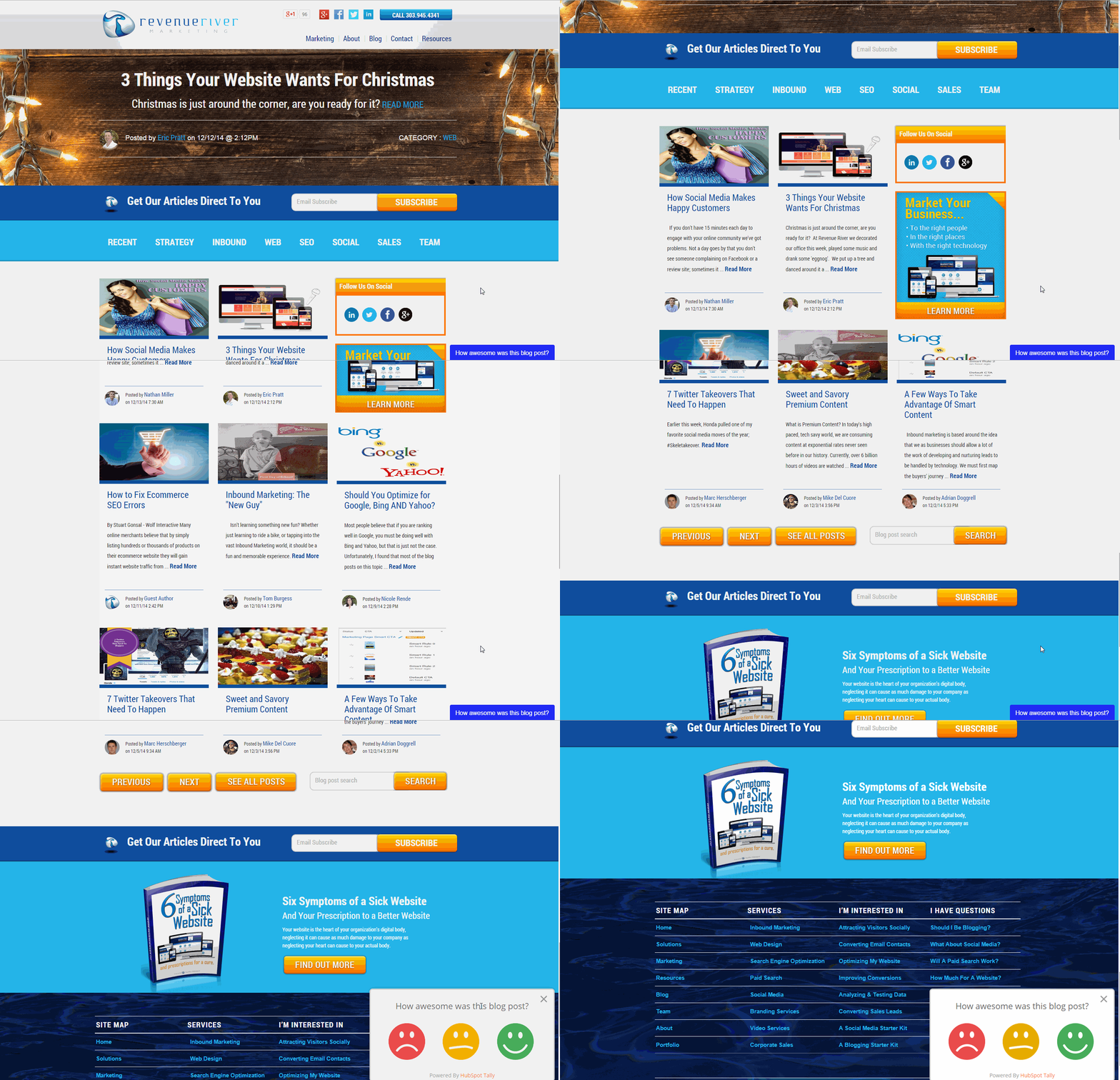
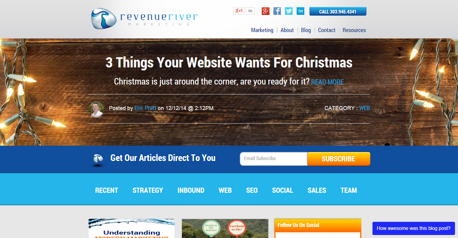
1) A visually appealing banner area that promotes new and popular articles
We wanted to make sure that when readers landed on our blog’s listing page that they were given the opportunity to not only read the most recent blogs but also some of our most popular or influential posts.
In keeping with our website’s overall design with visually appealing banner areas at the top of pages, we implemented high resolution images to help promote blog articles of our choosing.
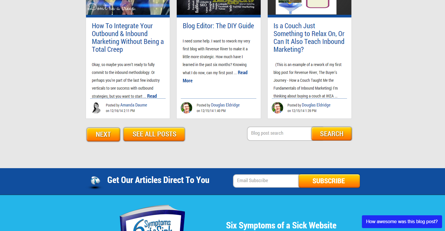
2) Multiple conversion opportunities for blog subscriptions at both the top and bottom of the page
Our old blog had one form on the sidebar that fought for the reader’s attention with CTA’s and topic listings. Now it boldly calls out the viewers with a custom module, form and button both at the top and bottom of the page, providing multiple opportunities for subscriptions both before and after articles are read.
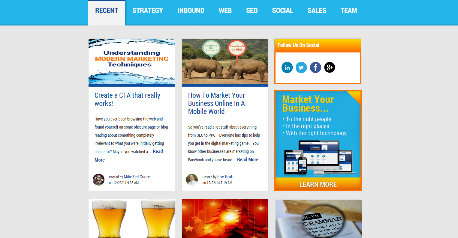
3) An easy-to-navigate submenu of blog topics
Through customer surveys and internal research, we realized that different readers came to our blog for different topics and our old blog did a poor job of showcasing all of them.
We created a submenu of all of the topics we write about as a company and placed it higher up on the screen, allowing our different readers to quickly find articles that are in their favorite categories. Want to learn about SEO? There’s an easy to find tab for that. Want to get the latest skinny on social media? Oh yeah, it’s right there!
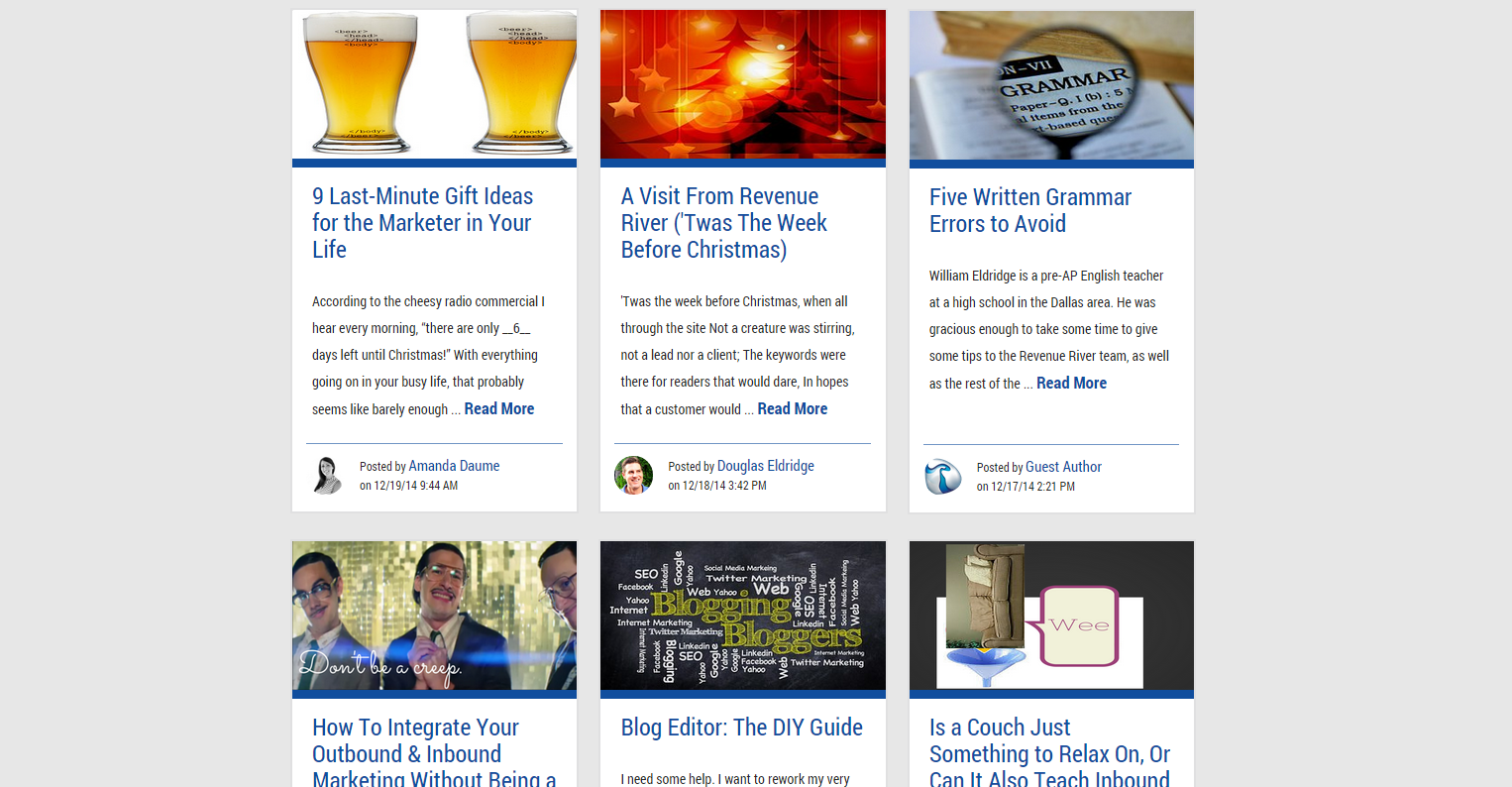
4) Vertical tiled article previews replacing the horizontal listing blocks from before
On our old blog, it was sometimes difficult to tell where one blog preview ended and another began. This disorganization and overall generic list styling led to high bounce rates as visitors were unable to quickly scan our recent posts to find what they wanted.
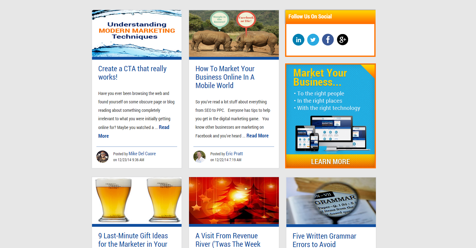
In order to create more space between each post and lay them out in a way that catches the eyes of our visitors, we decided to create tiled previews. Now people can quickly browse our uniform listings to find exactly what their looking for without spraining their fingers continuously scrolling down.
5) Featured offers blended seamlessly alongside the titles and at the bottom of the page
We had at least a half dozen CTA’s throughout our old blog’s listing page, and very few of them received clicks. We decided that in order to better provide the user experience our readers were looking for, we would minimize the amount of offer promotion on the main page and let the articles and the CTA’s at the bottom of each one do the talking.
If people were looking to download an offer, they would what they were looking for at the bottom of an article they found interesting or they would go to our resources page.
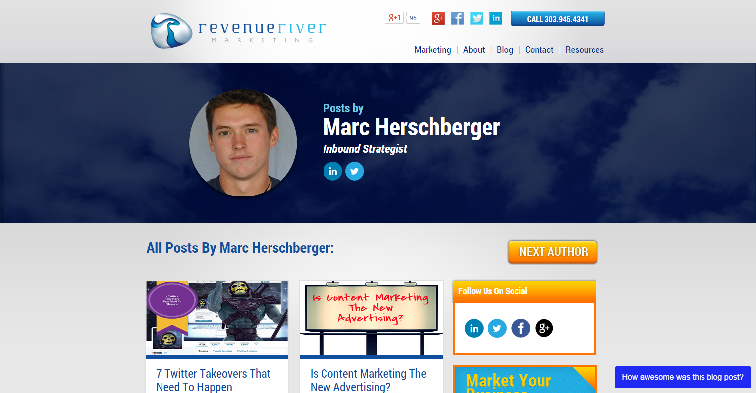
6) Updated blog author pages
Revenue River is only as successful as the people who make up the team. That’s why we put an emphasis on blog authors by promoting their photos on each article and giving them a custom blog author page that promotes only their articles in both tile and listing fashion.
The end result? A more credible team profile of writers who are proud to have their faces and content up on our blog!
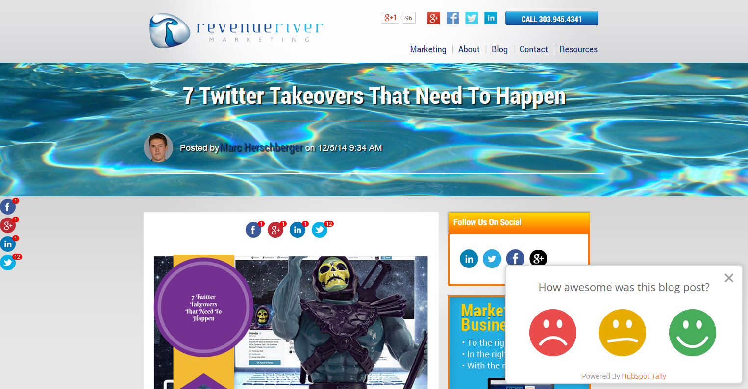
7) Implementation of HubSpot Tally to record reader satisfaction
It’s hard to make a change without feedback and direction from your users. That’s why we jumped at the chance to implement HubSpot’s Tally tool on our old blog so that we could put our ear to the ground when it came to our blog’s design, content and usability.
A number of the above changes came from comments we received both from our user experience research and notes provided within Tally. Now that we have our new design up and running, we’re still collecting feedback so that we can continue to improve our blog’s experience as we grow.
The Results
- 87% increase in blog listing page views
- 129% increase in blog subscriptions
- Resoundingly positive feedback from readers and clients both on design and usability
There you have it! Our new blog has only been live for about 2 months at the time of this article’s publication, but we have already seen major improvements in nearly every category we set out to effect.
Have any questions about our blog and how we implemented it? Give us a shout at marketing@revriv.com or find us on Twitter!
Want to see if the HubSpot COS can transform your blog into something beautiful like it did for ours? Find out more about the product and how the right team of experts can help you realize the modern blog and website you’ve always envisioned.
![]()


