 I’ve heard it before. You’ve heard it before. Heck, I’ve even said it before:
Marketing isn’t arts and crafts.
In today’s data-driven, closed-loop world where we track, measure, and analyze every little detail, the phrase above seems to make a lot of sense. To be effective marketers, we need to put childish things aside.
We can’t simply create super-cool content and other marketing materials for the sheer fun of it; we need to create with a purpose. And we need to be able to tie whatever we create to something quantifiable.
Ultimately, the modern marketing department is focused on hitting specific, number-oriented goals: X many leads. X many sales-qualified leads. X% lead-to-customer conversion rate.
There’s seemingly nothing aesthetic or artistic or “arts-n’-craftsy” about it.
But, in fact, there is.
The Art of Marketing
We can use the science-side of marketing to figure out who we should create content for, as well as to figure out what that content should be. Through A/B testing and optimizing, we can even figure out when the best times are to share our content with people via social media and email. And, of course, using analytics software, we can determine if the content we create ends up delivering on our underlying why, or goal (e.g. lead generation, lead conversion, etc.).
There’s only one piece missing from this marketing puzzle, and I assure you, it’s a crucial one: the how.
How do marketers actually create all that content? How do they organize the information? How do they decide on font sizes and color schemes? How do they figure out what to put in the cover image or other promotional images? How do they decide when (or when not to) use gradients or drop shadows or 3D bevel effects?
This, my friends, is where art comes into play. While science can inform us at every step along the way, it can’t actually do the work for us. At some point, we need to roll up our sleeves and create something.
At some point, we need to do some arts and crafts.
So I implore you, for the sake of your mental health, to take off your data geek/growth hacker hat for just a little while so you can explore some of the “arts-n’-craftsy” marketing projects below.
1) Create an Animated GIF
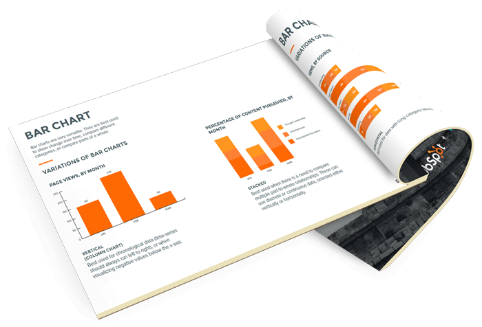
There’s something very satisfying about seeing an original animated GIF come to life. Not gonna lie, I was pretty pumped when I got this bad boy (see below) cranking for the first time to help promote a new guide, How to Optimize Your Marketing Channels.
Whether you’re looking to spice up an email, blog post, or site page, an animated GIF is a great way to create some visual excitement without having to bust out the video camera and editing software.
Ready to start designing your very own animated GIF? There are a few different tools you can use, but I recommend going the Photoshop route. It gives you a ton of control (e.g. you can set how long each frame should be shown for) and — best of all — we have this blog post that walks you through the entire process.
2) Redesign Your LinkedIn Banner Image
Trying to attract top talent to your marketing team? Having a super-spiffy banner image for your company’s LinkedIn page can only help.
While there’s no silver bullet for ensuring your LinkedIn banner image will stand out from the crowd, there are plenty of companies doing a great job that you can draw inspiration from. Just check out the SlideShare presentation below:
Side note: If you feel like your company’s entire LinkedIn profile could use a refresh, check out A Visual Guide to Creating the Perfect LinkedIn Company Page.
3) Spruce Up Your Other Social Media Cover Photos
LinkedIn isn’t the only social network where you can let your creativity run wild. Your Facebook, Twitter, Google+, and YouTube cover photos could all benefit from a design makeover.
One of my favorite cover photo strategies is to align your cover photo with your profile picture so the two seem part of the same overall image. (My colleague Ginny refers to this as the “Profile Picture and Cover Photo Combo.”) Here’s an example:
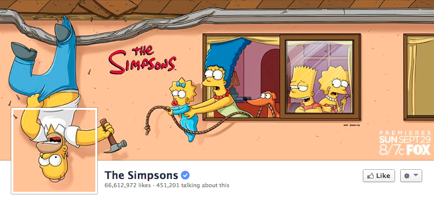
Need help figuring out the sizing for all of the different social media cover photos out there? We’ve got you covered. Click here to download these free, pre-sized social media image templates.
4) Add Matching Backgrounds to Employee Headshots
The secret to this project is learning how to remove the background from a photo. Once you’ve mastered that process, the rest is a walk in the park.
And while Photoshop is perhaps the best tool for the job, the simplest tool for the job is PowerPoint.
Once you get comfortable removing existing backgrounds from employee headshots, start dragging and dropping those headshots onto some new, snazzy backgrounds. Here are some examples below that I created using photos of my colleague Tyler (left) and his cat, Big Jim (right).

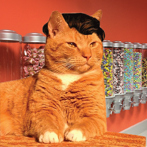

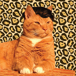


Once you’ve had some practice removing and changing backgrounds, you can experiment with using shadows, glowing edges, and other effects for making your headshots stand out a bit more.
Full disclosure: I created the images above in Photoshop and used a feathering effect to soften the edges around Tyer and Big Jim — but you could get similar results with PowerPoint. For a more advanced look at removing backgrounds, check out this Photoshop tutorial from Adobe.
5) Visualize Some Data
Know what’s incredibly boring? Staring at a bunch of numbers on a screen.
Know what’s NOT incredibly boring? Staring a picture of a cat — with a beautiful head of hair — in outer space!
You can think of data visualization as the middle ground between numbers on a screen and cats in space. Whether you’re creating a full-blown infographic or a simple pie chart, the goal with data visualization is to present your data in a way that is both easy to understand and visually exciting.
As co-founder & CCO of Visage, Ross Crooks, noted in a recent blog post, “By visualizing information, our brains can synthesize and retain content more effectively, increasing its impact. But if data isn’t properly visualized, it can do more damage than good.”
Need help bringing your first data visualization to life? Download our free guide, Data Visualization 101: How to Design Charts & Graphs.
6) Draw Some Groovy Designs on the Company Beer Taps
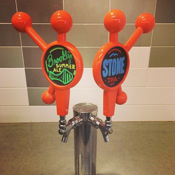
Don’t have company beer taps? Not to worry. Just pick up a six-pack from the store and draw on the walls of your office!
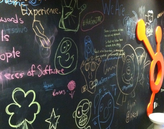
Nope, wait, don’t do that. But DO take a few seconds out of your day to leave a fun/funny/inspiring doodle on a whiteboard, chalkboard, or sticky note. The only real goal here is to spread some cheer (and culture) throughout the office.
It might sound dumb, but trust me: It’s nice to walk around and see evidence that actual living, breathing, thinking humans inhabit the space you work in. For example, when I walk across the hall to grab a coffee, I’m greeted by THIS chalkboard doodle display, courtesy of some of HubSpot’s finest in-house artists.
Looking for more marketing inspiration? Our INBOUND conference is right around the corner!
![]()


