
They say the best things often come in small packages. Think about it: jewelry, Snapchats, books, the keys to a brand new car … all of these things support this notion.
And with our attention spans shrinking below that of a goldfish, it should come as no surprise that we’re beginning to crave more focused content at a smaller scale, too.
Enter the rise of microsites. Unlike regular websites, microsites tend to be rather simplistic and easier to navigate. This isn’t to say they won’t make you want to poke around for a while, though. In fact, the really great ones do just that.

Download our full collection of website design examples here.
Ready to see a few use cases? Check out the list below for some great examples of microsites in action.
Note: There is profanity in example seven, so scroll on by if that’s not your cup of tea.
What Is a Microsite?
A microsite is an individual web page or small cluster of web pages that act as a separate entity for a brand. A microsite typically lives on its own domain, but some exist as a subdomain.


Microsites can be used to help brands achieve a number of things. For example, some companies have used them to highlight a specific campaign or target specific buyer personas. Others have used them to tell a short story, or to inspire a specific call-to-action.
11 Examples of Ingenious Microsites
1) YearInMusic.Spotify.com | Spotify
Aside from serving as a painful reminder of how many Justin Bieber song I listened to on repeat last year, Spotify’s Year in Music has proven to be one of the most well executed microsites we’ve ever seen.

Commonly referred to a “celebration” of the music that carried us through the year prior, Spotify’s interactive site is personalized especially for you, based on your listening habits.
What exactly does that mean? Well, the tool makes it easy for you to create a personalized recap that incorporates details such as your first played song, top artists by season, and how much time you spent listening. The experience is unique to the user, making it fun for them to share and compare their synopsis with their friends.
And when it comes to sharing, the microsite makes it really easy. Every stat that the site pulls for you can be shared on social media thanks to a handy button at the bottom right of the screen.
2) DangersOfFracking.com | Linda Dong
In an effort to gain support for the FRAC Act (Fracturing Responsibility and Awareness of Chemicals Act), Interaction and Industrial Designer Linda Dong designed a beautiful microsite that uses parallax design to tell the story about the dangers of hydraulic fracturing.
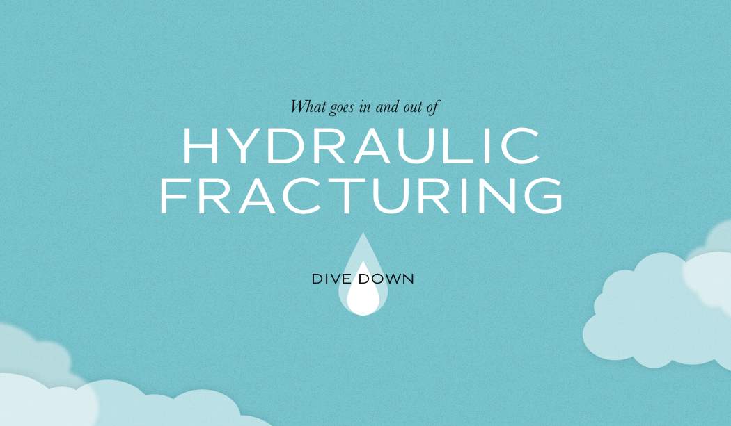
The story starts with a water droplet falling from a cloud, and as you scroll down through the site, you follow the water droplet as it’s taken from truck to fracturing site, turned into tracking fluid, and sent down a gas well into the ground. Along the way, you encounter floating facts and statistics about the dangers of fracking until you encounter two simple calls-to-action at the very end: “Contact your local officials” and “Join or support your local organization.”
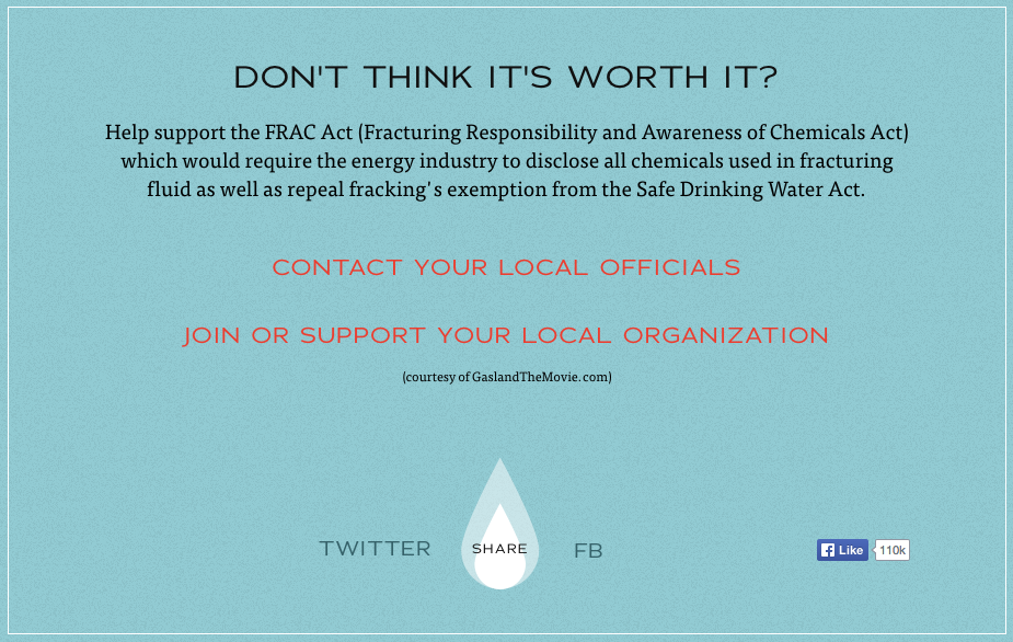
Microsites like this one are heavily focused on using directional cues (in this case, the parallax movement) to drive users to complete a certain call-to-action — so any other distraction or navigation bar is removed entirely.
If your microsite focuses on one or two calls-to-action, make sure they are concise and actionable like this one is, and that you set them apart visually from the rest of the site by making the font color pop or putting the copy in a button.
3) UrWhatUPost.com | Bolthouse Farms
“Why should junk food get all the glory?”
You’re asked this question when you first arrive to BoltHouse Farms’ microsite, UrWhatUPost.com. BoltHouse Farms created the site to show people how many social media conversations were happening about healthy foods versus unhealthy foods. To do this, they collected #UrWhatUPost hashtags and tracked the kinds of foods we share on social media, then pit the healthy stuff, like #grapes, against the unhealthy stuff, like #icecream. The goal of the website is aligned with their overall company mission: To change the way people think (and post) about healthy food.
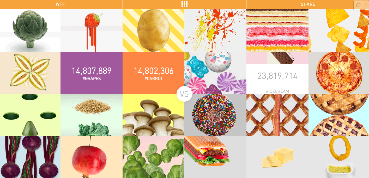
Bolthouse Farms proves microsites don’t have to be minimalist. The pages on the site are colorful and animated, with words and moving numbers turning into dangling carrots and swinging pomegranates. Click on a food item and magic happens — every food item is different. Click on a pomegranate and you can “hit” it with your clicker like a piñata. Click on a melon and you’re taken to a “melon meditation” page, kind of akin to the iTunes Visualizer.
4) Dominosdxp.com | Domino’s Pizza
Last year, Domino’s announced their new Chevy Spark pizza delivery cars, known as DXPs. The cars were purposefully re-engineered for pizza delivery, and as a result, they boast a ton of awesome features — like an oven where the left door should be, space for up to 80 pizzas, custom storage for sauces and drinks.
To show off this awesomeness, they recently launched a dedicated microsite detailing all things DXP.

The site is heavily interactive website enables visitors to zoom in each of the features to gain a better understanding of the purpose and level of thought that went into each addition. The entire site is also skillfully animated, making it really interesting to learn about each feature.
If nothing else, this is a great example of how to take a fairly complex product or idea and promote and explain it in a way that’s both fun and easily digestible. But don’t just take our word for it … visit the website to explore for yourself.
5) EmojiTracker.com | Matthew Rothenberg
There is no “point” to emojitracker.com — it was created by Matthew Rothenberg, former Head of Product at Flickr and Bitly, as an experiment in real-time tracking of all emojis used on Twitter.
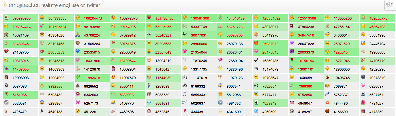
The only calls-to-action on the site are the tweet and follow buttons at the very bottom. Otherwise, it’s just for pure interest. With no navigation bar or way to get to another site, it might actually be confusing to some people.
Technically, it breaks the rules of good user interface design, but it goes to show that microsites don’t need to have complicated designs. Keep it simple to keep people on the page without taking up too much of their time.
6) Fu2016.com | House of Cards
Step aside, Donald Trump. There’s a new presidential candidate taking the internet by storm with this impressive, interactive microsite.
If you’re not familiar with the Netflix series “House of Cards,” the program follows a man named Francis Underwood, a ruthless politician with a hidden agenda. As the series enters season four, they’re promoted the premiere with a clever microsite that pokes fun at politics. Talk about perfect timing, amirite?

The microsite invites visitors to join Underwood’s movement and rally support for “important” issues such as inequality, dishonesty, and entitlement. But jokes aside, what we love most about this microsite is the design. In fact, you could easily argue that the site functions better than those of actual presidential candidates. From Underwoods attention-grabbing, shifty eyes (visit the website to see for yourself) to the high-quality videos, the microsite draws you in and provides good reasons for you to stick around and engage with the content.

7) WhatTheF*ckShouldIMakeForDinner.com | Zach Golden
Don’t have a big budget? Take a hint from Zach Golden, author of What The F*ck Should I Make For Dinner?, who created a microsite to promote the book.

Earmuffs, kids.
The site has a very simple layout: A rotating “purpose of the recipe” line, a rotating recipe from the book, and three links that let you kind of “choose your own journey.” It has a black-and-white, minimalist theme; uses all caps; and places a small call-to-action in the corner that promotes his book. That’s it.
Media company Digiday took a cue from Golden and used his microsite template to conduct an experiment of their own. They created the microsite WhatTheF*ckIsMyTwitterBio.com — with zero media budget — to see if the content would go viral and help build their brand.
“Thanks to the open-source WTFEngine by Justin Windle, some cheap Web hosting and a $12 domain registration, WhatTheF*ckIsMyTwitterBio.com was up and running in under two hours,” reads Digiday’s press release. “Step two was populating the site with content, which took [two hours].”

Their biggest takeaway? That good copy works. “We didn’t spend a dime promoting the site, and it reached nearly 100,000 unique users ‘organically.'”
8) ElfYourself.com | OfficeMax
You didn’t think I could write a blog post about microsites and not include ElfYourself, did you? Of course not. The screenshot below shows what the website looks like right now, but come the holiday season, expect your inbox to be rife with ElfYourself animations again this year because ElfYourself isn’t going away.

What made the site so popular? Other than being hilarious, it’s also easily shareable, has a single call-to-action, and makes the users the stars.
“It brought the brand to life for consumers,” wrote Kenneth Hein in Forbes, “and for the business-to-business crowd it provided a human face for the big box retailer.”
In other words, Office Max used the microsite to be creative and let their freak flag fly, and it worked like a charm. They focused the campaign on the consumers, not the brand — but the sales tie-in came at the end of the ElfYourself videos in the form of coupons and promos.
9) TasteTheFeeling.Coca-Cola.com | Coca-Cola
Let’s face it: We all love GIFs. And the folks at Coca-Cola have tapped into this inevitable admiration by creating a immersive online experience in the shape of the “Taste the Feeling” microsite.

Here’s how it works: When users land on the page, they’re met with a two-minute music video set to the sounds of a custom campaign anthem from Avicii and Conrad Sewell. The video is made up of looping, three-second GIFs that depict the many emotions felt by Coca-Cola drinkers. As you watch, you can select an emotion by clicking on one of the 32 emotion-based icons, or enter your own emotion to pull up a corresponding GIF.
All of the GIFs are easily sharable on social media, which serves as a great way to draw people back to the site to engage with the content.
This microsite also serves as a great example for those interested in globalizing their campaign assets, as it’s available in more than 20 different languages.
10) Inside.Chanel.com | Chanel
Inside Chanel is a microsite that “works to inform consumers about the house’s history and heritage through video and multimedia content,” according to Luxury Daily. The site houses a ton of short, social videos that chronicle the people, places, things, and events that have contributed to continued success of this iconic fashion brand.
The purpose? “The strategy behind this microsite is to create some accessibility of Chanel’s history, but more importantly, their success throughout the years,” explains Dalia Strum, president of Dalia Inc.

We love their video-centric approach to visual storytelling. Each of the videos aims to pull back the curtain and give visitors an exclusive look at behind the scenes photos and stories, as they pertain to different aspects of the brand — color, couture, and so on.
It’s important to note that this site isn’t Chanel’s first stab at microsite creation. In fact, the brand has experimented with multiple microsite formats, including the editorial-style site Chanel News:

11) BurgerBff.com | Mellow Mushroom
This microsite from the folks at Mellow Mushroom — a pizzeria franchise established in Atlanta, Georgia — was created to support their recent “Burger BFF” campaign. The campaign was launched to create buzz for their new menu items: Herb (a vegetarian burger) and Carnie (a beef burger).
The menu items have been adapted into cartoon BFFs for the sake of the campaign … and the result is pretty lovable.

Mellow Mushroom uses the microsite as a way to promote a contest for a chance to win a round trip to Denver or Seattle with their bestie. And it does so in a number of really fun and interesting ways. For example, one section of the site invites visitors to use the hashtag #BurgerBFF to enter the contest and show off their best burger shots on Instagram:

But that’s not all: The site also offers visitors several other engaging, interactive ways to enter the contest, including quizzes and a Mad Libs-style storytelling generator.
Which memorable microsites have you come across? Share them with us in the comments below.
Editor’s Note: This post was originally published in August 2014 and has been updated and for freshness, accuracy, and comprehensiveness.

![]()

