
We’ve all heard how important it is to make a good first impression. Show up late for a job interview? That’s a bad first impression. Eat a ton of garlic and forget to brush your teeth right before a first date? Also a bad first impression. Go to meet your significant others’ parents for the first time dressed in Crocs and sweatpants? That might also result in a bad first impression (depending on prevailing fashion sensibilities).
It turns out that the “make a good first impression” principle holds true not only in face-to-face encounters, but in email interactions as well.
When you send off a welcome email to a new blog or newsletter subscriber, or to a new customer, you’re making a first impression on behalf of your brand.
To help ensure you’re making the best first impression possible, we’ve rounded up some examples of standout welcome emails from brands big and small. As you’ll soon discover, each example showcases different tactics and strategies for engaging new email subscribers. Let’s dive in …
7 Examples of Standout Welcome Emails
1) Kate Spade
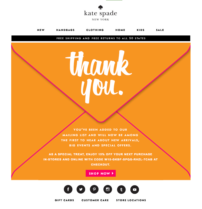
Let’s face it: We, the internet-using public, are constantly bombarded with prompts to sign up for and subscribe to all sorts of email communications. So as a brand, when someone takes the time to sift through all the chaos in order to intentionally sign up for your email communications, it’s a big deal.
In order to acknowledge how grateful they are to the folks who actually take the time to subscribe, Kate Spade uses a simple — but effective — tactic with their welcome emails: They say “Thank You” in big, bold lettering. And by placing that “Thank You” on an envelope, Kate Spade recreates the feeling of receiving an actual thank-you letter in the mail. (The 15% off discount code doesn’t hurt either.)
2) Virgin America
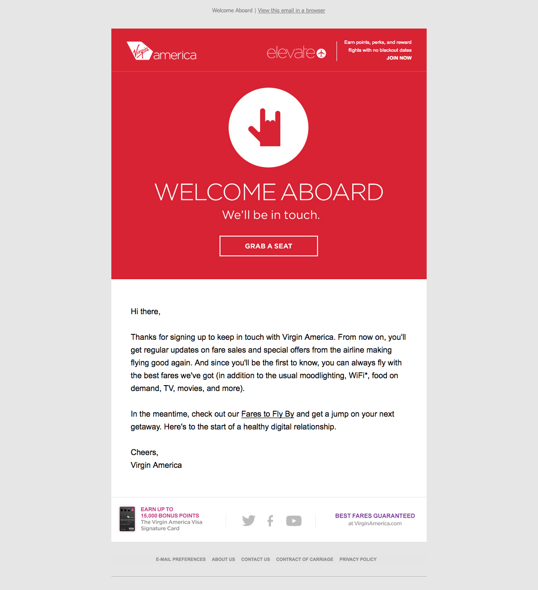
A welcome email is the perfect medium for introducing folks to the characteristics (and eccentricities) that make your brand unique.
For Virgin America, that means putting the “sign of the horns” hand gesture, which loosely translates to “Rock and roll!”, front and center. The playful accompanying copy, “Welcome aboard,” and casual call-to-action, “Grab a seat,” also help to position Virgin America as a hip, fun-loving brand right off the bat.
3) Michaels

The Michaels approach to the welcome email borrows elements from both Kate Spade and Virgin America. In addition to expressing gratitude to the folks who took the time to sign up, Michaels uses their welcome email to showcase their brand. And they do a great job: the lengthy email feels like one big arts and crafts project, complete with paint, yarn, and chalkboards.
Another standout feature of this welcome email is that Michaels makes it immediately clear what value their future email communications are going to provide. After thanking subscribers, there’s this nice bit of copy that sums it up: “We’re going to send fun stuff like DIY tips and tricks, invites to in-store events, and exclusive deals and coupons.”
4) InVision

When you sign up for InVision’s free prototyping app, their welcome email makes it very clear what your next step should be: using the app.
To facilitate this action, InVision’s welcome email doesn’t simply list out what you need to do in order to get started. Instead, it shows you what you need to do with a series of quick videos. Given the visual, interactive nature of the product, this makes a lot of sense.
5) Food52
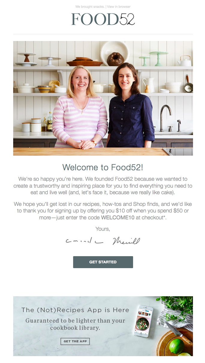
Sometimes the tiniest of elements in a welcome email can speak volumes about a brand. And when it comes to Food52’s welcome email, their preview text at the top of the email, “We brought snacks,” definitely accomplishes this.
Also known as a preheader or snippet text, preview text is the copy that gets pulled in from the body of an email and displayed next to (or beneath) the subject line in someone’s inbox. So when you see Food52’s welcome email in your inbox, you get a taste of their brand’s personality before you even open it.

Food52’s welcome email also does a good job of building trust by putting a face (make that two faces) to their name. As soon as you open the email, you see a photograph of — and welcome message from — the company’s founders.
6) IKEA
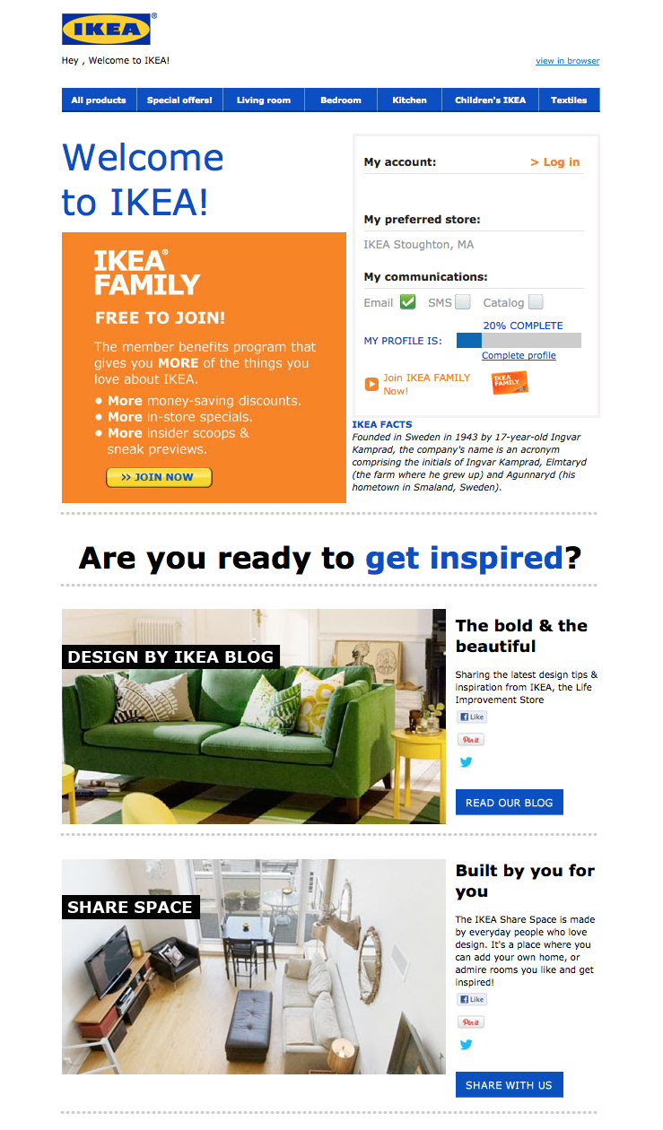
It might not be the most beautifully designed email on this list, but that doesn’t mean IKEA’s welcome email isn’t effective.
Instead of going for the hard sell (e.g., “By stuff now!”), or explaining what it is they do (which is something IKEA probably assumes most people already know), IKEA uses its welcome email to turn folks onto its other, lesser-known programs and content channels. For example, there’s a call-to-action right at the top that explains the value of its member benefits program. There are also prompts to visit their design blog and to contribute to their collaborative “Share Space” site.
Of course, if you’re not interested in any of that stuff, IKEA’s welcome email also makes it easy for you to simply log in and start shopping (there’s a login field right up top).
7) Drift
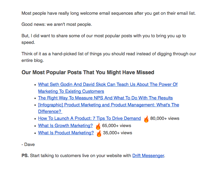
No fancy design work. No videos. No photos. The welcome email Drift sends out after signing up for their newsletter is a lesson in minimalism.
The email opens with a bit of candid commentary on the state of email. “Most people have really long welcome email sequences after you get on their email list,” Dave from Drift writes, before continuing: “Good news: we aren’t most people.” What follows is simply a bulleted list of the company’s most popular blog posts. And the only mention of the product comes in a brief post-script at the very end.
If you’re trying to craft a welcome email that’s non-interruptive, and that’s laser-focused on adding value vs. fluff, this is a great example to follow.
Know of any other standout examples of welcome emails? Share them in the comments section below!


