 Raise your hand if you are maniacal about monitoring your blog traffic.
Is your hand raised? Mine is, too. I check out our traffic every day, sometimes multiple times a day. Most of the time, it’s great to be so in-the-weeds — if I notice a sudden dip, I can quickly react.
Other times, it’s much more helpful to zoom out. With a bird’s eye view, you can see patterns that are really important, like how fast your blog has been growing. Depending on that answer, you can better staff your team, fight for budget, and allocate resources.
One way to figure out how fast you’re growing is to run a regression analysis on your monthly traffic. (Even if you haven’t had a math class in years, I promise it’ll be fairly painless.) In this post, we’ll explain what a regression analysis is and how to figure out what a regression analysis is telling you. (Though the example we use is for blog growth specifically, you can run a regression analysis on many of the metrics you have in your business, too.)

What Is a Regression Analysis?
A regression analysis is used in statistics to figure out if there is a relationship, or “correlation,” between variables. You can use it for lots of things — from figuring out whether more rainfall correlates with more crop growth, to how your blog has grown over time.
As long as you have only one independent variable (ex: time), one dependent variable (ex: blog traffic), and a fairly large sample size, regression analyses can tell you a lot about your blog traffic growth.
To determine the relationship between two variables, we’ll find the best-fitting line for a set of data. This best-fitting line represents the general direction in which the data is going. To understand how fast your traffic is growing, you need to know the components of a regression analysis.


The Anatomy of a Regression Analysis
There are three different things you need to know about a regression to analyze it properly. Here’s what one looks like for reference:
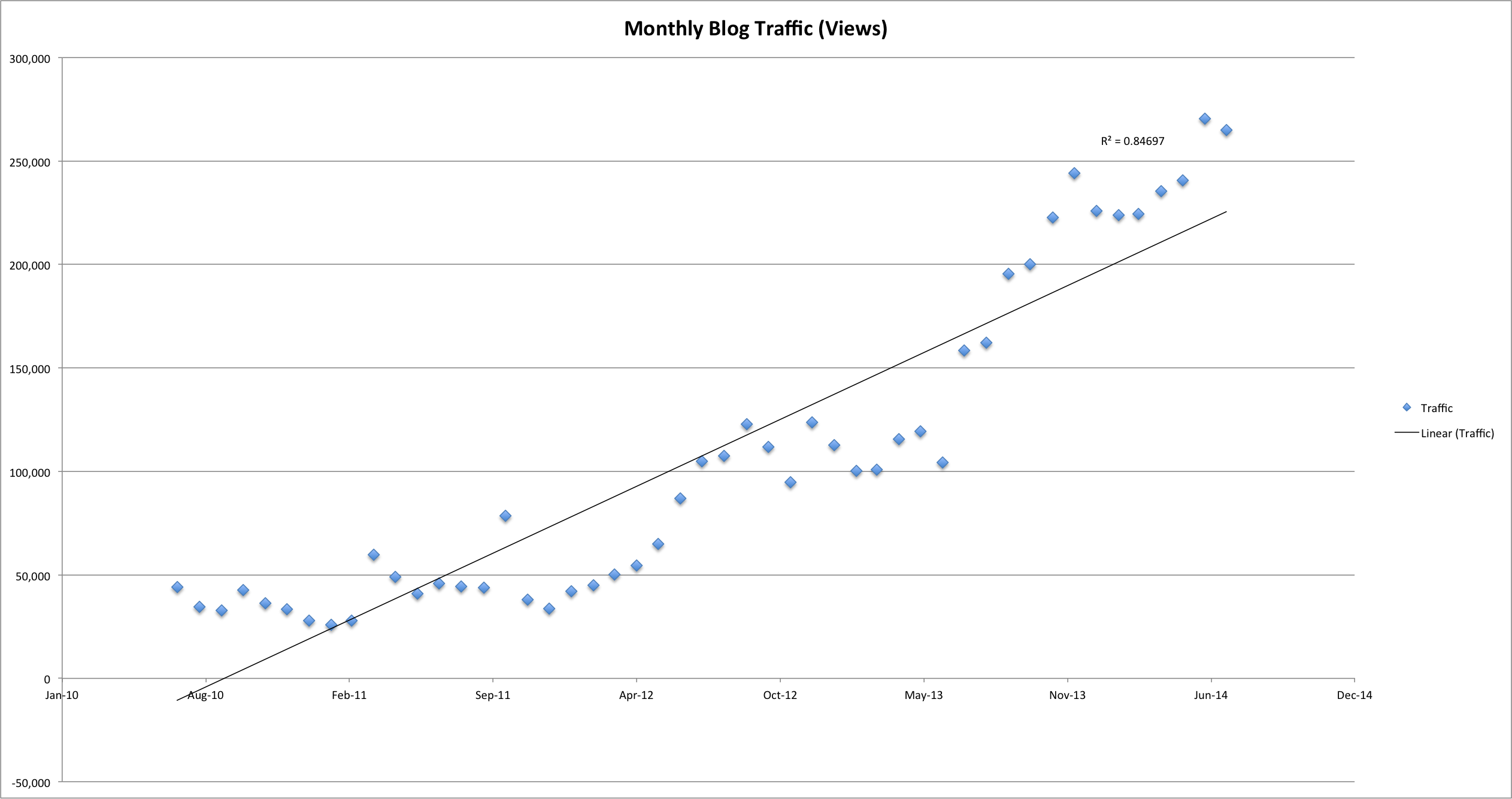
1) Scatter plot
To run a regression analysis, first we need to plot our data points — and the best way to display the data is through a scatter plot. The X-axis is the independent variable, and the Y-axis is the dependent variable.
2) Best-fit line
We’ve already covered what a best-fit line actually means, but you should also know which types of lines you should look for. There are three major types of lines you should investigate:
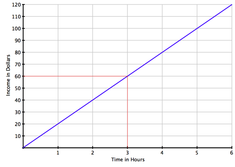
Linear
This is a straight line — it means you’re growing steadily. You’re progressing at the same rate over time. Here’s what that line looks like:
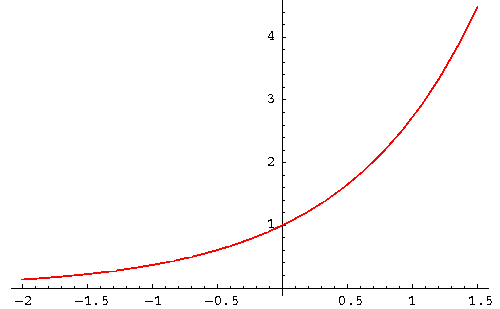
Exponential
This is a line that curves upward very quickly and doesn’t flatten out — you’re progressing at a faster and faster rate over time. Here’s what that line looks like:
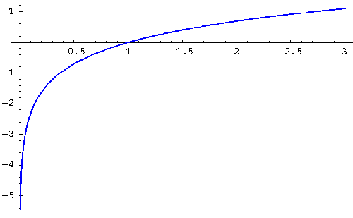
Logarithmic
This is a curved line that flattens over time — basically, you’re progressing at a slower and slower rate over time, and potentially reaching a “ceiling” where you wouldn’t expect to grow much more. Here’s what that line looks like:
There are more types of lines than these, but these are the most important for you to know.
3) R2
This is a number between 0 and 1 that tells you how well the line fits the data set. The closer to 1, the better the line fits the data set — and to draw correlation conclusions from these graphs, you want to be fairly close to 1. So with an R2 of 0.98, you can say that 98% of the variance in Y is explained by the variance in X.
How to Calculate Your Blog Traffic Trends
To figure out how your traffic is trending, you basically need to run a regression analysis using each of the three lines mentioned above, and then compare their R2 values. The one with the highest R2 is the best fit for your data.
Warning: You may find that none of them have a high R2 or that the highest R2 isn’t actually that close to 1 — that means that your data doesn’t fit any of these lines exceptionally well. In those cases, you should gather more data and then re-run the regression analysis.
Here’s how you can run a regression analysis in Excel.
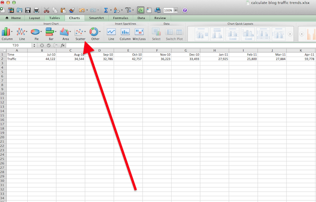
1) Export your monthly blog traffic into Excel.
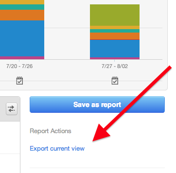
HubSpot customers, you can find this information in your Sources report — and make sure to select your blog subdomain from the top dropdown before exporting.
Once you get the export open in Excel, make sure to remove all other information besides the row for each month and the row for traffic. HubSpot customers, you can find all the information you need under the “Visits” tab.
2) Graph the data using a scatter plot.
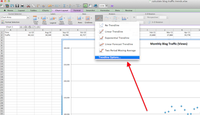
3) Next, in the top navigation, choose ‘Chart Layout’ > ‘Trendline’ > ‘Trendline Options.’
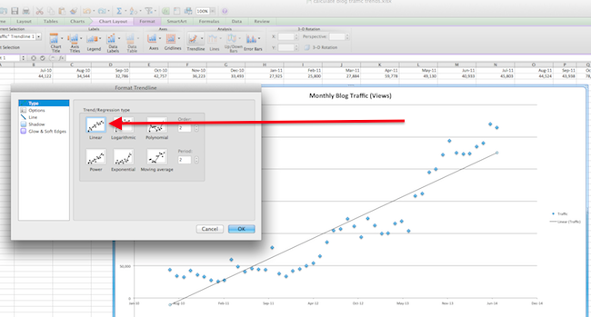
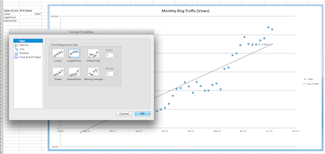
4) Under ‘Type’ select which line you’d like to test. We’ll use linear first.
5) Select ‘Options,’ then ‘Display R-squared value on Chart.’ R2 will appear next to your line. After you’re done, click OK.
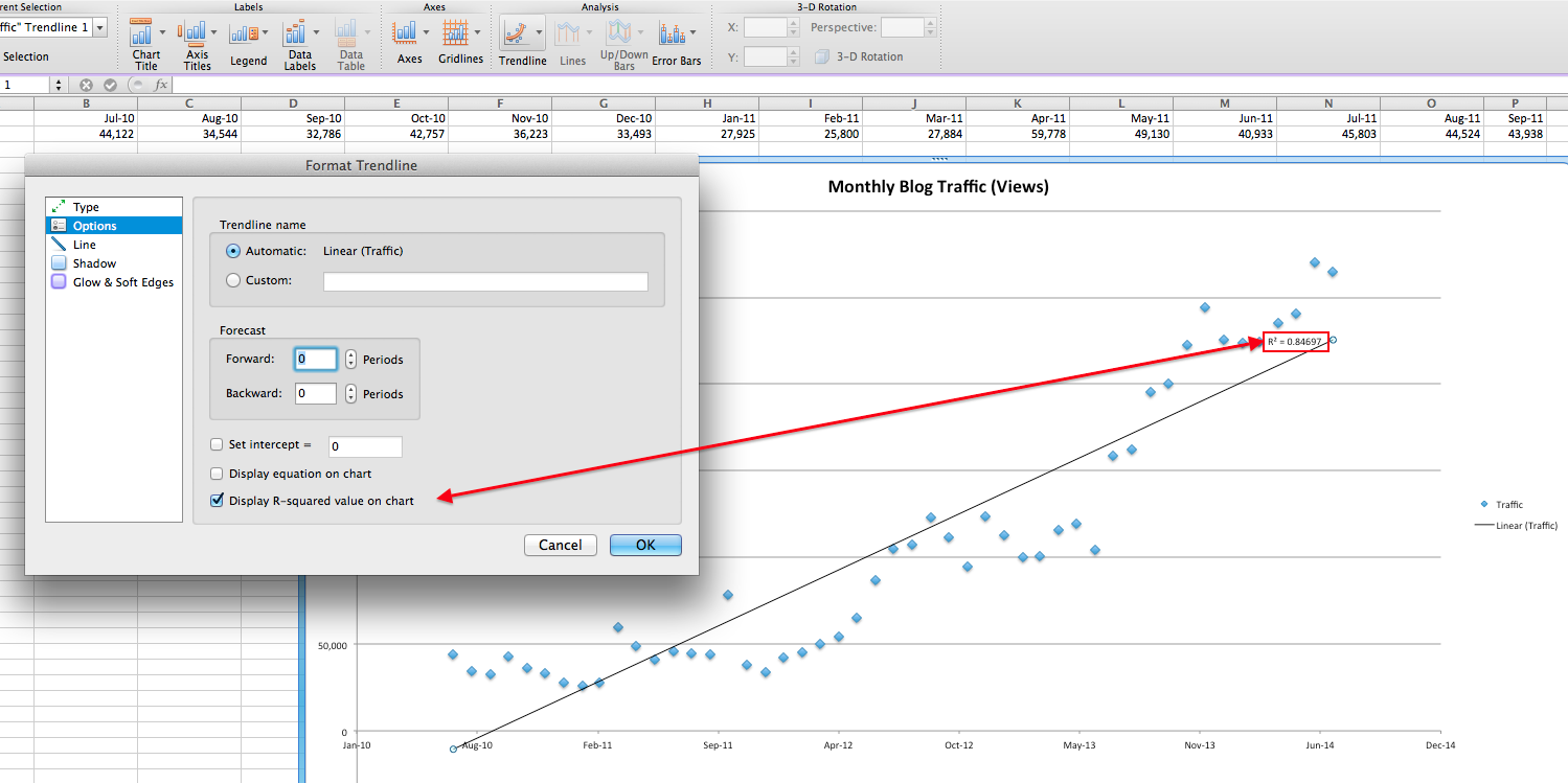
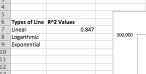
6) Record R2 in the cells to the left of your graph.
7) Click on the line, then hit “delete” on your keyboard.
8) Run steps 4-7 again for exponential and logarithmic lines.
9) Compare R2‘s — whichever is nearest to 1 is the best fit.
If you’re linear, you’re growing at a steady rate. If you’re exponential, you’re growing at an increasing rate. If you’re logarithmic, your growth is slowing.
It’s possible that none of them are a great fit — see the warning above for more information on this.
In this example, exponential is the best fit because it has the highest R2 at 0.896 and all are relatively close to 1. (Click to enlarge this image.) This means the exponential line is the best fit for your blog growth, and since it’s increasing exponentially, you have been growing quickly.

And that’s it folks! By now, you should have an idea of how fast your blog is growing. Remember, this is only an indication of your past growth. Anything can happen in the future to throw off your traffic.
Image credits: Math is Fun, SOS Math

![]()

