
Building charts and graphs is part of most people’s jobs — it’s one of the best ways to visualize data in a clear, easily digestible manner. But it’s no surprise that some people get a little bit intimidated by the prospect of poking around in Excel. I actually adore Excel, but I work in Marketing Operations, so it’s pretty much a requirement.
That’s why I thought I’d share a helpful video tutorial as well as some step-by-step instructions for anyone out there who cringes at the thought of organizing a spreadsheet full of data into a chart that actually, you know, means something. Here are the simple steps you need to build a chart or graph in Excel.
Click here to download our free tutorial about how to make charts and graphs in Excel — which also includes tutorials for performing other Excel functions like VLOOKUPs and pivot tables.
Video Tutorial: How to Create a Chart or Graph in Microsoft Excel
Editor’s note: Keep in mind there are many different versions of Excel, so what you see in the video above might not always match up exactly with what you’ll see in your version. We encourage you to follow along with the written instructions and demo data below (or download them as PDFs using the links below) so you can follow along.
Download Demo Data | Download Instructions (Mac) | Download Instructions (PC)
Step 1: Get your data into Excel.
First, you need to input your data into Excel. This is the easy part! You may have exported the data from elsewhere, like a piece of marketing software or a survey tool. Or maybe you’re inputting it manually.
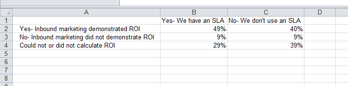
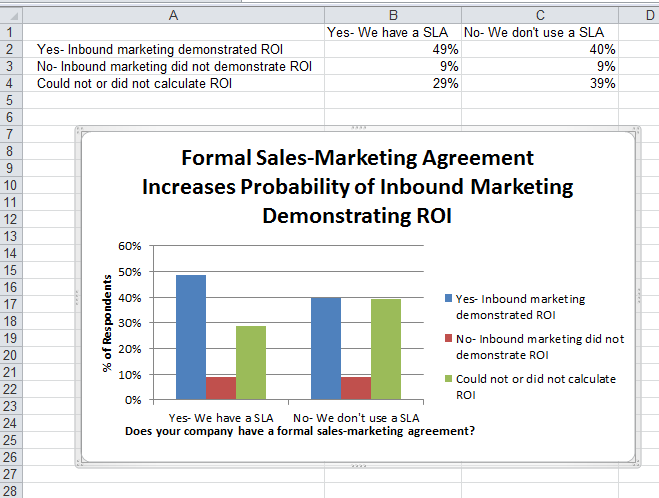
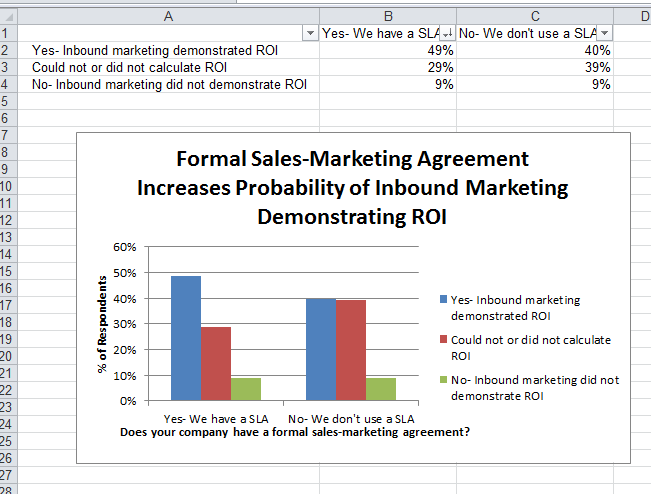
In the example below, in Column A, I have a list of responses to the question, “Did inbound marketing demonstrate ROI?”, and in Columns B,C, and D, I have the responses to the question, “Does your company have a formal sales-marketing agreement?” For example, Column C, Row 2 illustrates that 49% of people who have an SLA (service level agreement) also say that inbound marketing demonstrated ROI.


Step 2: Choose a type of chart/graph to create.
In Excel, you have plenty of choices for charts and graphs to create. (For help figuring out which type of chart/graph is best for visualizing your data, check out our free ebook, How to Use Data Visualization to Win Over Your Audience.)
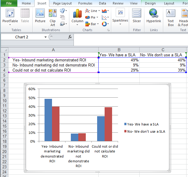
The data I’m working with will look best in a bar graph, so let’s pursue making that one. To make a bar graph, highlight the data and include the titles of the X and Y axis. Go to the ‘Insert’ tab, click ‘Charts,’ click ‘Column,’ and choose the graph you wish. In this example, I will be picking the first 2-D Column choice — just because I prefer it over the 3-D look.
Step 3: Switch axes, if necessary.
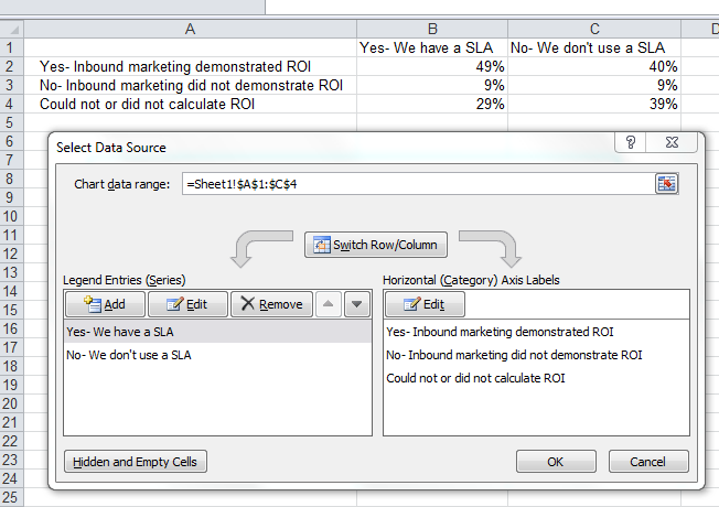
If you want to switch what appears on the X and Y axis, right click on the bar graph, click ‘Select Data,’ and click ‘Switch Row/Column.’
Step 4: Adjust your labels and legends, if desired.
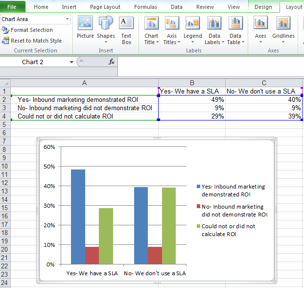
To change the layout of the labeling and legend, click on the bar graph, then click the ‘Layout’ tab. Here you can choose what layout you prefer for the chart title, axis titles, and legend.
In my example, I clicked on ‘Chart Title,’ and selected ‘Above Chart.’ To format the X axis title, I clicked on ‘Axis Titles,’ clicked ‘Primary Horizontal Axis Title,’ and clicked ‘Title Below Axis.’ To format the Y axis title, I clicked on ‘Axis Titles,’ clicked ‘Primary Vertical Axis Title,’ and chose ‘Rotated Title.’ To change the placement of the legend, click ‘Legend’ on the ‘Layout’ tab and choose your preferred location.
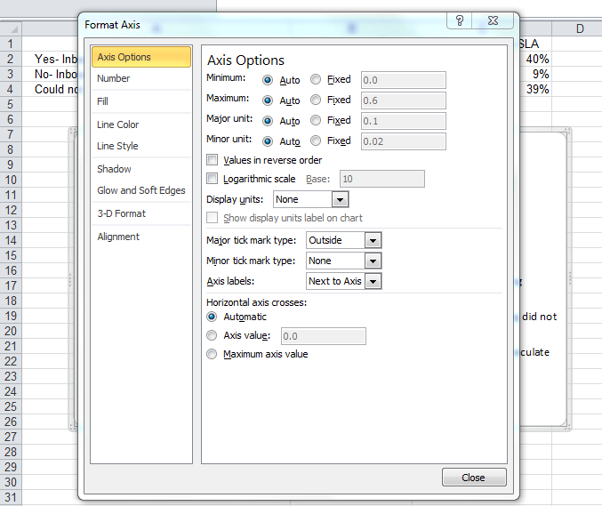
Step 5: Change the Y axis measurement options, if desired.
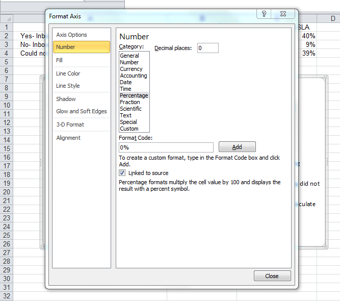
To change the type of measurement shown on the Y axis, right click on the Y axis percentages, and click ‘Format Axis.’ Here you can decide if you want to display units located on the Axis Options tab, or if you want to change whether the Y axis shows percentages to 2 decimal places or to 0 decimal places.
The resulting graph would be changed to look like this:
Step 6: Reorder data, if desired.
To sort the data so the software choices appear in descending popularity order, click on the column that is most important to you (in this case, I picked column B), click on the ‘Data’ tab, and click ‘Filter.’ Then go back to Column B, click the down arrow, and click ‘Sort Largest to Smallest.’
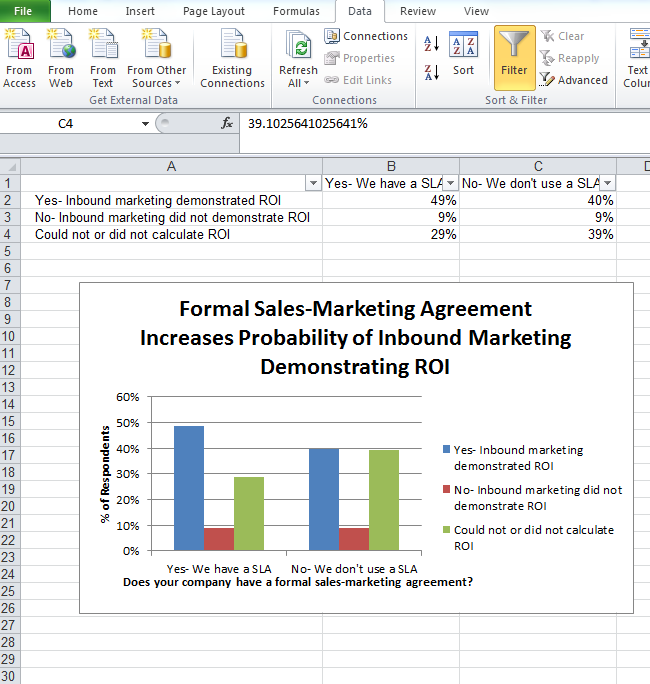
If you click on the downward arrows located at B1 and C1, you can choose to sort based on smallest to largest or largest to smallest, depending on your preference. Here, I sorted largest to smallest on B1.
Pretty easy, right? What other Excel functions have you always wanted help with? Check out some additional resources below for additional help using Excel and visualizing your data in smart ways.
Additional Resources for Using Excel and Visualizing Data:
- How to Build a Pivot Table in Excel [Video]
- How to Use the VLOOKUP Function in Excel [Video]
- Why Most People’s Charts and Graphs Look Like Crap [Blog Post]
- How to Use Data Visualization to Win Over Your Audience [Ebook]
Editor’s Note: This post was originally published in May 2013 and been updated for accuracy and comprehensiveness.

![]()

