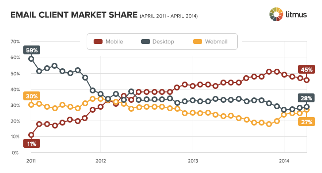
 Over the past few years, mobile email opens have seen explosive growth. While they are now holding steady around 45% of all email opens, three years ago, they accounted for only 11% of opens — which is a 309% increase since April 2011.
Not only are mobile opens growing, but they’re also cannibalizing desktop and webmail opens. Desktop opens have decreased 53% in the past three years and now represent 28% of opens. During the same period webmail opens decreased 10% and now account for 27% of opens.
This rise in mobile has left many brands and businesses wondering if they need to hop on the mobile train — and if they decide to do it, what they actually need to do to be “mobile optimized.” Keep on reading to figure out how to tailor your email marketing strategy for mobile audiences.
What Does Mobile Mean for Me?
When it comes to creating successful email marketing in general, it’s all about your audience. What type of content are they interested in? How often do they want your emails? Which email programs and devices do they use to read your emails?
When it comes to reacting to the increase in mobile email opens, the answer to this last question is key. However, MarketingSherpa found that only 31% of marketers know their mobile email open rate.
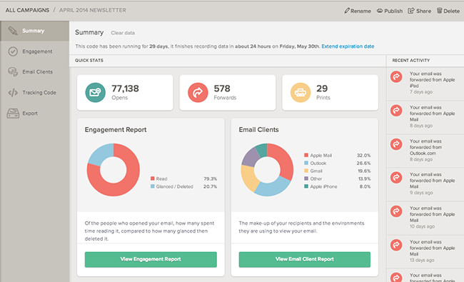
Since every audience is different, look into your analytics to see on which devices people are opening your emails. While some companies may see mobile open rates as high as 70%, others may see just as high Outlook opens. You should focus your testing and optimization efforts on the devices the majority of your subscribers are using to read your emails — and if that happens to be on mobile, so be it.
For example, Auto Trader discovered that an increasingly large percentage of their audience was opening on mobile. With that information in hand, they knew it was essential to make their emails mobile friendly. With the help of Chalk and Pixel, they completely revamped their emails to be responsive and have noticed a 391% increase in clickthrough rates since the redesign! By providing their subscribers with a better experience, Auto Trader has seen great results.
Designing for Your Subscribers’ Needs
Discovering where your audience is opening your emails enables you to design for your subscribers’ needs — it’s all about making their email experience as smooth as possible. Once you’ve determined which email clients are most popular with your subscribers, the next step is uncovering the quirks of those clients and what techniques they support. Then, it’s decision time. Which design approaches will resonate best with your audience and their devices?
For example, at Litmus, we have a high percentage of Apple Mail opens so using techniques like HTML5 video background is an option — Apple Mail supports video. Of course, we use fallback techniques so that subscribers reading our email in programs that don’t support video still have a great experience.
If you’re seeing a high percentage of Outlook opens, it’s best not to use background images or text shadows since these elements will not be supported. Are the majority of your subscribers opening on the iPhone? If so, perhaps you should think about using responsive design.
Mobile Email Best Practices
With over 80% of subscribers reporting that they will delete an email if it doesn’t look good on their mobile device, it’s essential to optimize your emails for mobile subscribers if they’re a big chunk of your audience. Using mobile email design best practices ensure that designs are legible and easy to interact with not only on mobile devices, but also on tablets and desktop environments. Here are some tips for making your emails look great on mobile:
1) Enlarged Fonts
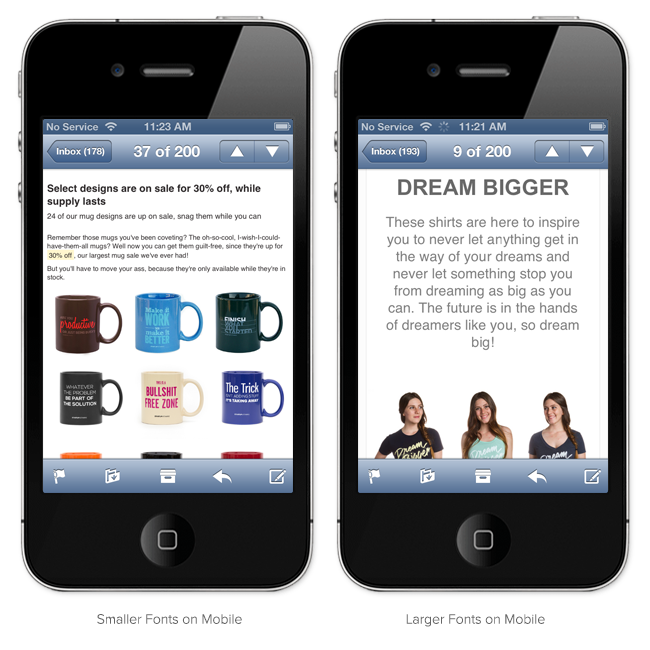
Tiny text is hard to read on a desktop computer, never mind on the small mobile screen. To avoid illegible fonts, we recommend 14 px as a minimum size for body copy and 22 px for headlines. Also, note that iOS will automatically resize fonts under 13 px, making them larger on your behalf.
You can see how much enlarging fonts can help in the two emails below. Due to Company A’s tiny font (image on left), the text is difficult to read on the small screen of a mobile device. However, Company B (image on right) uses much larger fonts, allowing subscribers to easily read the email without having to zoom in.
2) Streamlined Content
Evaluate the content in your email and get rid of the less useful or relevant links, copy, and images. Also be concise, but still approachable. The shorter the copy, the easier it is for people to scroll on mobile.
3) Single Column Layout
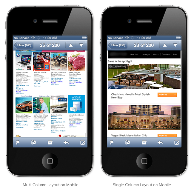
While many newsletters are multi-column, mobile-friendly emails should consider switching to a single-column layout. This approach accommodates smaller screens and can help increase legibility. In addition, ditch detailed navigation bars. When viewed on a mobile device, navigation bars can break, are too small to tap, or simply aren’t relevant to the content of the email.
Take a look at the emails below to see what I mean. Company A’s newsletter (image on the left) is four columns wide — on the small screen of a mobile device it appears busy, and images and fonts are extremely small. However, Company B’s one-column design (image on right) allows for imagery to stand out, and accommodates for larger text size and tappable buttons.
4) Touch-Friendly Buttons
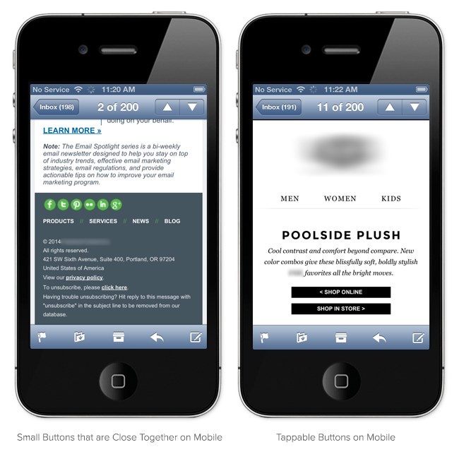
When it comes to reading emails on mobile, your call-to-action (CTA) must be touch-friendly. We recommend putting the CTA front-and-center and, if you’re using a button, make it a minimum size of 44 px x 44 px.
In the example below, Company A’s social sharing icons (image on left) are extremely close together (and small), which could cause subscribers to click on the wrong link. Conversely, Company B’s CTAs (image on right) are large and have appropriate space between them, allowing subscribers to easily “touch” the CTA that they are most interested in.
5) Image-Blocking Techniques
Like webmail and desktop clients, there are numerous mobile email apps that block images by default. As a result, it’s important to optimize your emails to be viewed without images. Luckily, there are a number of strategies to help combat image blocking.
ALT text, which is short for alternative text, is one of the best ways to get around clients that block images by default. When images are turned off, ALT text often renders in place of the images. It’s a fantastic way to provide some context for subscribers when images are disabled. As an added benefit, ALT text makes your emails more accessible to visually impaired subscribers that use screen readers! Luckily, adding ALT attributes is extremely easy — all it takes is adding an attribute to the image tag.
You can take your ALT text to the next level by adding a bit of inline CSS to change the font, color, size, style, and weight. This technique, known as styled ALT text, is a great option for maintaining branding and adding some fun to your images-off view.
In addition, your touch-friendly buttons should be visible even when images are disabled. While text links are an option, bulletproof buttons allow you to have a bit more fun. Bulletproof buttons consist of live text combined with a background color, styled to look like an image-based button. While there are numerous options for creating this type of button, we prefer to use simple HTML and inline styles, which holds up well across most email clients.
We also recommend using a proper balance of live text and imagery. It ensures that your emails are accessible, eliminates the HTML-to-text ratio spam issue, and allows for the email to be legible and easy to interact with regardless of whether images are present or not.
6) Optimized Content in the Upper-Left Corner
Many mobile email apps, including some Android and BlackBerry apps, will only display the upper left-hand corner of your email. Lack of autoscaling cuts off the right side of emails and forces users to scroll left-and-right in addition to up-and-down to view your entire message. As a result, it’s important to place important information and CTAs in the upper-left corner of your email.
What other best practices do you follow to optimize your emails for mobile?
![]()


