Remember when blind dates were all the rage and you loved the experience? Of course you did, until you ended up on a bad date, or worse got stood up. In the web design world, bad blind dates equal high bounce rates. Let’s understand how.
Say your users visit your website’s homepage. They don’t like what they see. It could be because of an inconvenient web layout or a page that’s taking too long to load. Whatever the case, a “first impression” is created, they decide against it and leave. Sound familiar?
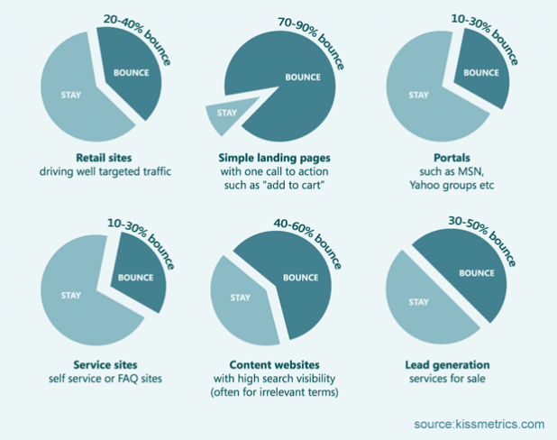
In simplistic terms, a bounce rate refers to the percentage of people who visit a website but leave after only viewing one page. In other words, they visit the site without taking any further action. You’ll be surprised to know that data by RocketFuel suggests that the average bounce rates for websites vary between 26-70%, not a small number by any stretch of the imagination.
So, what can be done to reduce your website’s bounce rate organically, effectively, and sustainably? Keep reading.
1. Amaze Visitors with Real-Time Support
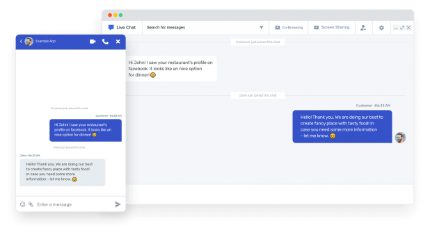
In our humble opinion, real-time communication is the real deal. Visitors today are constantly moving from one website to the next, looking for unparalleled user experience. They wish to be guided, not left alone, supported, not questioned, and heard, not commanded. This is where the live chat feature can emerge as your business’ edge. It gives you the ability to conduct real-time conversations with your customers so that you can address their queries and cater to their needs at the click of a button. Plus, it offers innovative and collaborative features, such as screen share, and voice and video call to boost customer satisfaction and sales eventually.
2. Embrace an Analytics-Mindset to Get to the Source
If you’re not analysing your website’s performance and understanding what’s causing the unusually high bounce rates, you’re leaving money on the table, and customers behind in the process. Every business, big or small, needs to invest their time, energy, and resources to analyse data from their website which can further drive performance and boost engagement.
Some tools that you can employ include:
- Google Analytics for an insight-driven approach towards understanding the high bounce rates. It highlights the problem areas so that you can address the underlying issues with better CTA, use of quality content, engaging visuals, etc.
- Hotjar to highlight major issues engulfing a particular web page with respect to which elements are working and which are not.
3. Get Interactive and Responsive with Your Web Design
Imagine you walk into a movie theatre and instead of getting the larger-than-life viewing experience, you see a smaller screen where the only thing that’s visible is your seething anger.
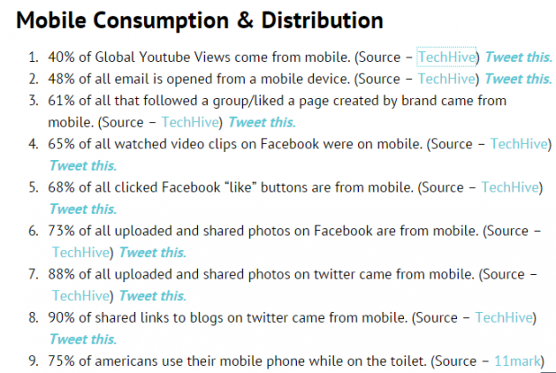
Most users experience the same if your website is not optimised to operate on multiple channels, such as mobiles, desktops, laptops, iPad, tablets, etc. With billions of users now actively browsing on their mobiles, if your website is not mobile-friendly, it may as well be extinct.
The verdict: Make the website responsive so that it can adapt to any screen size effortlessly and perfectly and offer a seamless display experience. If that’s not enough, mobile-friendliness now forms important criteria to get featured on Google’s page rankings. Need we say more?
4. Time to Create Laser-Like Focus on On-Page Elements
Every user-friendly website is a culmination of different elements that come together to offer easy navigation and a holistic page-viewing experience. For starters, do a ‘background check’ (pun intended). If your background colour is too light, and so is the text colour for the content, the text won’t be readable. The last thing you want is for your user to squint their eyes to understand what’s written on the page.
That said, make sure to avoid placing large chunks of content as it can drive the reader away. The key is to maintain a balanced format by understanding the right font size, font type, and text-image alignment for your web page. Another important factor to keep in mind is to write compelling headlines on the page that are clearly formatted and categorised appropriately. You can use bullet points and sub-headings to make the content easier to read. It should be smart enough to reel the reader in and creative enough to provoke an action.
5. Avoid Spammy Ad Placements at All Costs
Let’s call a spade a spade. Pop-ups and spammy ads opening left, right, and centre is every user’s worst nightmare. There’s no doubt that they cause unnecessary pauses and disrupt the user experience. So, if you wish to boost user engagement and get people hooked to your site, say farewell to these aggressive advertising formats for good.
While pop-ups may contribute significantly to your mailing list, your website won’t get organic visitors who genuinely love to engage with the brand. Our suggestion? Instead of going the pop-up route, try sending offers via email. Data corroborates that around 51% of users are willing to respond positively to email offers as opposed to popup ads. Also, make sure to reserve static ads only to the sides of a web page so that it literally doesn’t get in the user’s way and their primary focus stays on your brand.
6. Design Faster and Prompt Websites for a Seamless Experience
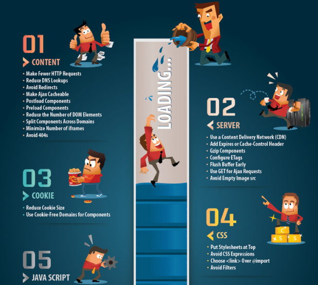
Nothing kills conversion like a slow-loading website. With instant becoming an intrinsic quality for almost anything and everything, you surely don’t want to keep your users waiting. Data paints an encouraging and discouraging picture:
- Sites that load in five seconds (in comparison to those that load in 19) experience 70% longer average sessions.
- Around 46% of users attribute waiting for pages to load as one of the most disliked features of a website.
- A one-second delay in loading time leads to 11% in lowered page views, 16% in reduced customer satisfaction, and 7% in lost conversions.
So, what can you do to get the numbers back in your favour? One, you can start working on technical SEO elements, such as identifying crawl errors, checking HTTPS status code, broken links, and XML sitemap status, looking out for duplicate data, checking site responsiveness on mobiles and restricting the meta-description length, among other things. Two, you need to rethink and resize images to smaller proportions. The smaller the files, the faster the loading time. It’s simple math.
Still not convinced? Consider this: Even tech giants like Google have faced a 20% drop in traffic thanks to an extra 0.5 seconds in load time! All in all, remember that it literally takes seconds to make or break your online presence.
Conclusion
A colourful website with pretty pictures isn’t enough to hold your user’s attention. It requires a complete rethinking of business and digital strategy, redesigning in terms of user-friendliness, and redefining in terms of analytics and performance. If you wish to reduce your website’s bounce rate by natural means that actually work, try these tips to see a world of a difference.
Sam Makad is an experienced writer and marketing consultant. His expertise lies in marketing and advertising. He helps small & medium enterprises to grow their business and overall ROI. Reach out to Sam Makad on Twitter or LinkedIn.
The post Top 6 Proven Web Design Tips to Reduce Your Website’s Bounce Rate appeared first on SiteProNews.
