As a marketer, data is your lifeblood. To gain support for your new idea or prove the value of your most recent campaign, you need data backing it up. But, for many people working in a primarily creative role, pulling and analyzing data can be a challenging task.
Not only do you have to export your data, which really means opening up a jumbled spreadsheet bursting with an endless amount of metrics, but you also have to configure the data to report it correctly. If you don’t filter out the unnecessary metrics, your data becomes much more difficult to analyze. Data analysis can be a taxing process, requiring a ton of time and energy. But in an industry that moves as fast as marketing, there’s no time or energy to waste. Fortunately, Google offers a solution to this prevalent problem.
Their data visualization tool, Google Data Studio, can pull and visualize your data into engaging reports within seconds, saving you countless hours on configuring a bottomless spreadsheet and analyzing a bunch of numbers packed into Excel.
And since Google Data Studio can produce easy-to-understand reports, the tool will help you accurately extract insights from your data and prove that you’re producing results.
What is Google Data Studio?
Google Data Studio is a data visualization tool that lets you create engaging, digestible data reports from sources like Google Analytics, Google Ads, Google Sheets, Google Search Console, YouTube, MySQL, and more.
With Google Data Studio, you can visualize your data in numerous charts, graphs, and pivot tables, like time series, bar charts, pie charts, tables, heat maps, geo maps, scorecards, scatter charts, bullet charts, and area charts. The tool also lets you customize your reports and dashboards’ logos, images, shapes, background, font, object properties, and more.
If you want to share or collaborate your report or dashboard with someone, you can do it all on Google Marketing Platform. Google Data Studio even has templates to help you quickly and easily set up reports and dashboards.
To learn how to use Google Data Studio, better understand your data, and present it to your team in a more visually appealing way, check out the tutorial below.
Google Data Studio tutorial
1. Login to Google Data Studio.
Just like Google Analytics, Google offers a robust free version of Google Data Studio. To access Google Data Studio, visit datastudio.google.com and sign in with the same account that you use for Google Analytics and Google Search Console.
Google Data Studio is part of Google Marketing Platform, so its interface will look like Google Drive’s interface. Your Data Studio portal will only store your Data Studio documents, which are separated into two categories: reports and data sources.

2. Create a new report.
In the reports section, click the “+” button at the top left or bottom right of the screen. A blank page should appear.

If you want to quickly create a data report from Google Analytics, Search Console, Google Ads, YouTube Analytics, Google Sheets, or Google BigQuery, you can use one of Data Studio’s report templates.

3. Connect your data.
To connect data to your report, click the “Create New Data Source” button at the bottom right corner of the screen. You can connect your report to 18 Google data sources and 98 partner data sources, if you already use a Data Studio partners’ tools.

Once you choose your data source, you need to let Data Studio connect to your Google Analytics account. After that, select your account, property, and view.

Next, a spreadsheet of fields or metrics that your data source tracks will pop up. Press the “Add To Report” button at the top right corner of the screen to connect the data to your report.

4. Customize your report.
Your report will be a blank grid that you can add different types of visualizations to. Before you add your visualizations to your report, though, you can customize its layout and theme.

If you want to add another data source to your report, click the “Resource” button and then press “Manage added data sources”.

Click the “Add a Data Source” button and pick the data source you want to connect to your report.

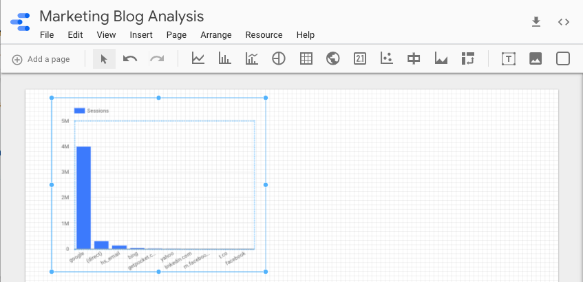
5. Add a visualization.
There are a ton of different ways you can visualize data in Data Studio. You can create a time series, bar chart, combo chart, pie chart, table, geo map, scorecard, scatter chart, bullet chart, area chart, and a pivot table. You can also add text, images, and shapes to your report.

Once you choose your visualization, drag its preferred size on your report and release. Your visualization should immediately appear.
6. Edit your visualization.
In the right sidebar of your report, you can edit your visualization’s data source, dimension, metric, and date range.

You can also sort your data, filter it, add another Google Analytics segment to your visualization, and edit its style.

Additionally, you can turn one visualization of a certain data set into another visualization. For instance, you can change a bar graph into a time series of the same exact data.


Once you finish your first visualization, you can add as many as you want to your report.
Data Analysis Made Easy
Data analysis might be the last task on your to-do list every day, but with Google Data Studio, you can pull and configure your data much faster than you can with Excel. This gives you more time to extract insights from your data, proving your campaign’s results and — most importantly — green lighting your next idea.
![]()
