ESPN recently redesigned their website. Nothing out of the ordinary there. Companies redesign their websites roughly every 18-24 months. (You’re probably sick of yours right now, am I right?)
But this particular redesign garnered a ton of attention, earning coverage and analysis in Fast Company, TechCrunch, and VentureBeat, among other publications.
So why did so many other publications want to cover such a common thing like a redesign? Well for starters, ESPN’s website gets a ton of traffic. In 2014, ESPN.com attracted 22 million daily users, notably more than CNN.com, BuzzFeed, and other high-volume sites.
But that’s not the only thing they did. They made one major strategic shift: ESPN redesigned the website to adapt to the person looking at it.
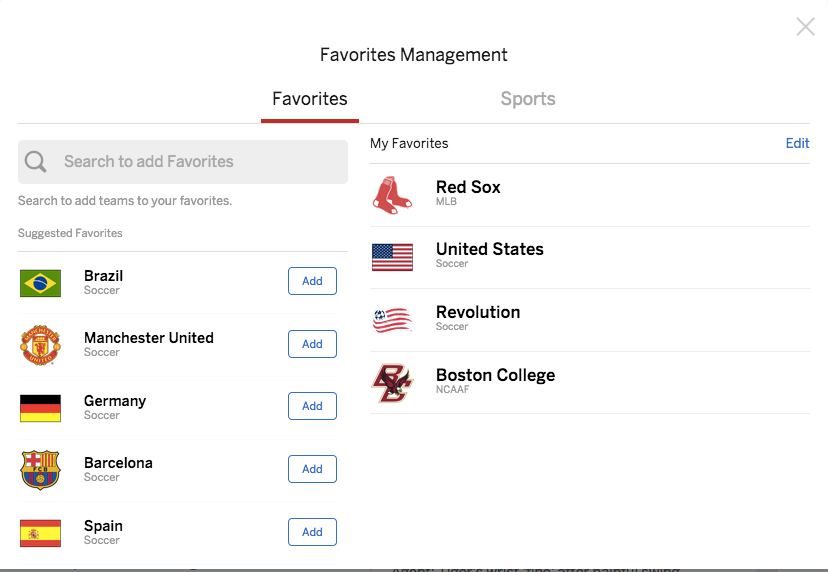
Building personalization features into the fabric of the new site, ESPN.com will now reflect the interests, location, and device of each fan. For example, when I visited ESPN.com for the first time after the redesign, it took a guess at my favorite sports teams based on my location, then enabled me to tailor my view for future visits. It looked like this (Clearly, I’m a bit of a townie):

Once your preferences are set, the website will prioritize relevant content whenever you visit again. With dynamic delivery of relevant stories, ESPN.com becomes, as the company put it, “a constantly updating river of content” that is tailor-made just for you.
“We’re hoping what you will notice is that you are more engaged and immersed than ever, getting exactly what you want, when you want it, wherever you are,” wrote ESPN’s editors in the redesign launch post. “That’s what all of us fans expect.”
ESPN was not the first to add personalization to its website, but given its popularity and the sheer volume of impact this approach will have, we expect this may signal a tipping point in website personalization.
Why You’ll See More Adaptive Websites
Personalized content on websites began in the ecommerce space with Amazon recommendations, and continues to be prevalent on many other sites today. Shop Direct, one of the largest U.K. retailers, recently launched a fully personalized homepage for its main brand, Very.co.uk. Shop Direct claims that this website will serve 1.2 million different versions of the homepage to its customer base and expects that number to rise to 3.5 million by the end of the year. 3.5 million different web experiences out of one website.
Spurred in part by early experiences with personalization on ecommerce sites and a natural proclivity for relevant content, consumers in all industries are starting to expect some level of a customized experience. According to Janrain, nearly three-fourths (74%) of online consumers get frustrated with websites when content appears that has nothing to do with their interests.
Where customer demand exists, technology shortly follows. As more websites are plugged into contact and email databases, dynamically producing different views becomes technically much easier. While Amazon and ESPN likely have robust personalization and content delivery engines powering their entire sites, a wide range of companies are using tools to leverage what they know about visitors and personalize their most critical pages or conversion paths.
How to Make Your Own Website Adaptive
Get the Technology
To personalize your website, you’ll need a database to automatically store relevant information on each visitor about their on-site behavior. You’ll also need a tool to serve up different content based on a set of criteria from that database. (Full disclosure: HubSpot software does this or we wouldn’t know so much about the topic. There are also a number of other personalization engines out there you can research, including Monetate for ecommerce and retail.)
Start With Mobile
I know. I know. You want to get to the good stuff like personalizing for brown-haired, knitting fanatics or targeting CEOs who have visited your pricing page. But trust me, before you do anything else, start with mobile. Make sure your website, blog and landing pages can recognize the various devices visitors use to view your content and adapt to give them the best possible view. The reasons for this are manifold.
First, mobile-optimization is now weighed heavily as a search rank criterion on Google. If your site isn’t fully optimized for mobile, its ranking could plummet on mobile searches, no matter how good the content.
Second, making sure any person could easily read content and click on your links your links is the very foundation of creating a good user experience. But that good experience needs to adapt as your visitor moves from their static desktop to mobile phone to their tablet on the couch at home. Customer-focused personalization has to be rooted in a responsive, device-agnostic design. As Ryan Spoon, ESPN’s SVP of product development told Fast Company, “The last time we did a redesign, there was no concept of a mobile application or fragmentation between iOS and Android. As the world has evolved, we want all our experiences to evolve.”
Add in Lifecycle Stages
Think of a brand new, fresh-faced, first-time visitor to your website. Got ’em? Aren’t they adorable?
Now think of a long-standing, loyal customer of yours.
How different are their needs from each other? Furthermore, how different are those needs from the needs of someone who has been to your site repeatedly and is seriously considering purchasing your product or service?
You see what I’m getting at. As an individual’s relationship with your company evolves, the content that is interesting to them is going to change too. Media companies, like ESPN, may differ on this slightly, but for my marketing dollar, the most important personalization I can do is to adapt my content to fit the customer lifecycle. By customer lifecycle, I mean all of the stages individuals go through when they’re weighing a purchase decision. People begin with needing exploratory information on the field, then progress into more and more specific questions related to your product and company. After someone purchases and becomes a customer, his or her content needs shift again.
Get Advanced With Interest- and Persona-Based Personalization
The second major personalization feature you should implement is based on what topics are most relevant to certain types of people. This is the strength of a website redesign like ESPN’s. In a world of hundreds upon hundreds of sports teams, how do you appeal to everyone?
You can get a sense of what’s interesting to each individual viewer by keeping tabs on their viewing history. That’s where the contact or subscriber database comes in. By leveraging cookies to store the pages, articles. and other content each viewer consumes in a running profile, you can start to pick up on and leverage trends based on that behavior. If, for example, I only read articles about the New England Revolution and skip articles about the Boston Celtics, you might start to guess that my interests are squarely in the soccer/football arena. By surfacing those articles above the articles on basketball, ESPN would save me the step of having to search for them, making my whole experience on the site more relevant and fulfilling.
Allow Your Visitors to Contribute to Their Own Personalization Settings
Every website visitor brings with them a certain amount of information when they land on a site — it’s kind of like a digital footprint. From the moment someone arrives on your site, your analytics can recognize the device they’re using, the channel or site from which they came, and their general location based on the IP address associated with their computer. That IP address is what told ESPN that I was accessing their site from a computer in Massachusetts.
Given that, they then took the educated guess that I would be interested in Massachusetts based sports teams. It was a good starting point because it meant the personalized experience began right away.
But what if I wasn’t into Boston sports? What if I liked the Denver Broncos, The English Premier League, or somehow (inexplicably!) the New York Yankees? ESPN was smart to follow up their automatic personalization with filters I could tweak to correct my view. Checking in with your website visitor directly to make sure you’ve gotten personalization right is a great move to keeping your viewers engaged.
When in doubt, ask — particularly if personalization is going to have a big change in the visitor’s experience of your website. Sales Benchmark Index, an entirely different type of company from ESPN, does this kind of visitor-selected personalization to send visitors down the conversion path that works best for them.

Time will tell if ESPN’s website results in better numbers for the media company. The move to create a website that acts more like living, evolving channels than static brochures, however, seems to be a trend that is swiftly finding its way toward the norm. There is still more to discover in this space, including more than a few mistakes I’m sure companies will hit along the way, but a personalization strategy rooted in the desire to create a better experience for visitors holds a lot of promise for marketers and media companies alike.
![]()


