
You’ve done it. You provided valuable content to your readers and they’ve converted into leads. Now, it’s time to nurture these leads into opportunities for your sales team.
Trouble is, cutting through the inbox clutter isn’t an easy feat. And many of these folks just aren’t ready to buy yet.
That’s where lead nurturing comes in: It’s a way to stay connected to the leads you collect that aren’t ready to buy from you yet, and build up trust until they are ready.
If you want to learn more about lead nurturing in general, you can check out this guide. But for the sake of this post, we’re going to dive deep into one of the best channels for carrying out your lead nurturing efforts: email. 
To help you better understand how to pair the two concepts, check out the lead nurturing email examples below. From ecommerce to product marketing, there’s something for everyone — no matter what industry you operate in. (And If you haven’t already, check out Leadin: A free tool by HubSpot that helps you generate more leads and learn more about them.)
Check out these industries:
Ecommerce | B2B | Retail | Travel | Food & Beverage | Services | Product Marketing
19 Lead Nurturing Email Examples to Inspire Your Strategy
Ecommerce
1) Framebridge
Not all lead nurturing emails need to be strictly promotional. Engagement will lead to sales, so it’s important to send recipients something they’ll want to open and read. Framebridge does something in their nurturing emails that works like a charm: education. By teaching the reader a helpful skill, they are providing value in exchange for an ask from their recipient (reading the guide).
It’s also worth mentioning that they only use one clear call-to-action — “Educate Me.” According to WordStream, simply using one call-to-action (CTA) in an email increases clicks by 371% and sales by 1617%.

2) Casper
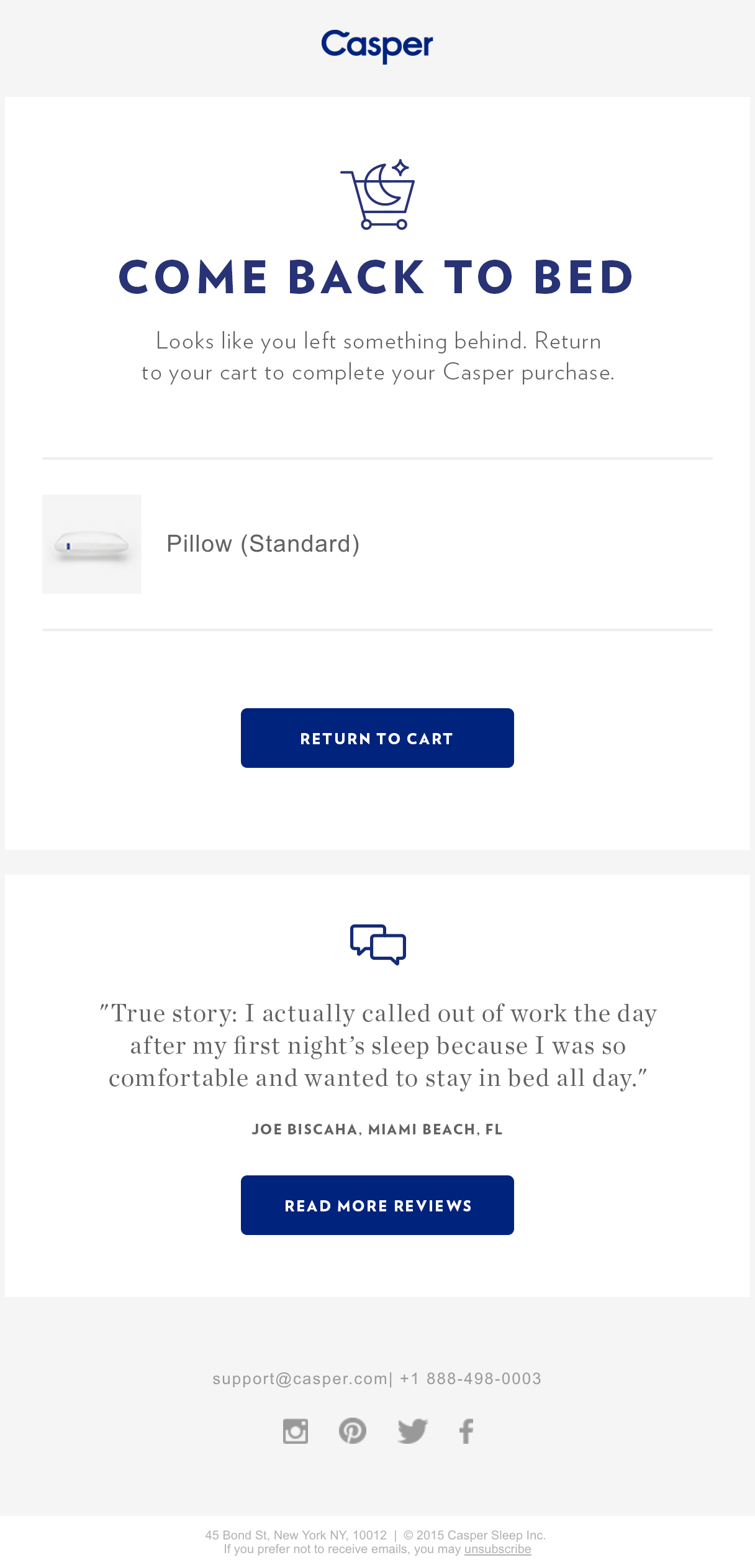
Your product is only as good as its reviews: eConsultancy reports that 61% of customers will read a review or testimonial online before purchasing. In this traditional abandoned cart email, Casper adds a bit of social proof with a fun customer testimonial.
Casper’s abandoned cart email is clever and to-the-point. It asks the reader if they’d like to revisit a cart they have added to, shows what they were shopping for, and includes two simple CTAs.
3) Sephora
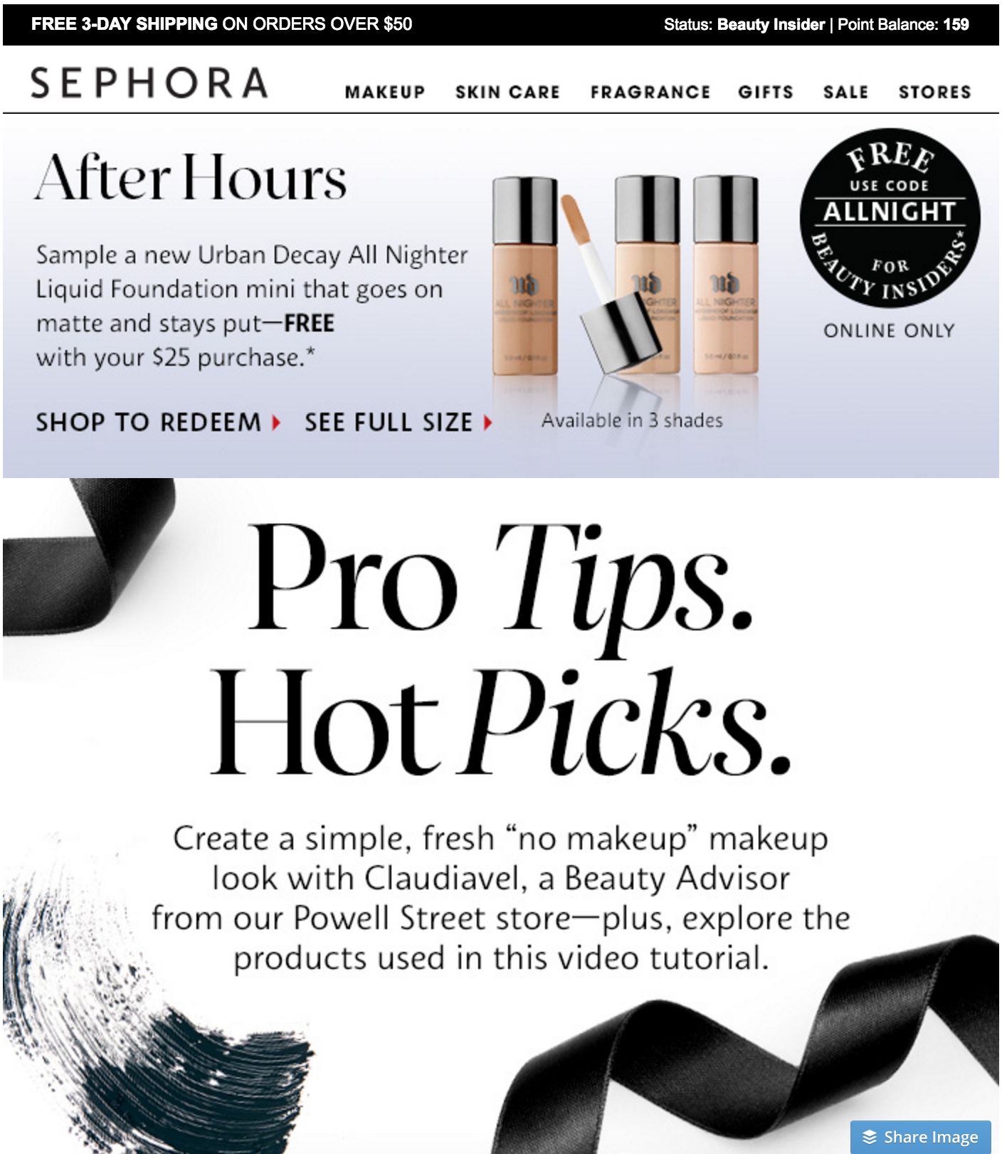
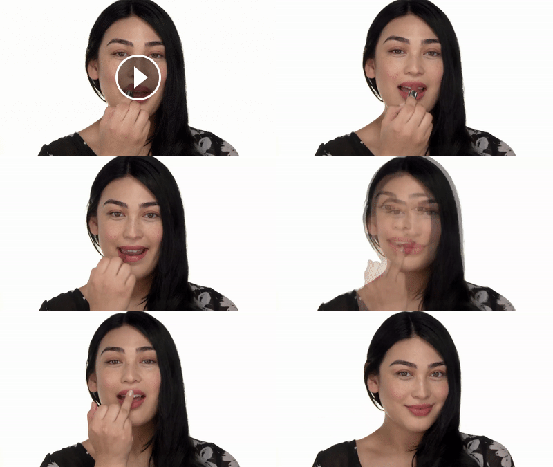
For visual products, video is a great method of communicating or explaining. A study by Tubular Insights reports that 96% of B2B organizations use video in some capacity in their marketing campaigns, of which 73% report positive results to their ROI.
Sephora includes a fun video from an employee with educational content as well as product offerings. They do have a lot of calls-to-action, however, the main focus is to watch the tutorial which is helpful to the reader. A visual email for a visual brand, it grabs your attention and shows off the products in a unique and interesting way.

B2B
4) Litmus
Triggered email messages yield 67.9% higher open rate and 241.3% higher click rates than standard email messages, according to Epsilon. In other words, when you use a person’s behavior — let’s say that downloaded content about email workflows — to trigger a relevant email based on that action, it will perform well.
Here’s a great example from Litmus that demonstrates how to use clever, clear copy to provide recipients with a relevant email that adds provides even more value.

Retail
5) Uncommon Goods
Uncommon Goods shows their products in context and creates a Pinterest-inspired section for each different aesthetic. Each collection has a featured CTA and the email feels more like a curated pinboard than a sales email.
Not to mention, this email is also very mobile-friendly, which can play a big part in the success of an ecommerce lead nurturing email: 56% of email is opened on mobile devices, according to Litmus.

6) Chubbies
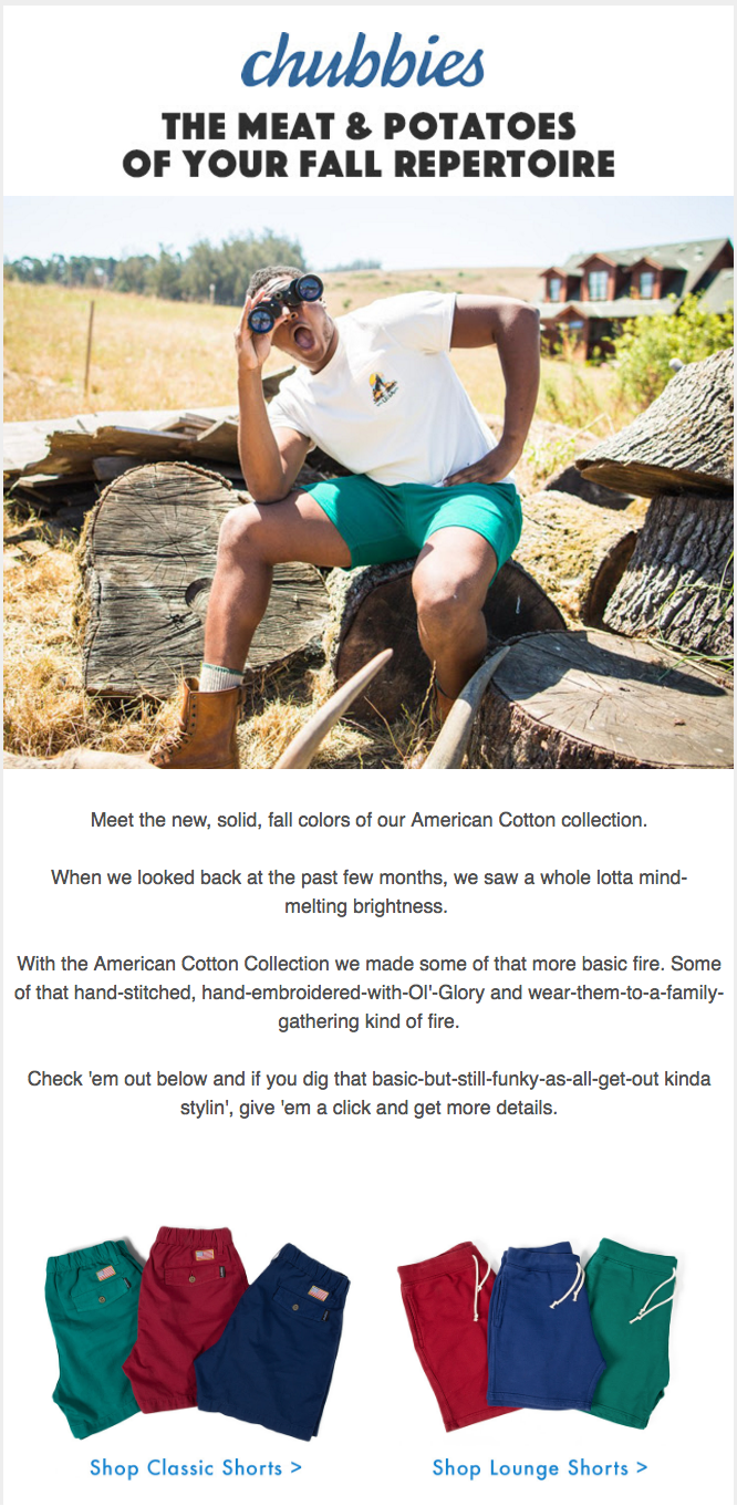
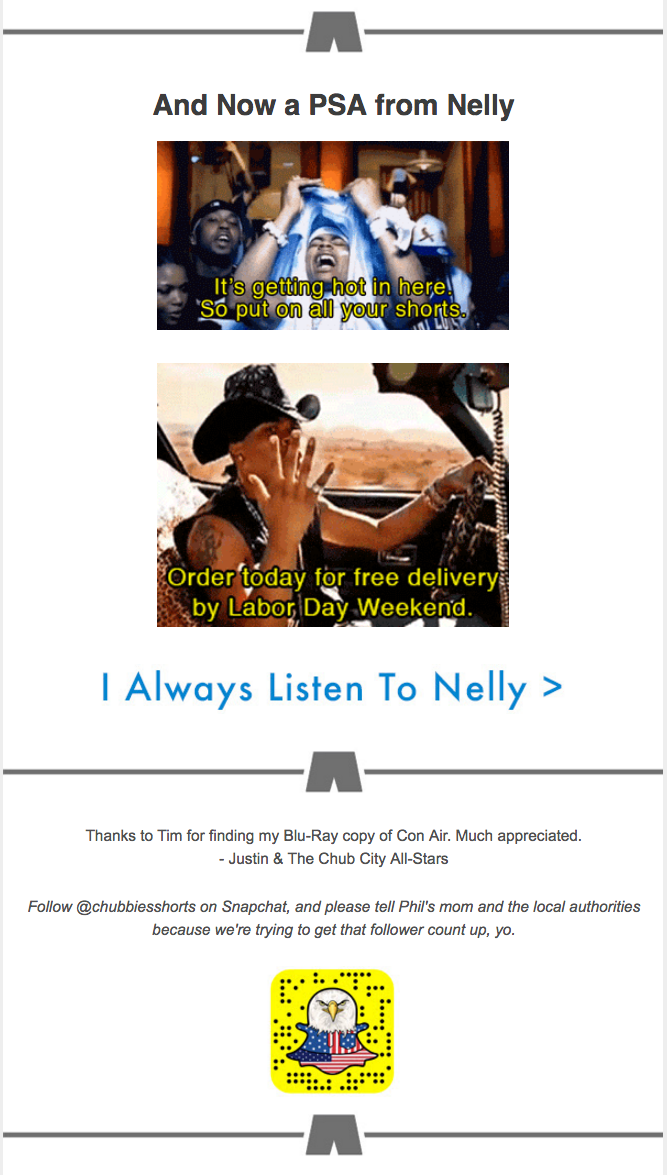
Chubbies is well known for their cheeky marketing and their emails do not disappoint. With 1.4 million Facebook Likes, they put the social, fun aspect of content first. Their email newsletter serves as a hub for user-generated content, promotions, and all-around humor.
Part information, part fun, this email encourages its reader to enjoy reading it even if they aren’t planning to buy anything in that moment. The copy relates to its audience, the visuals are on-brand, and they offer multiple CTAs (purchase clothing & follow on Snapchat).
Travel
7) JetBlue
JetBlue has some of the best email copy around. Not only is this email funny, helpful, and full of great puns, but it also reflects JetBlue’s commitment to engaging and retaining customers through email.
Aware that the funnel isn’t always visitor > lead > customer, one of JetBlue’s email objectives is to convert current or past customers into TrueBlue members, as demonstrated below.
(Want to learn how long your emails should be? Check out this helpful blog post that takes audience and message into consideration.)

8) Airbnb
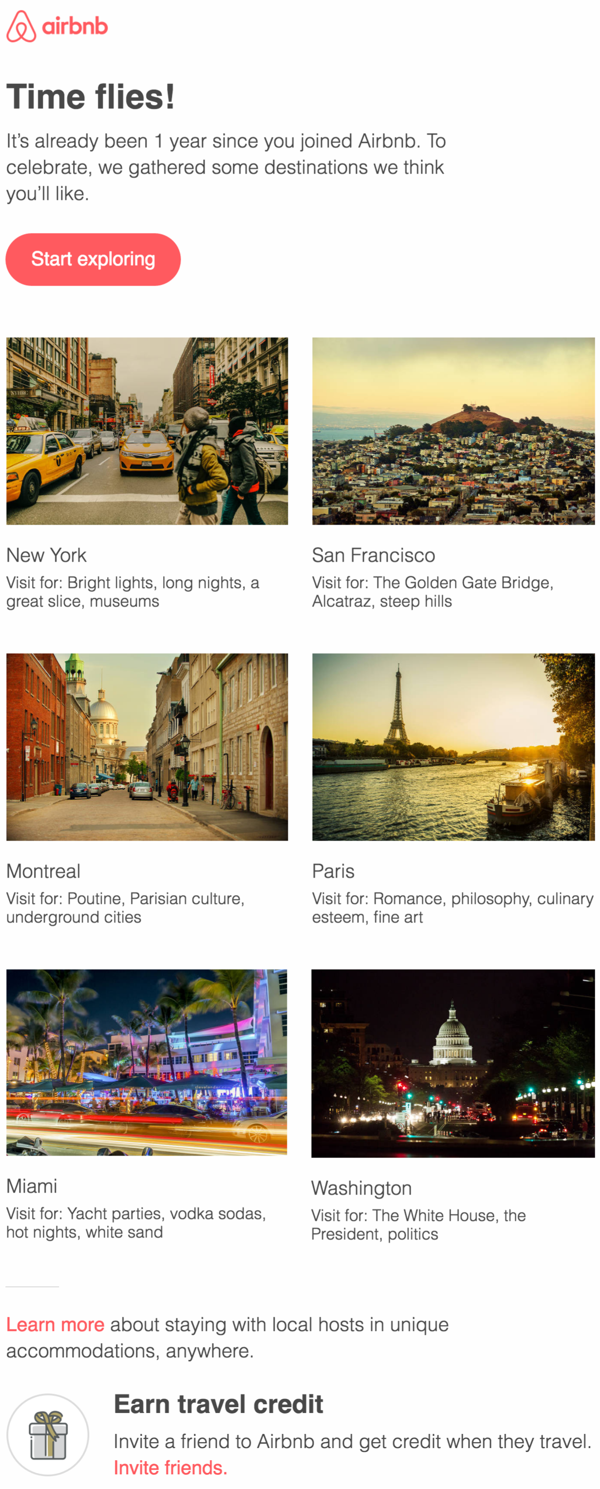
Airbnb’s emails have one goal in mind: give their readers wanderlust.
This email has a clear CTA, highlights beautiful travel destinations, and doesn’t ask too much of the recipient. Not to mention, the one year anniversary is also a good opportunity to reach out to their subscribers without seeming pushy. It feels personal and curated. (Take me to Paris, please!)
Services
9) Handy
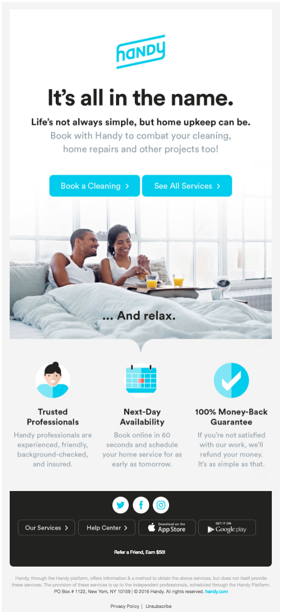
The combination of clear buttons, information about the service, and a nice photo make this email from Handy feel uncluttered and effective. More specifically, the photo of smiling customers is a smart move for two reasons:
- It helps to draw attention to the effect their product has on those who buy it: happiness.
- Human photos saw 95% higher conversion than object photos, according to VWO.
10) Freelancer
I’m a sucker for a good illustration and Freelancer’s caught my attention immediately. They prove the value of the service through a drawing, then provide a clear ask in the CTA: “Get Started Today.”
Eye-tracking studies have shown that readers spend more time looking through images than reading text when they are relevant to the copy. So if you can align images in your email while educating your readers, the message will stick with them for longer and have a higher impact.

11) Skillshare
At the top of this email, Skillshare includes a nice reminder to its recipients that their trial is about to expire — a smart move that’ll hopefully result in a renewal or purchase.
The reminder is accompanied by some unobtrusive, helpful CTAs for various educational classes. Notice how the simple, stylish boxes stand out as an alternative to a traditional button.

Food & Beverage
12) Thrive
When a person hears something, they’ll remember 10% of that content three days later. However, when it’s paired with a relevant image, they will remember 65% of the information three days later. This concept is referred to as the picture superiority effect.
Thrive takes advantage of this theory through their use of product images. They highlight their products in an attractive way, include a good amount of content, and encourage the reader to start shopping.

13) Dunkin Donuts
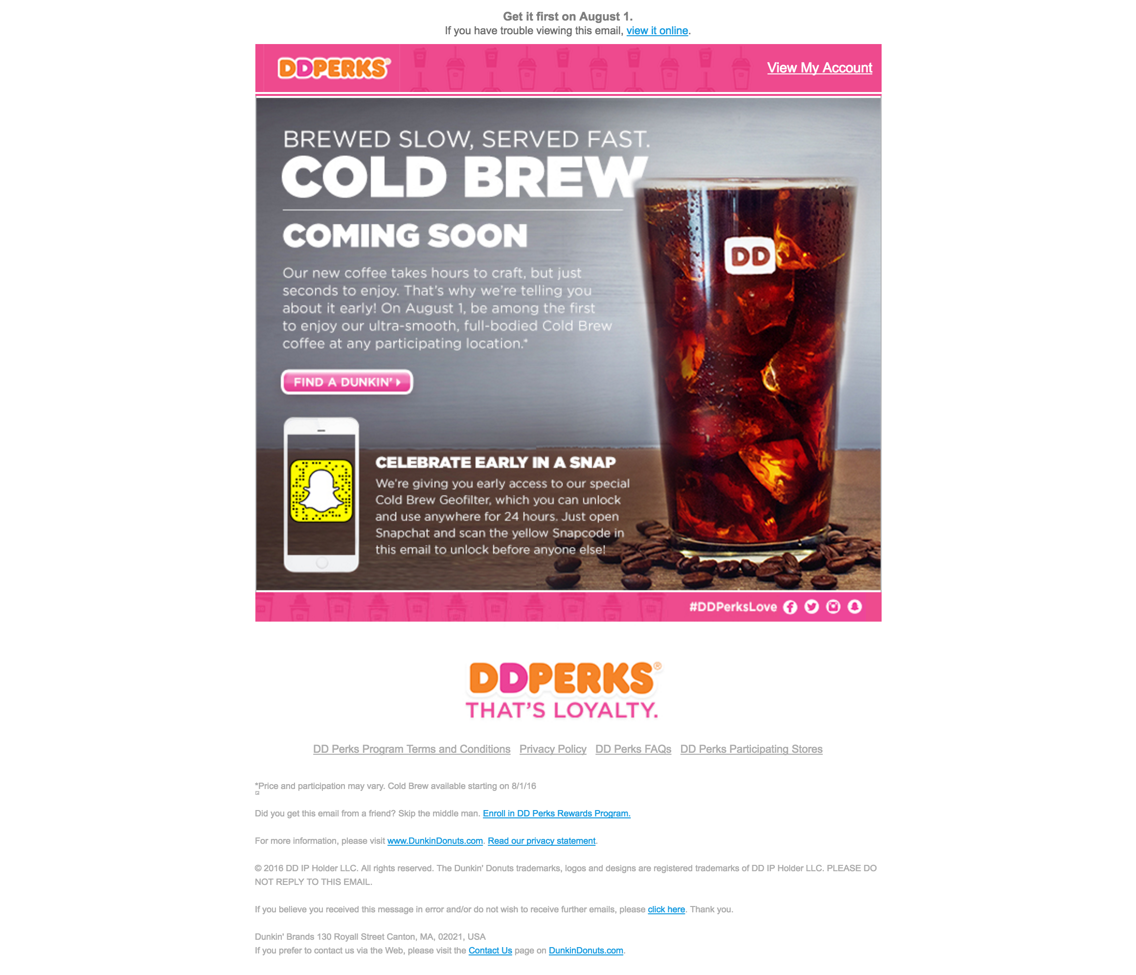
Dunkin Donuts used an announcement for a new item as a way to reach out to its audience. This simple email asks its readers to find the location nearest them, showcases the new drink, and has a secondary CTA to add them on Snapchat. (Speaking of which, check out this guide to Snapchat for business.)
Product Marketing
14) InVision App
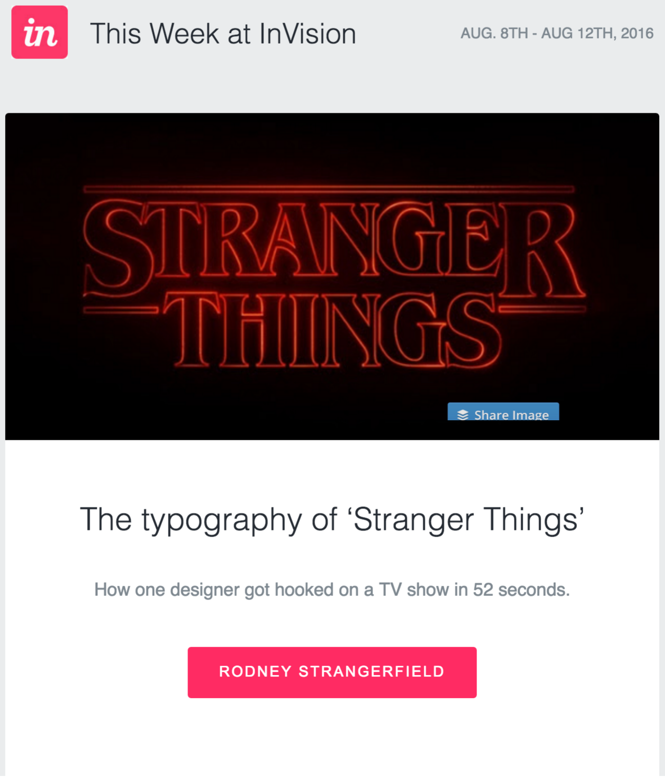
Newsjacking is defined by HubSpot as “the practice of capitalizing on the popularity of a news story to amplify your sales and marketing success.” By mentioning a current, trending topic into your marketing, you can bring in a new audience and engage with your current users. (You can learn how to incorporate newsjacking into your marketing strategy here.)
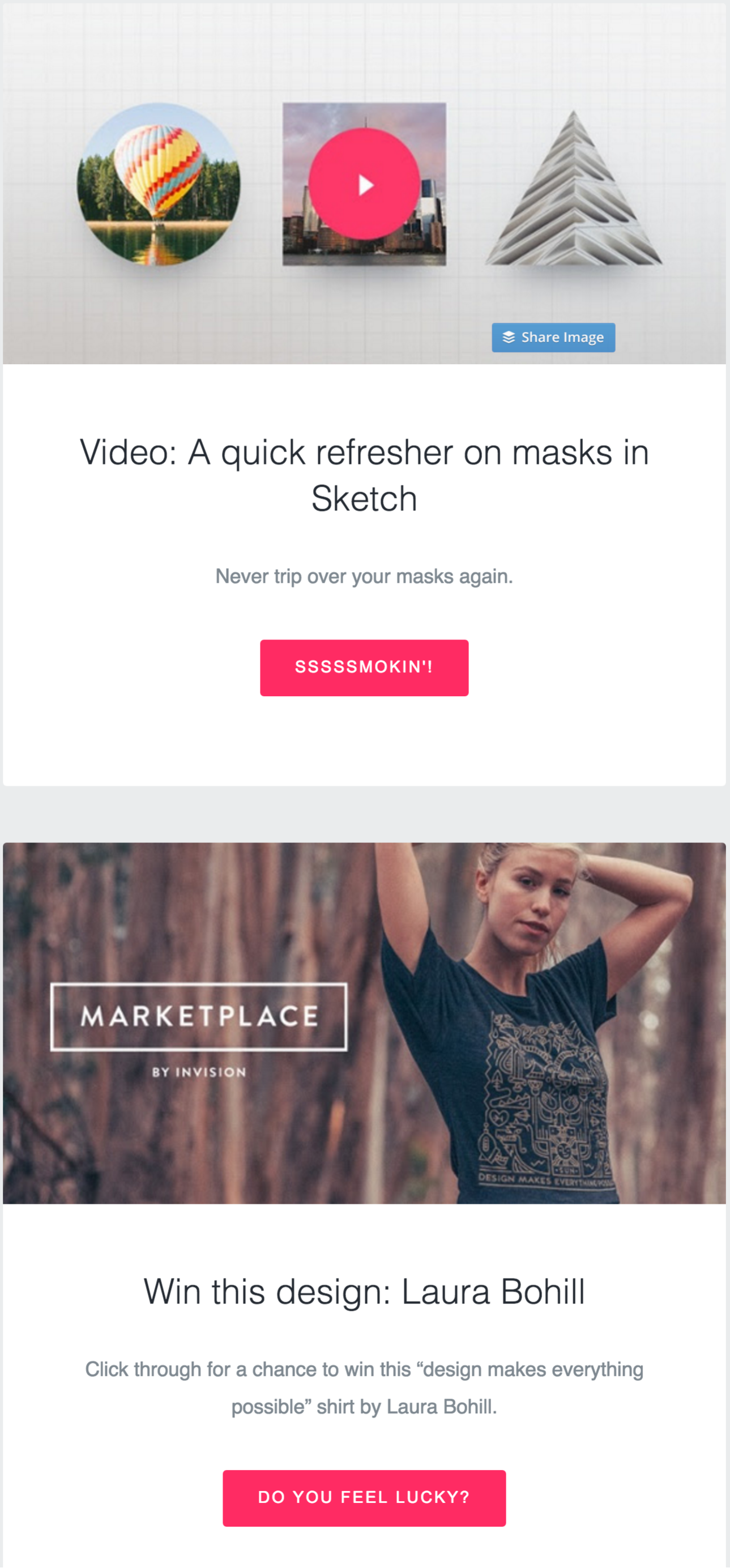
InVision monopolized on the “Stranger Things” trend by highlighting its typography in this email and relating it back to the design industry. They also used it as an excuse to teach their newsletter recipients through workshops and trainings.
15) Zapier
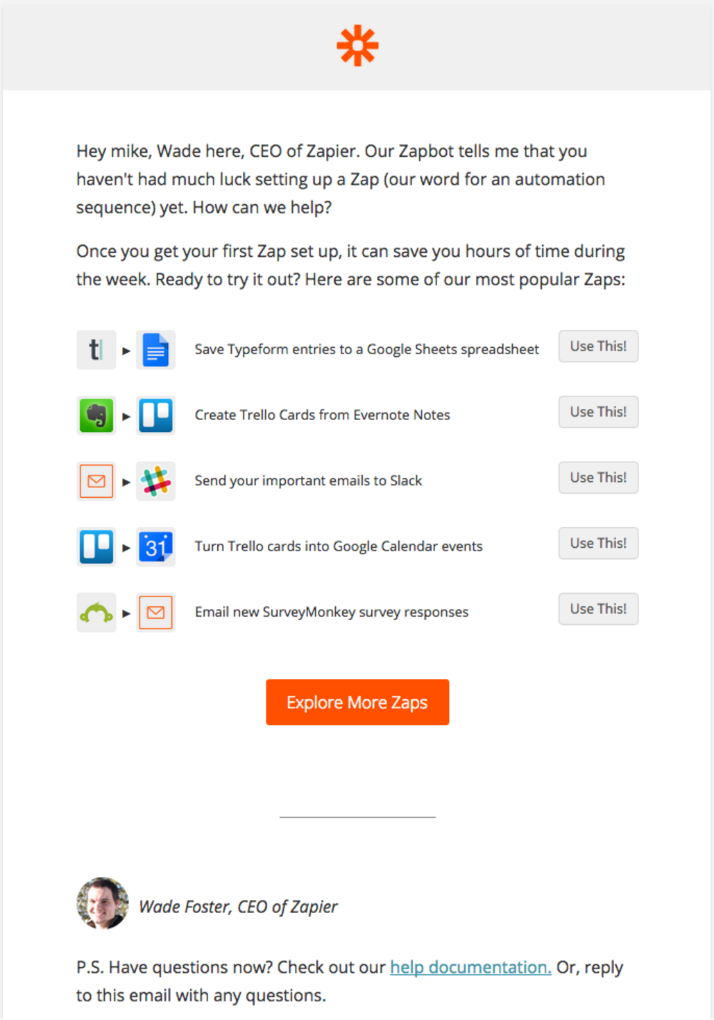
According to DemandGen, leads that are nurtured with personalized content convert into sales at 20% higher than those who aren’t.
This email is from the CEO of Zapier asking how he can help them get setup proves that they’ve got a handle on the whole personalization thing. This user is being targeted with a name personalization token as well as a trigger indicating that they are yet to setup the product.
For technical products, friendly, helpful emails based on activity can perform extremely well. Notice how they even include a link to their help documentation for added value and clarity.
16) Sprout Social
Sprout Social uses a new feature as a reason to reach out to leads. They teach the audience about this new feature, let them know that their trial is expiring, and provide helpful feature descriptions to inform their decision.
The Kapost blog tells us that 60% of people are motivated to learn more about a product after reading about it. By giving your readers a taste of your new products and services, they will be inspired to learn more, so be sure to also include relevant links and information for them to continue their research.

17) Typeform
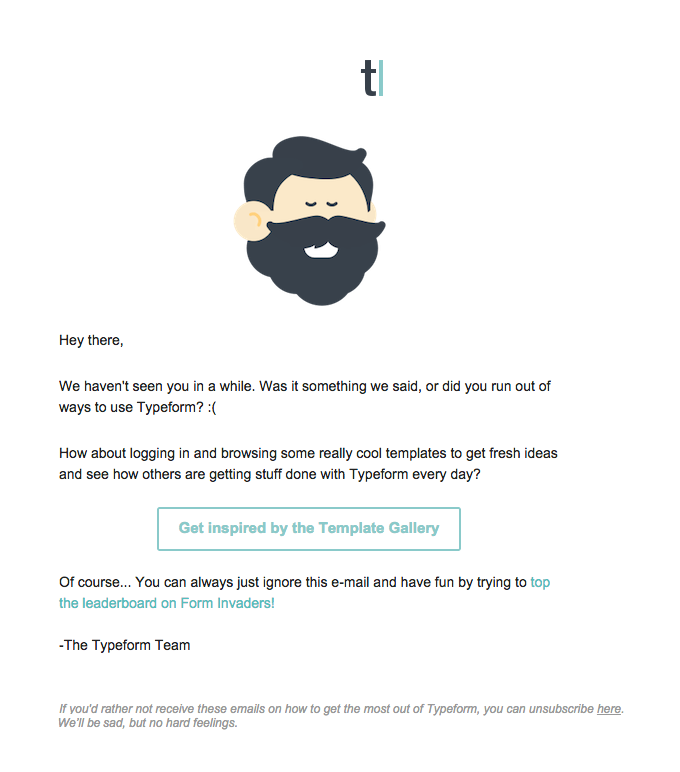
Writing email copy is difficult. It’s important to be friendly, helpful, and straightforward.
That’s why Typeform really hit the nail on the head with this email. In the example below, you’ll see that they’re not only being relatable and honest, but they are also strategically taking advantage of their user’s inactive status to position the outreach. And the challenge to look at their leaderboard is a nice secondary CTA that doesn’t ask too much.
18) Square
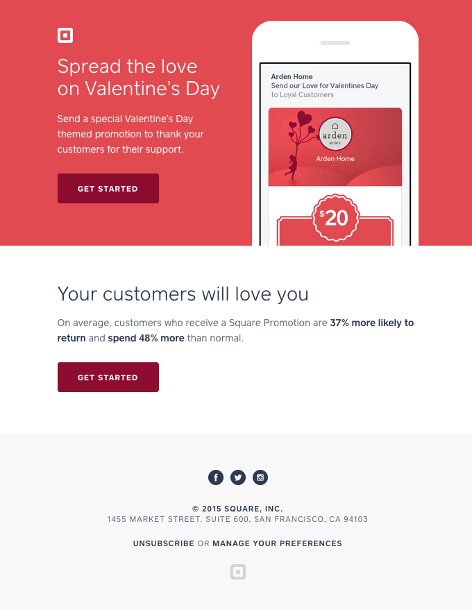
Holiday marketing is a common type of lead nurturing. Both B2B and B2C companies take full advantages of running holiday-themed campaigns throughout the year.
Square leverages the Valentine’s Day holiday to encourage its recipients to take action with their own customers. They provide a helpful and powerful statistic to prove value, and keep it short and sweet.
19) Duolingo
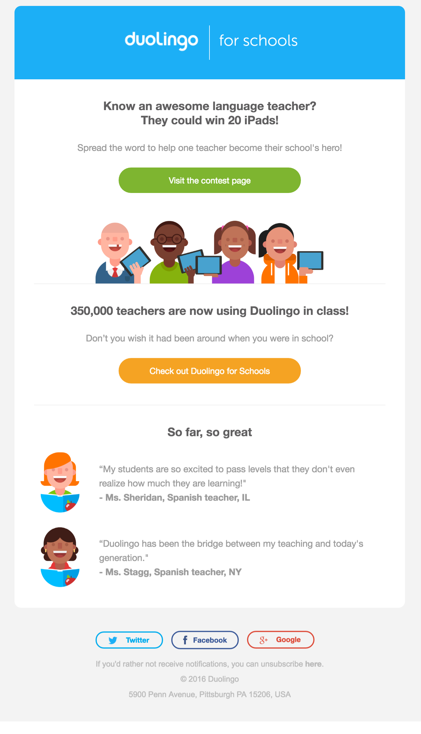
Duolingo taps into their users’ affinity for learning by asking them to nominate a favorite teacher for a contest. This is a great way of engaging with your audience while providing a helpful and fun reason to click.
They also make use of two different types of testimonials. They tell the reader to join “350,000 teachers” as well as including two quotes from teachers using the product. What a great use of social proof.
Now that you’ve been inspired by these great brands and products, learn how to write email copy like a pro and create compelling images.
Have any favorite lead nurturing images? Mention them in the comments below.


