 Applying color is one of the most enjoyable parts of graphic design, but it can also be incredibly difficult to get right. Which colors look good together? How many should I use? How do I create a color palette?
These questions are asked all the time by people starting out with design. In this article I’ll take you through everything you need to know to start using colors effectively. Whether you’re choosing colors for a new brand or creating graphics for your social media pages, learning this essential skill will help you improve your visual strategy and create beautiful designs.
Get familiar with the color wheel.
The color wheel is an incredible tool you can use to apply different colors to your designs — from black and white, to the deepest and brightest greens and blues. There are two main aspects of the color wheel every beginner should know about: how to select different colors and how to identify them.
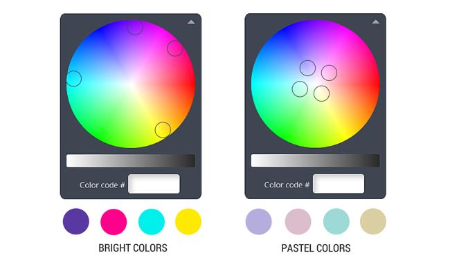
When choosing different colors, the brightest colors can be found toward the outside of the color wheel. These colors are the most vibrant, and can be thought of as the most intense version of a color. Toward the middle are pastel colors, which are soft and neutral.
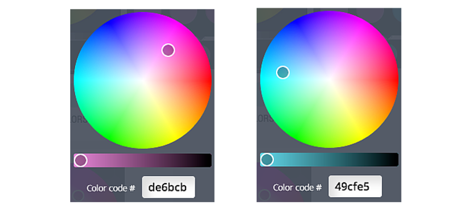
Every color on the color wheel can be identified by a unique hex code. This is the six-digit code that appears underneath the wheel when you select different colors. Hex codes are incredibly useful if you want to reuse the same colors in multiple designs — which is an essential skill for consistent branding.
Change the intensity of your colors using the brightness slider.
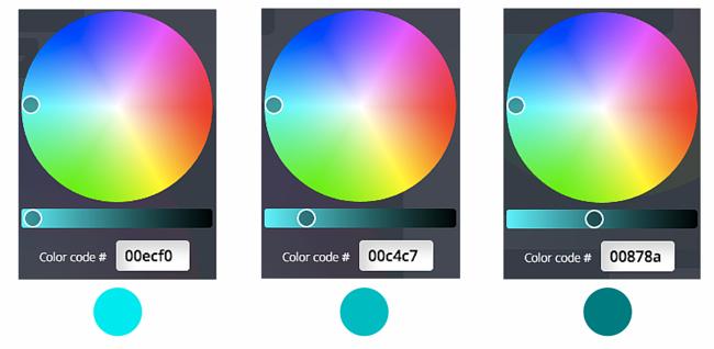
The brightness slider is a tool which allows you to find lighter and darker versions of the same color. By moving it to the left, the color lightness will increase, while moving it to the right will make it decrease. Using this tool is a great way to different various shades of the same color.
Explore color relationships.
Ever wondered why some colors clash together and some just work? It’s largely due to the way that they’re related.
Color relationships are determined by their position on the color wheel. These three well known color relationships can be a great basis for an original color palette:
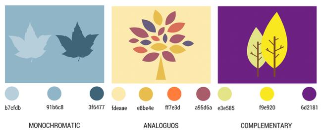
- Monochromatic colors: A monochromatic color palette includes dark, medium, and light versions of a single color.
- Analogous colors: Analogous colors are located next to each other on the color wheel, which gives them a seamless, low contrast harmony.
- Complementary colors: Complementary colors are located on opposite sides of the color wheel, allowing for the most dramatic contrast of all color relationships.
Evoke emotions with color.
There are two types of colors on the color wheel: warm colors and cool colors. Warm colors are found on the right, and include reds, oranges, and yellows. These colours are great to create energy and emotion in your designs.
Cool colors, ranging from blues and greens to pinks and purples, can be found on the left. Cool colors are considered more calm and soothing in nature.

Compare the difference between the cool pink used by Benefit Cosmetics on its Instagram account and Corona — which use an iconic warm yellow filter over its images. The Benefit graphic is feminine and delicate, while the Corona graphic is warm and inviting.
Create an effective color pallette.
The first thing to know about choosing a color palette is not to choose too many colors — limit your selection from two to four. First, choose a single vibrant color that will stand out in your design. In this example, the dark green color is the most prominent. White and a lighter shade of green have been chosen as the additional colors, creating a low contrast harmonious palette.

Make sure the colors you choose are relevant to your design subject. In this example, the olive green color matches the earthy tones of the photograph.
Match color with images.
To create visual harmony, match your text color with a prominent color from your background image. You can find the exact color using a color picker tool. See here how the vibrant pink color of the flowers matches the text.

Explore different color schemes.
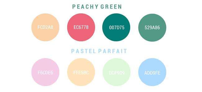
When choosing your color palette, it’s a great idea to explore different color schemes. For example, if you’re creating a social media graphic for a ladies boutique, a pastel color scheme could provide a feminine touch. Here are two great color schemes for you to try in your designs:
Use colors consistently for branding.
Using the same colors repetitively is an essential skill for branding, as it helps create recognition. See how Tiffany and Co. has used its iconic turquoise color on its Facebook page. A bit of variation is great too — see how there are lighter and darker versions of the same color visible.

Apply a color palette to everything in your design.
When people start designing it’s not uncommon for them to think their color palette is just for their background and text. In fact, you color palette should be applied to everything in your design, including text, text holders, images, shapes, icons, and more.

In the design above, an orange color has been applied to the transparent shape to match the clementine fruits. All of the text and the dotted line are also a light cream color to suit the style of the design.
Create a mood board for inspiration.

Whether you’re trying to find the right color for anything from a new brand to a social media graphic, creating a mood board is a great way to find inspiration. Consider these questions when putting together a mood board:
- What kind of images spring to mind when you think of your brand or design subject
- What kind of feelings do you want to evoke?
- If there are other similar brands out there, what kind of colors do they use in their branding and marketing?
Put these skills into practice.
When used effectively, colors can evoke emotions and change the meaning and mood of your designs. Next time you create a marketing graphic for your social media page or even put together an original birthday card for a loved one, be sure to pay careful attention to the colors you use.
With a little practice, you’ll be amazed at how quickly you can improve your eye for choosing amazing colors!
If you’re eager to learn more, check out Canva’s Design School! It has everything you need to learn design like a pro.
![]()


