Conversion rate optimization (CRO) and inbound marketing go together like peanut butter and jelly. After all, nobody is more concerned with (and obsessed with) conversion rates than the inbound marketer.
But many inbound marketers find themselves navigating a new world of CRO with a sense that there’s so much to test, and they’re not quite sure where to start. Here are 6 CRO initiatives you can undertake today to help give your conversion rates—and inbound marketing performance—a boost.
1) Start learning with visitor heatmaps
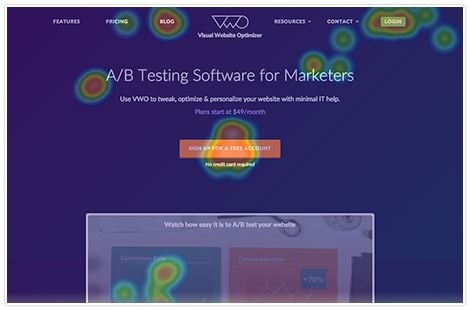
In 2016, there’s really no excuse for running an inbound program without also running heat mapping software on your site’s core conversion pages. There’s just no substitute for seeing, with real tracking data, how site visitors are making their way through your conversion funnel. Simply put, the best and only true source of data is the experience of visitors themselves while they use your site.

A heatmap delivers an aggregate picture of the click activity on a page, giving you insight into the elements of the page design that are attracting attention and driving action. Here are a few examples of what to look for as you conduct your first visitor heatmap tests:
Confusing Page Elements
Are there elements on the page that get a lot of clicks but aren’t actually clickable? It might surprise you how many visitor clicks are wasted. You can often get a solid conversion rate bump just by making an element that visitors are telling you they want clickable, actually clickable.
Desired Content
Are visitors’ click patterns telling you what content they actually want to see? No matter how user-focused you might think your site design is, visitors sometimes have a way of telling you what’s really important. Is there a tab that’s hidden on page load that the majority of page visitors click to surface? You may want to make that the default page state. Is there a piece of content further down the page that seems to get an inordinate amount of visitor attention? You may want to test a version of the page that presents this information closer to the top of the page.
Misplaced Priorities
Sometimes your heatmap test will reveal that an area of page that you put a lot of focus on is actually being ignored by site visitors. If you have a homepage carousel, this is a key area to watch in your first heatmap test. Are people actually using the carousel? The majority of homepage carousels we have tested simply do not convert beyond the content featured on the first slide, with first slide clicks often accounting for over 90% of total carousel engagement. If your test turns up similar results, it’s probably time to redesign that part of your homepage and ditch the carousel in favour of a well-designed CTA.
2) Try a different button color
Insignificant as it may seem, the color of your call-to-action (CTA) buttons on your site could be holding back your conversion rate. The good news is that testing it is easy, and doing so is a great way to get started with CRO.
Most conversion rate optimization platforms, such as Visual Website Optimizer, make split testing button colors incredibly simple—no developer or designer required.

There are plenty of articles singing the praises of red or orange buttons as top performers. Don’t believe the hype—our testing has shown that contrast is typically a more important determinant of success than any red or orange rule-of-thumb.
Start by testing complementary button colors that sit opposite of your site’s primary palette on the color wheel. Often, that extra contrast is exactly what’s needed to lift the page’s conversion performance. We’ve seen conversion rate lifts of over 25% simply from changing the color of a CTA button, which is well worth the minimal cost of testing.
3) A/B test your PPC landing page headlines
All right, sure—you could test headlines on any landing page. But I chose PPC landing pages for a reason: you’re paying to send people there, so you should try to get the most out of that traffic.
Most CRO platforms offer the ability to easily test landing page headlines. The harder part is coming up with the right headlines to test. As you build out your headline options, a quick Google search will reveal countless headline formulas that you can take for a test drive. And by all means, go ahead and give ‘em a try.
One bit of advice on headline writing: learn from the best. David Ogilvy’s copywriting genius is well-documented. And when you look at his bestselling headlines, you’ll notice that there isn’t a clear plug-and-play formula for success. There is, however, a lot of wisdom to be found in those timeless advertising headlines.
In developing my headline testing options for PPC landing pages, I like to generate a range of options that loosely fit within the following categories:
Benefits-focused: Headlines that communicate the benefit of the product or service offering. e.g. “Get more leads faster with Inbound Marketing”
Descriptive: Headlines that tell you what the product or service is. e.g. “Conversion Optimized Inbound Marketing Services”
Emotional: Headlines that attempt to appeal to the reader on an emotional level, often describing a feeling they may get by purchasing a product or service. e.g. “You’re going to love being a better marketer”
Match the Ad: Particularly with PPC conversion funnels, many marketers have found their best results when there is symmetry between the search term someone uses, the PPC ad headline, and the landing page headline. For example, to capture people searching for “inbound marketing services”, you would make “Inbound Marketing Services” the headline for both the PPC ad AND the PPC landing page.
4) Split test your most visited landing page
It is important to draw a distinction between Split Testing and A/B Testing. While often used interchangeably, a helpful distinction is to use the term Split Testing when you’re testing designs that vary greatly from each other, while using A/B Testing to refer to when you’re testing two versions of a specific page element (e.g. testing 2 headline options on a landing page).
Armed with new insights into how your visitors are experiencing the page and the headlines that are resonating best, you’re ready to create and split test a fresh landing page design.
In addition to translating learnings from earlier tests into your new design, consider taking this opportunity to answer additional key questions that leads might have, or testing a new conversion-focused design element (like, say, the old directional photo looking at the CTA button trick).
As you might expect, successful landing page tests often lead to even bigger gains as winning changes are duplicated elsewhere across the site. We reversed that scenario somewhat here at Kula Partners in an effort to test a new site design.
Earlier this year, using the landing page of one of our most downloaded content offers (the Executive’s Guide to Inbound Marketing), we started testing our new site design. Getting a sense of how people were interacting with the new layout and monitoring how well it converted proved extremely valuable in evolving the design and optimizing its flow.
And, while choosing your most-visited landing page for the test might not be the best approach in all instances, for many brands the benefit of getting statistically significant test results faster will outweigh the perceived risks of testing a highly visited page.
5) Mix up your email subject lines for improved open rates
Subject lines are the headlines of email. To once again borrow from Ogilvy, once you’ve written your headline (or email subject line, in this case), you’ve already spent 80% of your marketing investment.

It always surprises me how some people can spend countless hours in meetings nailing down the specifics of a promotion, only to hit send on the email with an atrocious, ill-considered subject line. It’s pretty simple—your message has to be opened to be actioned, and it’s the subject line that determines whether or not it gets opened.
Beyond the typical headline writing formulas, there are number of different subject line approaches to test. For example, while you have to be careful to not overdo it, adding personalization to your email subject lines is often a great way to boost open rates. Just make sure you’ve accounted for any contacts who do not have complete personalization data in your contact database.
While they aren’t right for every brand, using emojis in your subject lines has also been shown to deliver a nice open rate lift.
So test early and test often—there are real gains to be made by getting those subject lines right and getting more emails opened.
6) Try a radically different lead nurturing sequence
This tip assumes you have some experience in inbound marketing, and you’ve already implemented a lead nurturing sequence. Unfortunately, too many inbound marketers treat their lead nurturing sequences as a set-it-and-forget-it exercise—quickly turning their attention to some of the, shall we say, sexier aspects of inbound.
If it’s been a while since you’ve reviewed your lead nurturing sequences, now might be the time to take a fresh look. Chances are, you know more as a marketer (and about the business you’re marketing) now than you did when you created the nurturing sequence. Moreover, you probably have more content to draw from now than when you started. Step back, ask the hard questions about the objections and curiosities that your leads have at various stages in the customer journey, and craft a new lead nurturing sequence from scratch.
Don’t feel like you have to adhere to the structure (number of emails, timing, etc.) of your current lead nurturing sequence. Take this opportunity to start with a clean slate. I’ve found that many inbound marketers’ first lead nurturing sequences have too few messages that are spaced too far apart. If that sounds like you, try integrating some recent blog posts or case studies into your nurture sequences to increase the number of messages you’re sending by 50% or more.
Today’s the second best time to start
If you’ve made it this far in the post, it’s safe to say that you’ve been thinking about CRO for a while now. Like a lot of things, the best time to start with CRO was probably years ago—and the second best time is now.
To recap (or to provide a TL;DR version for those of you who skipped right to the bottom), the 6 CRO initiatives you can implement today are:
- Start learning with visitor heatmaps: gain real user data to track and analyze behavior throughout your funnel
- Test button colors that sit opposite of your site’s primary palette on the color wheel
- A/B test the headlines on your PPC landing pages
- Split test your most-visited landing page to measure the success of design changes
- Take a critical look at your email subject lines, and try something different
- Radically overhaul your email lead nurturing sequence.
Optimizing your conversion rates will pay immediate dividends while giving your future inbound marketing efforts their best chance at success. So give these 6 tests a try, get comfortable with CRO, and get ready for better inbound marketing results.
Want to learn more about CRO for Inbound Marketing? Download a free copy of The Inbound Marketer’s Quick Start Guide to CRO
![]()


