In the perpetual race to stand out on social media, visual content is pulling in front and kicking up speed.
According to Socially Sorted, the image-focused Instagram is now surpassing Twitter in daily mobile traffic. And Facebook posts with images generate an estimated 53% more likes that solely text-based posts.
While many have noticed the trend and jumped on board, there are still many marketers out there spinning their wheels without traction. There is an invisible, constantly changing culture on social media platforms determined by popular demand, and if you aren’t abiding by the unwritten rules, you will find yourself left in the virtual dust.
Here are some of the leading causes of harm to social media relevancy when it comes to visual content — and how to fix them.
6 Visual Content Mistakes People Make on Social
Mistake #1: Your images don’t reflect your brand.
Think of your brand image as a combination of your businesses beliefs, services and your unique value-add to the world.
Now, ask yourself: Do your images reflect this?
Your fans followed you for a reason. Either they like your product or what you stand for. Or, in most cases, they like both. This means you technically already know what your fans like — and creating visual content that reflects that will help massively boost your chances of them sharing it.
The example below from Nike’s Instagram Account doesn’t display their iconic “swoosh” logo in the photo, but it does display the lifestyle that’s inherited with their apparel. This is a great example of how you can embody brand essence without obvious visual elements, such as a logo.

Try using images that are related to what you can offer with your goods and services, rather than putting your logo on every piece of content you put out there.
Mistake #2: Your designs don’t stand out.
Among the millions of posts flooding through social media every day, do you think mediocre visual content will separate you from the crowd? If no one notices your content, they’re certainly not going to share your stuff.
One way to dramatically improve the overall look and feel of your designs is to experiment with different color palettes. What are the feelings you want to evoke from your social media audience? Understanding the impact of color on your audience is key to appealing to their emotions, and encouraging them to share your content. Try and replicate that feeling with the colors you choose.

Image Credit: WebPageFX
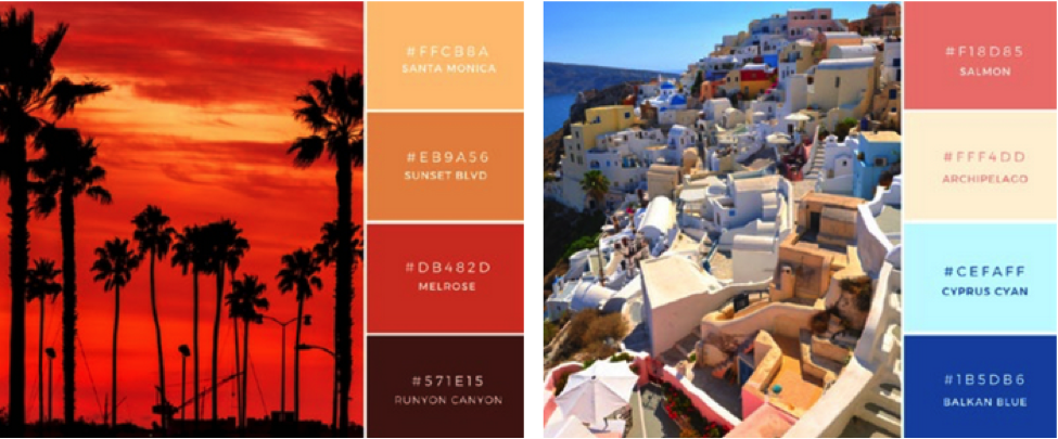
One of my favourite ways to experiment with color combinations is to extract different hues from images with a color picker tool, like the Eyedropper Chrome extension. Take a look at the two color palettes below:

From the left, the first is sun drenched and warm evokes a familiar or nostalgic feeling. The second is bright and modern, immediately evoking a happy or “vacation” feel to the image. Try finding images you like, and use the color picker tool to extract different hues and create a mood.
Another way to stop the mindless scroll when you browse social media? Edit and enhance the photos you post. Up the saturation, adjust the contrast, add a filter. These are techniques to help make your images look more professional and unique.
Here’s a great example of a jaw-dropping enhanced image from the @weddingideas_brides Instagram account.

Remember: Your goal is to draw the audience in.
Mistake #3: Your images are low-quality.
If you’re using low-quality images, you won’t “wow” your followers — and, in turn, they might not share your posts. Your visual content is a direct reflection of the quality of your brand, and it will also reflect on your followers if they choose to share it on their accounts.
If you think you don’t have the budget or resources to hire a photographer or purchase professional stock photos, don’t freak out. Luckily, there’s a ton of high quality content out there that’s also totally free — you just need to know where to look. For example, here are over 550 royalty-free stock photos from HubSpot you can download and use.
Along with choosing high quality images to promote your brand, consider this checklist:
- Are your images a high enough resolution so they don’t appear pixelated on larger devices?
- Can you read the text on the images clearly?
- Do your photos and graphics appear as if they were professionally done? (Pro tip: Use professional templates like Canva’s free templates.)
Below is an example of a lower quality Facebook profile photo that wasn’t formatted to the correct size, creating an abundance of dead space around the image and hard-to-read text:

While you may provide a great product or service, it’s important to ensure your online presence matches that same quality.
Now, consider the next image from Elite Daily’s Facebook Page and take a mental inventory of what draws you in:

Elite Daily consistently accompanies its blog posts with striking, high-quality images. Notice how the image in this Facebook post is also highly relevant to the topic. That’s another important factor in boosting the shareability of the post.
Mistake #4: You didn’t format your design for the right social platform.
If you don’t format your designs for the right platform, then your images will appear cropped and low quality — and that’s not going to impress your audience.
Always check the correct dimensions for your social media content designs before you even start designing. (Here’s a detailed guide to photo and image sizes on Facebook, Twitter, YouTube, and other social networks to help you out.)
Below, I’ve pulled out three designs optimized for Instagram, Facebook, and Twitter. Notice the difference in shape between. This shows why correctly formatting images is essential to keep them looking their best.

Mistake #5: There’s too much text.
People love visual content on social media because it’s easy to digest. Too much text on your images has the opposite effect. A picture is worth a thousand words — and in an age where our attention spans last only 140 characters, it’ll serve well not to overwhelm your audience.
Be quick, concise, and let your visual content do the talking for you.
Check out the image below from Peek’s Twitter account:

The image is a simple picture taken from the window seat on a plane. No text; just the reader’s imagination of the possibility of travel. Consider keeping your pictures and graphics clear of overlaid text, or only using text where necessary.
Have a lot to say? Your best bet is to grab your reader’s attention with a compelling image, and then direct them to a blog post or website that offers more information.
Mistake #6: You’re not following the trends.
Trends, especially on social media, flourish because of popular appeal. If you don’t tap into popular social trends, then you’ll miss out on a huge opportunity to get your visual content shared.
Take the time to explore other brands’ social media pages that are generating a high level of success with their visual content. One way to do this is to search for your brand keywords in Pinterest and keep a note of content with a large amount of pins. By replicating posts with similar visual content, you’ll be instantly increasing the chances of getting your content shared.

Of course, don’t forget to add your own personal touch or flair. That’s what makes your brand unique, after all. But in the case of social media, a little research can go a long way.
Over to You
If you’re already using visual content on your social media pages, you’re off to a great start. Even if you’re not a design pro, all it takes is a bit of research and the right tools to become a visual marketing pro.
![]()


