
Have you ever wanted to create a single chart for two different (yet related) pieces of data? Maybe you wanted to see the raw number of leads you’re generating from each channel and what the conversion rate of the channel is. Having those two sets of data on one graph is extremely helpful to picking out patterns and identifying full-funnel trends.
But there’s a problem. Those two sets of data have two Y-axes with two different scales — the number of leads and the conversion rate — making your chart look reallllly wonky.
Luckily, there’s an easy fix. You need something called a secondary axis: it allows you to use the same X-axis with two different sets of Y-axis data with two different scales. To help you solve this pesky graphing problem, we’ll show you how to add a secondary axis in Excel on a Mac, PC, or in a Google Doc spreadsheet.

(And for even more Excel tips, check out our post about how to use Excel.)
How to Add a Secondary Axis in Excel on a Mac
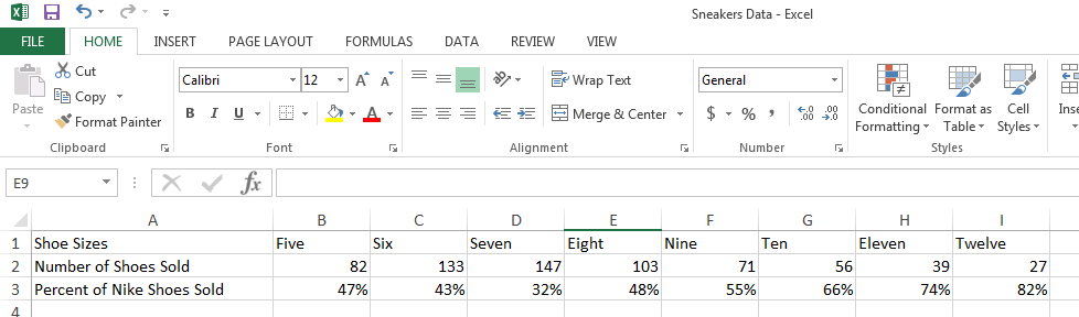
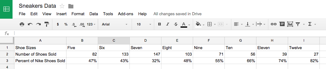
Step 1: Gather your data into a spreadsheet.
Make Row 1 your X-axis and Rows 2 and 3 your two Y-axes.


Step 2: Create a chart with your data.
Want a detailed guide to creating a chart in Excel? Click here.
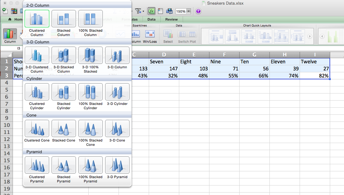
Otherwise, you can highlight the data you want to include in your chart. Then, go to “Charts” on your dashboard, select “Column,” and click on “Clustered Column” at the top left.
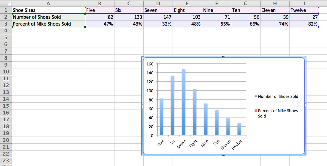
Your chart will appear below your data set.
Step 3: Add your secondary axis.
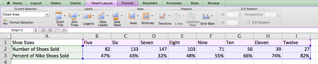
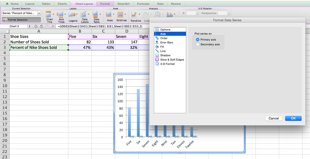
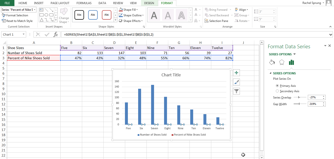
Now it’s time to make the “Percent of Nike Shoes Sold” data your secondary axis. Head over to your dashboard and click on “Chart Layout.” This should pop up in purple next to “Charts.”
Under the “Current Selection” drop-down in the top left corner, select “Percent of Nike Shoes Sold” or whatever series you want as your secondary axis.
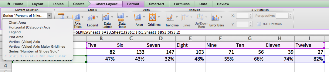
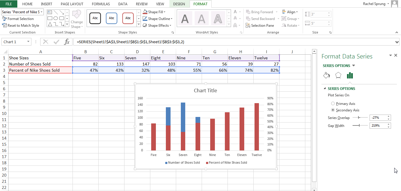
After you select “Series ‘Percent of Nike Shoes Sold,” click on the “Format Selection” button — it’s right below the dropdown. A pop-up will come out that gives you the option to select a secondary axis. If “Axis” isn’t automatically highlighted on the left menu, click onto “Axis” and select “Secondary axis.” When you are done click “OK.”
Step 4: Adjust your formatting.
Now you will have “Percent of Nike Shoes Sold” overlapping the “Number of Shoes Sold.” Let’s fix that.
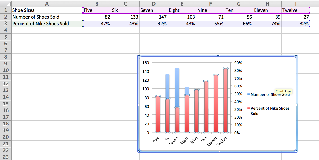
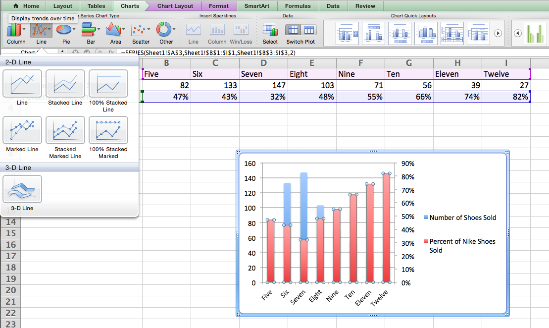
With the graph still highlighted, click on the green “Charts” tab once again. Select “Line” at the top left, and click on the top left “Line” graph option.
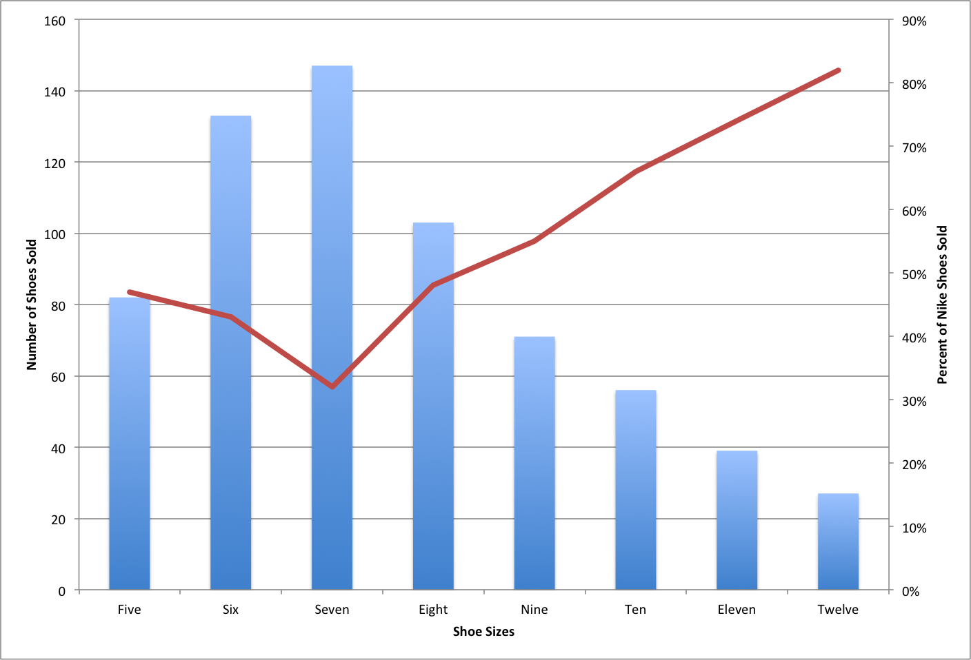
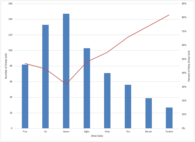
Voilà! Your chart is ready, showing both the number of shoes sold and percent, according to shoe size.
How to Add a Secondary Axis in Excel on a PC
Step 1: Gather your data into a spreadsheet.
Set it up so that Row 1 is your X-axis and Rows 2 and 3 are your two Y-axes.
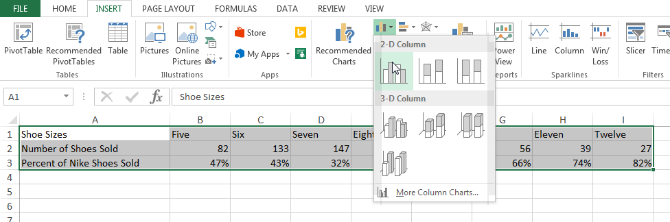
Step 2: Create a chart with your data.
Highlight the data you want to include in your chart. Next, click on the “Insert” tab, where you’ll find a “Charts” section. Click on the small vertical bar chart icon at the top left. You will now see a few different chart options. Select the first option: 2-D Column.
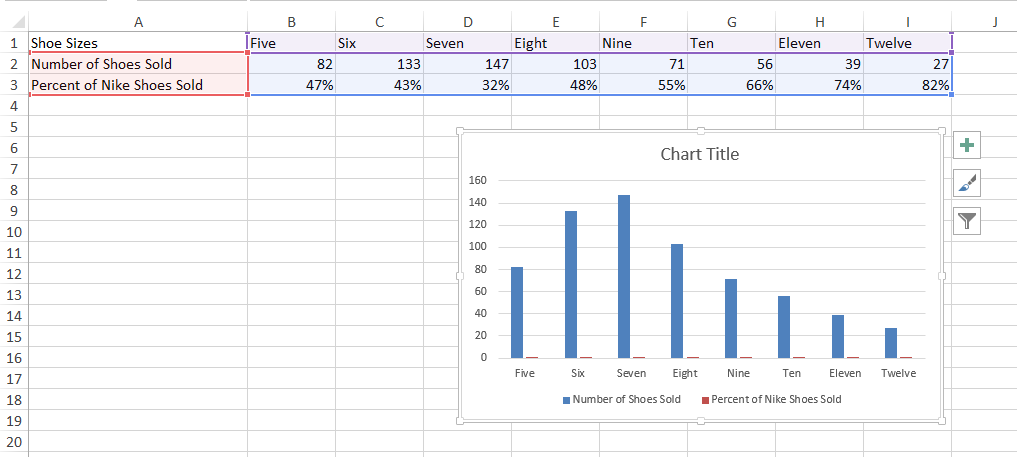
Once clicked, you’ll see the chart appear below your data.
Step 3: Add your secondary axis.
Now it’s time to add the “Percent of Nike Shoes Sold” data to your secondary axis. After your chart appears, you will see that two new tabs appear at the end of your dashboard: “Design,” and “Format.” Click on “Format.” Then on the far left where it reads “Current Selection,” click on the dropdown that reads “Chart Area.” Select “Series ‘Percent of Nike Shoes Sold'” — or whatever you want your secondary axis to be. Then click on the “Format Selection” option right below the dropdown.
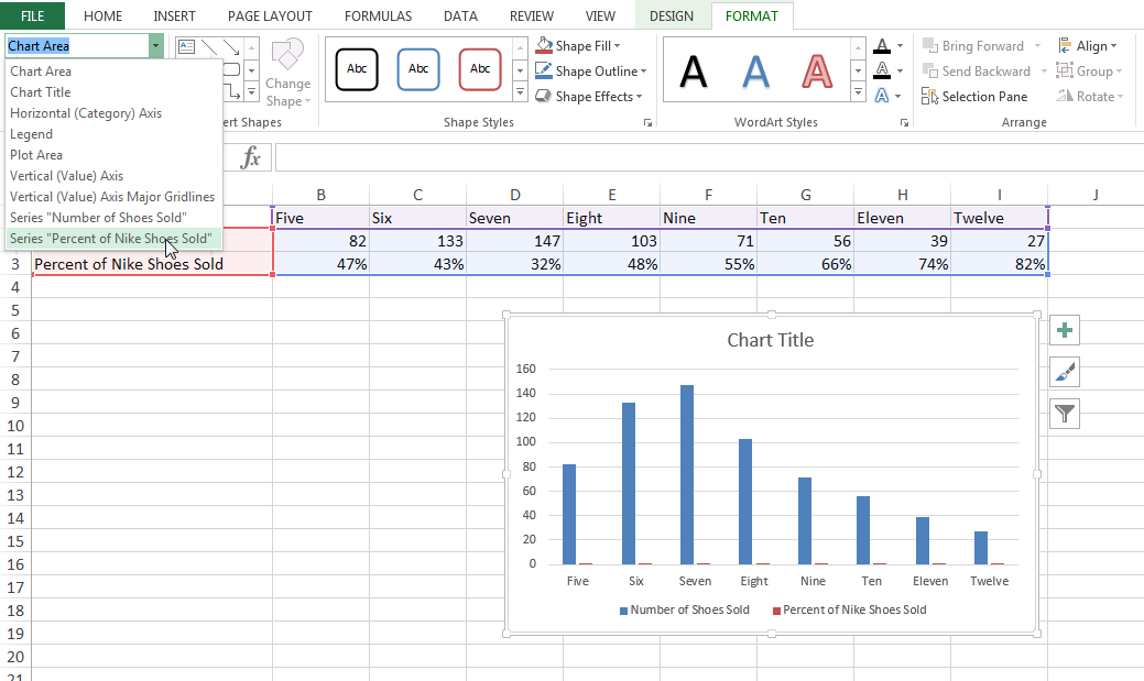
You will see an option pop up to your right that reads “Format Data Series.” Select the bubble next to “Secondary Axis.”
Step 4: Adjust your formatting.
Notice that your “Percent of Nike Shoes Sold” data is now overlapping with your “Number of Shoes Sold” data? Let’s fix that.
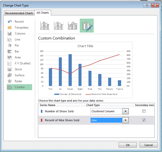
Click the “Design” tab (which is located next to the “Format” tab at the top of your screen). Then click “Change Chart Type.”
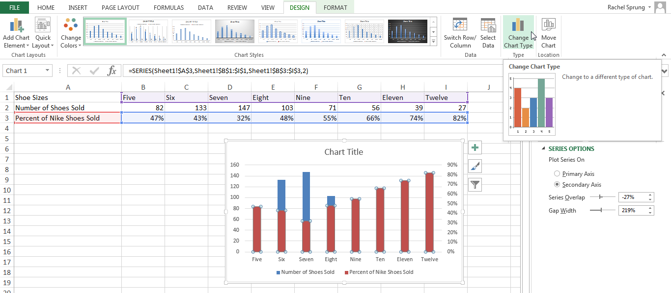
You will see the following pop-up modal. Next to “Percent of Nike Shoes Sold” at the bottom, click on the dropdown, and select an option below “Line.” This will change this data series into a line graph.
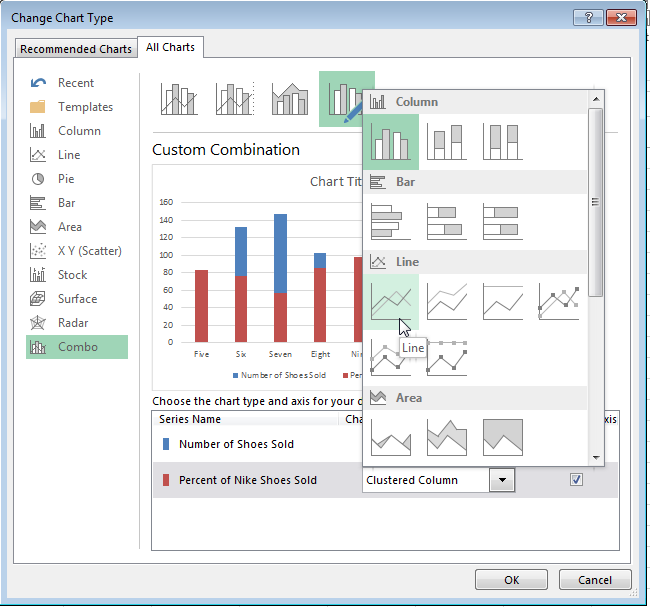
Make sure the “Secondary Axis” check box next to the dropdown is selected as well.
Voilà! Your chart is ready.
How to Add a Secondary Axis in a Google Doc Spreadsheet
Step 1: Gather your data into the spreadsheet.
Make Row 1 your X-axis and Rows 2 and 3 your two Y-axes.
Step 2: Create a chart with your data.
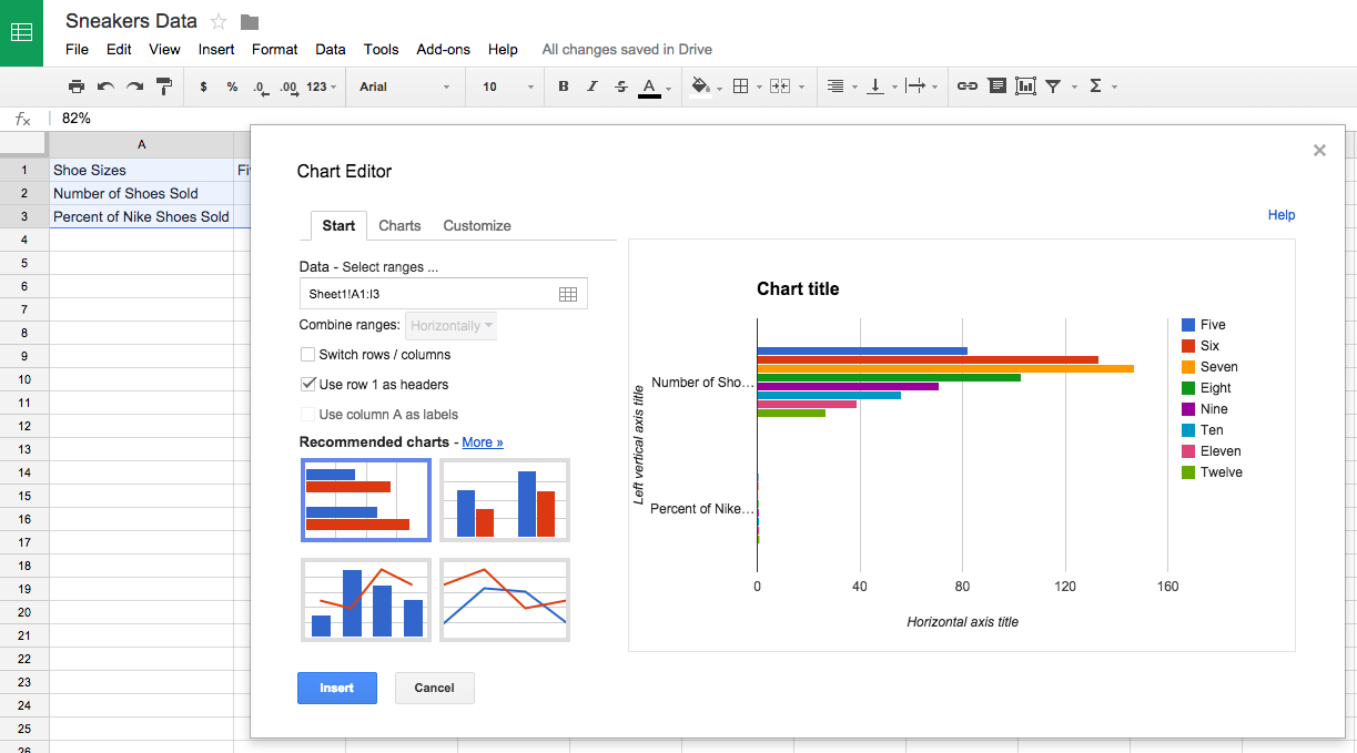
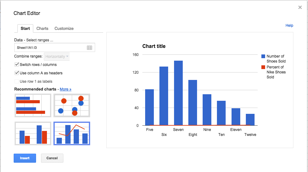
Highlight your data. Then click on “Insert” on your menu, and click “Chart” — it’s located toward the bottom of the drop-down. This module will appear.
Step 3: Add your secondary axis.
Under the “Start” tab, click on the graph at the bottom right showing a bar graph with a line over it. If that doesn’t appear in the preview immediately, click on “More >>” next to the “Recommended charts” header, and you will be able to select it there.
Make sure that “Use column A as headers” is checked at the top. If the chart still doesn’t look right, you can also check the option to “Switch rows / columns.”
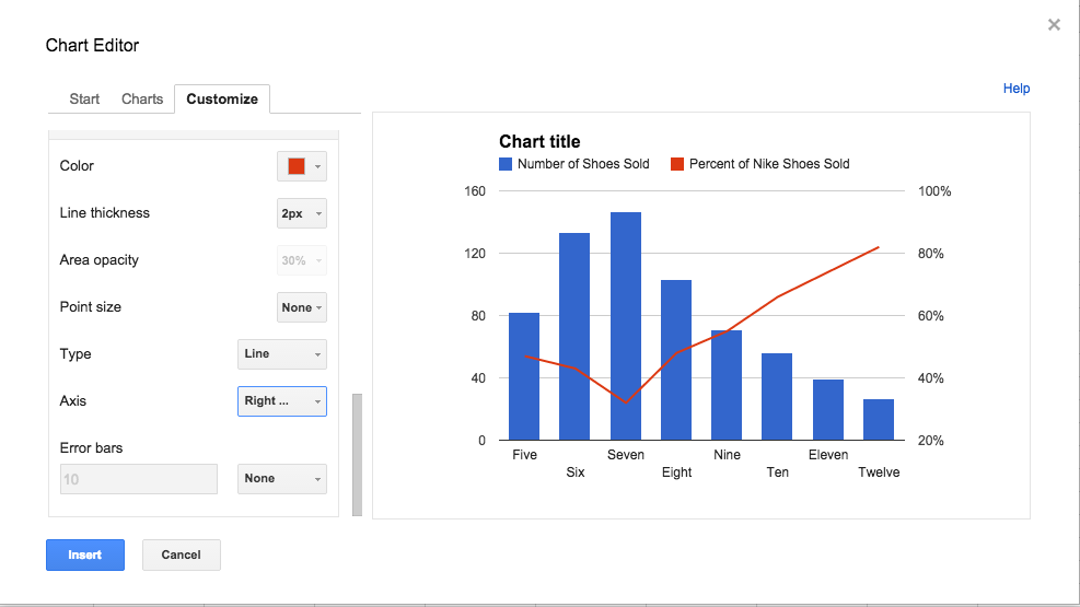
Step 4: Adjust your formatting.
Now it’s time to fix your formatting. Under the “Customize” tab, scroll down to the bottom where it says “Series Number of Shoes Sold.” Click on that dropdown, and click on your secondary axis name, which in this case is “Percent of Nike Shoes Sold.” Under the “Axis” drop-down, change the “Left” option to “Right.” This will make your secondary axis appear clearly. Then click “Insert” to put the chart in your spreadsheet.
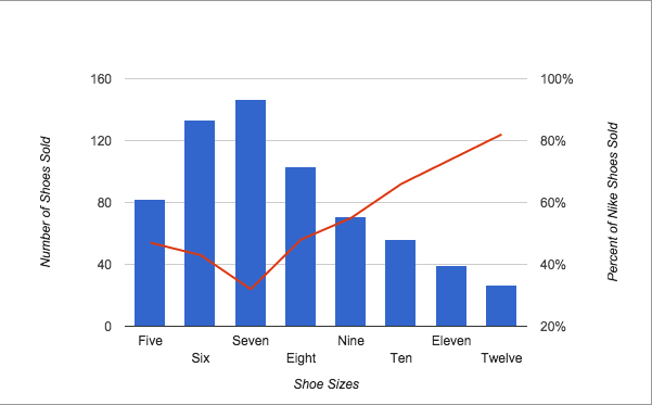
Voilà! Your chart is ready.
What data are you going to use to create your secondary axis?

![]()
