Do you want the bad news or the good news first?
Let’s start with the bad: Email marketing databases naturally degrade by about 22.5% every year.
Whether your contacts switch companies, decide to purge an old address they don’t use anymore, or simply opt-out of your email communication, they’re gone … and they might not be coming back.
Considering a recent survey by HubSpot and Eventbrite revealed that email is the single most effective marketing channel that event organisers have at their disposal, this news is likely to ruffle a couple of feathers. (After all, more subscribers = more sales.)
Which is why we came prepared with the good news …
In an effort to fill in the gaps left by email database decay, we’ve come up with five tools proven to help businesses grow their email list. From pop-ups to sticky bars to Twitter Lead Generation Cards, all of these resources are designed to help you maintain and scale a healthy email list.
5 Tools to Grow Your Email List
1) The Pop-Up
When it comes to using pop-ups on your website, you’ve probably heard some mixed reviews. And while some marketers argue that this approach is invasive, I’d combat by saying that a pop-up is only as disruptive as you allow it to be.
As long as you’re employing a sophisticated design and offering something that is both relevant and valuable to your audience, then pop-ups actually serve as a highly effective way to build an email list.
Still need some convincing?
While working on a new site design, blogger and author Chris Penn removed the pop-up on his website and built it into the page instead. The result? Not only did his subscriptions go down, but they nearly fell off a cliff. (You can bet it wasn’t long before he reinstated it.)
Not to mention, Social Media Examiner reported that its pop-up opt-in form helped grow its email list by 234% in just one year. Founder, Mike Stelzner, attributes as much as 70% of that success to the pop-up.
While I think these results speak for themselves, there are “less disruptive” alternatives for those who are still worried about bothering their website visitors.
One option would be to employ a scroll-triggered, slide-in CTA. Unlike traditional pop-ups, slide-in CTAs are only initiated when your reader is fully engaged and scrolling down the page. These CTAs slide in from the side rather than taking over the entire screen, like this:
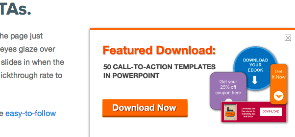
Aside from slide-in CTAs, you can also customise the functionality of your pop-up by specifying a delay or setting it to appear only once per session. And in terms of the content you include, don’t hesitate to offer an incentive to encourage more visitors to convert. We at Eventbrite use this technique on our pop-ups to provide visitors with even more reason to subscribe:
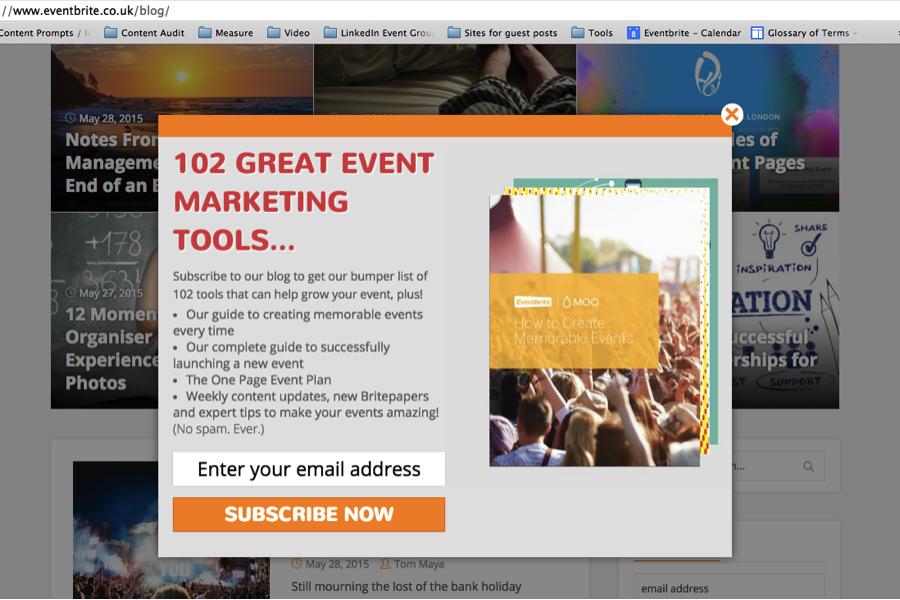
As you can see, there are many different ways to approach using pop-ups on your website. While we’ve seen success with traditional pop-ups, you may want to experiment with an alternative approach — like the slide-in CTA — before making the final call.
The Tool You Need
Want to add a pop-up like ours to your site right now? Check out SumoMe. This free tool makes it easy for you to get up and running in just a few minutes. While SumoMe offers three different pricing tiers for more advanced work, you can access all of its awesome apps for free with its beginner plan.
2) The Sticky Bar
If you absolutely, positively cannot stand the thought of adding a pop-up to your site, then we recommend that you consider the sticky bar. The sticky bar is a full-width bar that “sticks” to the top of the page and follows the visitor’s scroll.
To clarify, here’s what it looks like in action:

↓

↓

Notice how the content on the page changes as I scroll, yet the subscribe bar at the top remains in position?
While this technique is a little less intrusive than a traditional pop-up, it helps you to achieve the same goal — conversions. And while we’re on the subject of conversions, it’s worth noting that the sticky bar has proven its ability to deliver impressive results. In fact, ProBlogger (featured above) credits its sticky bar with a 25% increase in subscriptions.
But ProBlogger isn’t the only company that’s seen the value in this approach. DIY Themes also found the sticky bar to be an effective way to grow its email list after it helped them generate an extra 1,180 emails in just 30 days.
The Tool You Need
If you’re ready to experiment with a sticky bar on your website, why not check out one of the leaders, HelloBar. HelloBar is a great tool to help you deliver the right message at the right time, however, the free plan does incorporate ads. So if you’re looking for ad-free bars, you’ll want to look into its Pro plans.
3) The Exit Intent Pop-Up
Exit intent pop-ups are different than normal pop-ups, in that they detect your users’ behaviour and only appear when it looks as though they’re about to leave your site.
By intervening in a timely way, these pop-ups serve as a fantastic way of getting your reader’s attention while offering them a reason to stay.
Here’s an example of the one HubSpot uses on its MakeMyPersona tool:
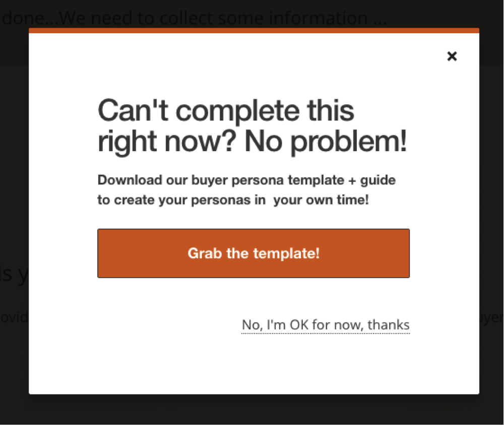
Much like the other options we’ve mentioned, there are a whole host of results that prove this pop-up’s effectiveness.
In fact, after implementing an exit-intent pop-up, WP Beginners saw a 600% increase in sign-ups. This increase helped the blog jump from 70-80 daily new subscribers to 445-470.
Neil Patel also reported seeing a 46% increase in sign-ups after implementing this type of pop-up on his personal blog, NeilPatel.com. And on the QuickSprout blog, Patel added that the ecommerce site, Xero Shoes, measured a 28.4% increase in sales after trying its luck with the technique.
The Tool You Need
If you want to implement an exit intent pop-up on your website, we suggest you try Hold On Stranger. Although this tool is not free forever (all good things must come to an end), it offers a 14-day free trial, 60-day money back guarantee, and a very affordable entry-level monthly rate.
4) The In-Content Subscribe Box
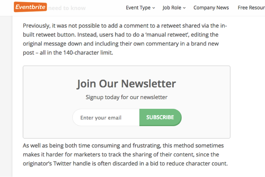
Another great way to encourage sign-ups for your blog is to include a sign-up box right in the thick of your content.
This way it’s not obtrusive, but it’s still pretty hard to ignore. By incorporating it half way down the page, there’s a better chance that the reader is engaged and actually seeing it.
Alternatively, if you don’t want to break-up the reader’s flow, you can also place them right at the end of your post.
Our Eventbrite Ireland blog has seen a lot of success with this method. Here’s what it looks like in action:
The Tool You Need
Want to pepper conversion opportunities into your content? We use MailMunch’s Embedded Opt-In Forms to create high quality forms that can be embedded before, after, or in between our website or blog content. While MailMunch does offer paid versions, you can register one site with unlimited forms, page level targeting, and integrations for free.
5) The Twitter Lead Generation Card
And now for something completely different …
While the pop-ups detailed above all serve as an effective way to facilitate conversions once visitors arrive on your website, why wait until they get there?
With Twitter Lead Generation Cards, you can ask your followers (or ask your competitor’s followers) to join your newsletter or download a content offer directly within a tweet.
Here’s an example of what a card looks like: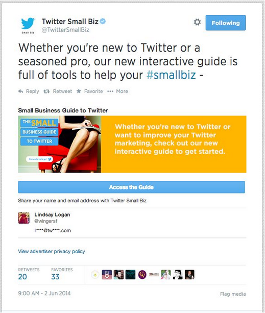
(Source: Moz)
Each card includes a short description, an image, and a CTA.
The goal of the description is to provide Twitter users with the context they need to share their contact information with you. Ask yourself: What’s type of value are they going to receive after converting on this card.
The image simply serves as a way to capture the attention of your audience. When selecting an image, be aware that the display size is rather small. (We wouldn’t exceed the amount of text shown in the example above.)
And as for the CTA, keep it simple and actionable.
For more information on Twitter’s Lead Generation Cards, check out this resource.
The Tool You Need
Okay, so this one’s pretty self-explanatory. In order to leverage Twitter’s Lead Generation Cards, you’ll need, yup, you guessed it — a Twitter account. If you don’t already have one, you can create an account here. Once you’re registered, you’ll need to visit the Twitter Ads page to get started. While Lead Generation cards live amongst the other Twitter Ad tools, they can be used entirely for free. (Although we suggest that you try to at least throw some promotional budget behind them in order to see the best results.)
Want Even More Advice?
We at Eventbrite have compiled 5 key lessons for anyone who wants to grow their blog subscribers into a free course, How to Grow Your Email List in 5 Easy Steps. Sign up to today and start growing your email list like a pro.
![]()
